Everyday items we interact with and rely on — like our transportation, road signs, medical equipment — all require some type of metal fabrication (shaping, bending, cutting, pressing, or all of the above).
As North America’s leading trade association of its kind, Fabricators & Manufacturers Association has spent 50+ years dedicating itself to the professionals of its industry and has delivered continual progress and security for trade businesses, as well as opportunity for students whose skills and enthusiasm contribute to a better tomorrow.
The impacts of FMA are far-reaching, but not widely known. You don’t have to be an FMA member to benefit from everything it’s doing in metal manufacturing (CE, training, events, scholarships), and the association operated separate independent brands for its various needs. In doing so, FMA’s own value and meaning has been downplayed and somewhat hard to find.
With a goal to unite its brands so they would be understood as a connected ecosystem, we helped FMA reposition itself as the leader it’s always been, sharing its common mission of uniting and connecting the industry for good.
FMA was ready to uncover their path to increased industry awareness and greater internal synergy. During our brand discovery, we heard about a number of misconceptions concerning FMA that we knew we could help solve with the right strategy and brand identity.
• FMA was perceived as just one of a dozen trade associations in metal manufacturing.
• Trade associations are generally seen as antiquated, stuck in the past, and less inclusive.
• FMA was synonymous with its Chicago founding, but has grown to be a global company.
By identifying these misconceptions at the beginning of the project, we could consider how the current brand was contributing to them and what opportunities FMA could take to change them. In addition to helping correct the broader confusions around trade associations, we specifically needed to shift the perception of FMA as being just a peer association to a place for professionals and businesses to connect with each other and their industry.
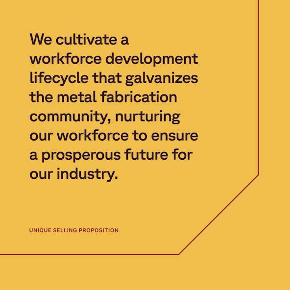
During these weeks, we also worked with the FMA core project team to study and uncover true brand differentiation for the FMA brand. In the competitive landscape, most brands chose to compete on membership, pricing, and tenure. FMA had similar surface-level claims, but its association is the only one of its kind improving the workforce lifecycle. While others are studying the changes in metal manufacturing, FMA is approaching this challenge with solutions by hosting camps, creating scholarship opportunities, instigating the push for diversity, and investing in new technologies to help future-proof the industry (at the time, this work was under the brand name Nuts, Bolts, & Thingamajigs). When discussing it as a team, this point of differentiation was the single aspect that every FMA employee was most excited about, proud of, and driven by.
We proposed a Hybrid brand architecture for FMA — one that would confirm FMA as the core behind its powerful brand portfolio, eliminate the confusion and cost caused by so much separation, bring things closer in-line visually, unite FMA with its most important differentiator, simplify the management of the brands, allow its publication and trade show to be independent channels connecting back to FMA, and enhance the equity and awareness across the system.
With these strategies set, we focused on a direction that positioned FMA as so much more than a membership. This pivot gave the brand the ability to appeal to businesses and professionals looking to be part of the bigger change happening in their industry. FMA dedicated its brand to enabling its industry community to see themselves as active participants in ensuring the sustainability and relevancy of their work.
Many of the issues uncovered in discovery and strategy could be addressed through the verbal identity work — namely, the lack of cohesive messaging that would establish FMA’s value and sit above its pillars, supporting a connected experience between offerings.
FMA was underrepresented as a valuable entity in its own right; audiences were clear on the benefits of specific pillars but weren’t necessarily engaging with the others. The goal was to help them see FMA as a unified organization with a rich set of offerings, encouraging audiences to interact with them all. So it was critical to build messaging that put forward a bold vision for metal fabrication’s future. Audiences needed to buy into FMAs long-term proposition — which focuses on advancing the industry and growing the next generation of fabricators — instead of short-term gains.
But we didn’t want to ignore those short-term gains either, or the benefits members enjoyed via specific pillars (which, for many, had served as their entry point to FMA’s universe in the first place). Our approach was to create an audience messaging framework that would highlight those benefits in targeted messaging. Then, we balanced that with high-level assertions about FMA’s foundational role in making them available.
It was just as important to give FMA a compelling voice, one that could telegraph its optimism for the future as well as its deep expertise and credibility. We wanted a voice that would motivate members and inspire them to see themselves as part of something bigger. This voice is both representative of FMA and of its members, who have their own stories, dreams, and legacies to share.
All aspects of FMA’s verbal identity culminated in a brand story, which speaks directly to those members, their hopes, and their goals for the future. First, we built a narrative emphasizing FMA’s vision and promise. Then, we invited all members to be a part of that vision, acknowledging that they may have been in the industry for decades or just starting out. Inclusive, forward-looking, and bold, the brand story unites the metal fabrication industry and puts FMA at the center of that achievement.
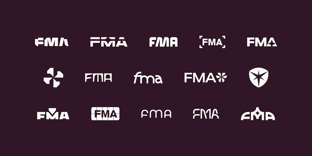
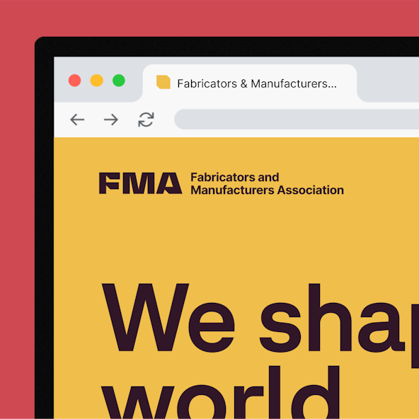
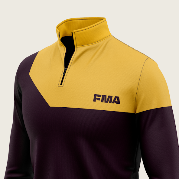
FMA’s logo is inspired by metal shapes — and a direct tie to its newly minted vision statement. As if it were cut from a sheet, the all-custom mark lives and breathes the metal fabrication and manufacturing industry. It’s simple, direct, distinct, and bold. The letterforms pay unmistakable homage to the profession’s history while remaining inventive and futuristic.
Once the teams aligned on this logo direction, we went to work on detailed alterations and refinements to enhance the logo’s stability and legibility. A few tweaks to the scale, and it was ready.
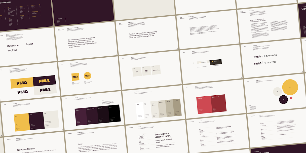
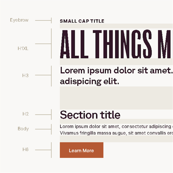
Given both the familiarity of its acronym and the length of FMA’s full name, the logo is used most often. In applications where the full name is needed, we opted for utility by pairing the mark with the brand’s secondary typeface, Inter, in a stacked and horizontal lockup style.
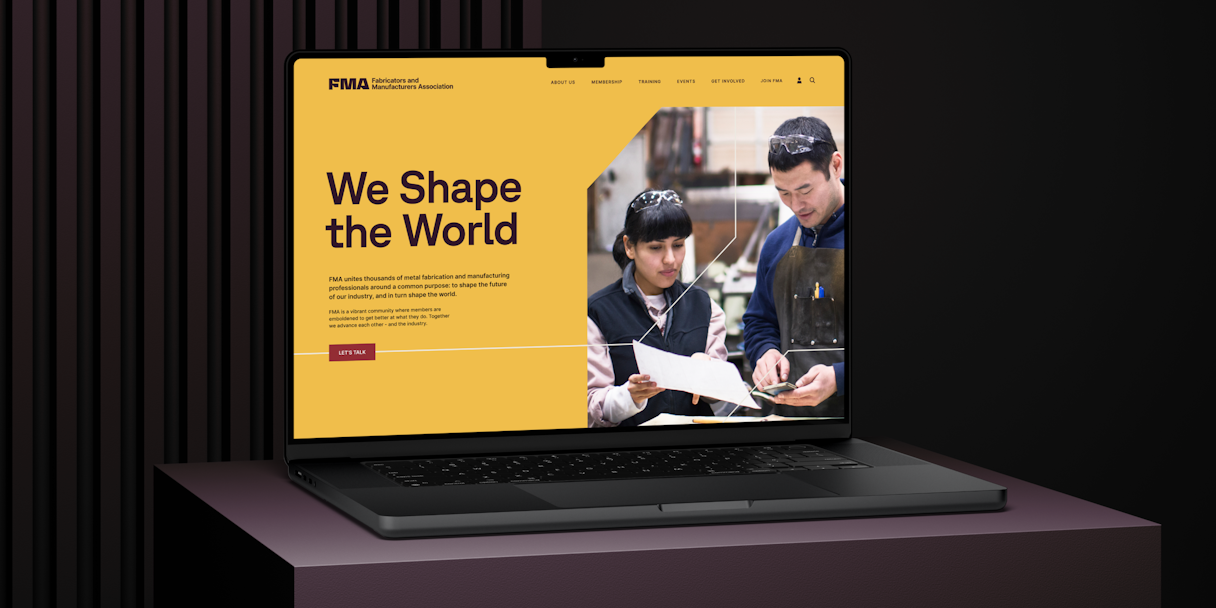
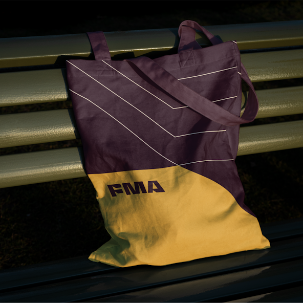
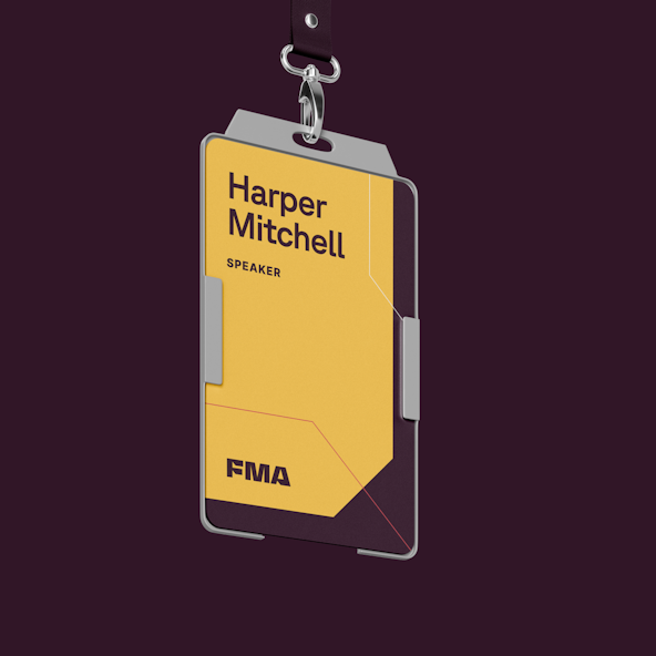
Expanding on the sheet metal logo, we began to look at punched sheet scraps for visual language inspiration. Each piece of scrap metal has a myriad of interesting geometric patterns in the negative spaces. Without ever showing the presence of metal, the shapes and their repetition felt representative and ownable. Using a formula of geometry, sharp corners, even spacing, and angles, we constructed a shape language that’s simple, unique, and meaningful, while being flexible enough to be worked into nearly any layout application.
The shapes can contain images, text, solid colors, texture, and other content types, making them extremely easy to use and practice for the design system.
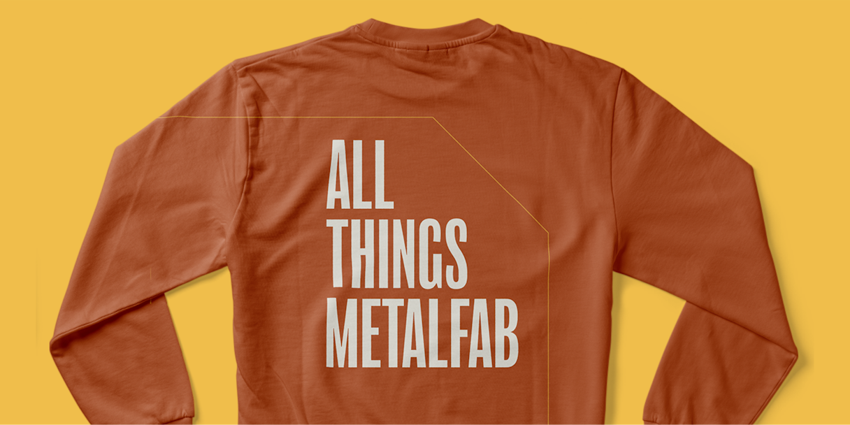
In addition, we introduced a line version of the visual language derived from the same sheet metal inspiration. Not only does it provide extra texture, it communicates technique — engineering plans, dielines, and such. In that spirit, every FMA layout is built from a grid system to show unity and cohesion.
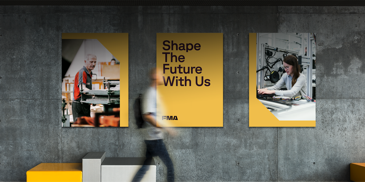
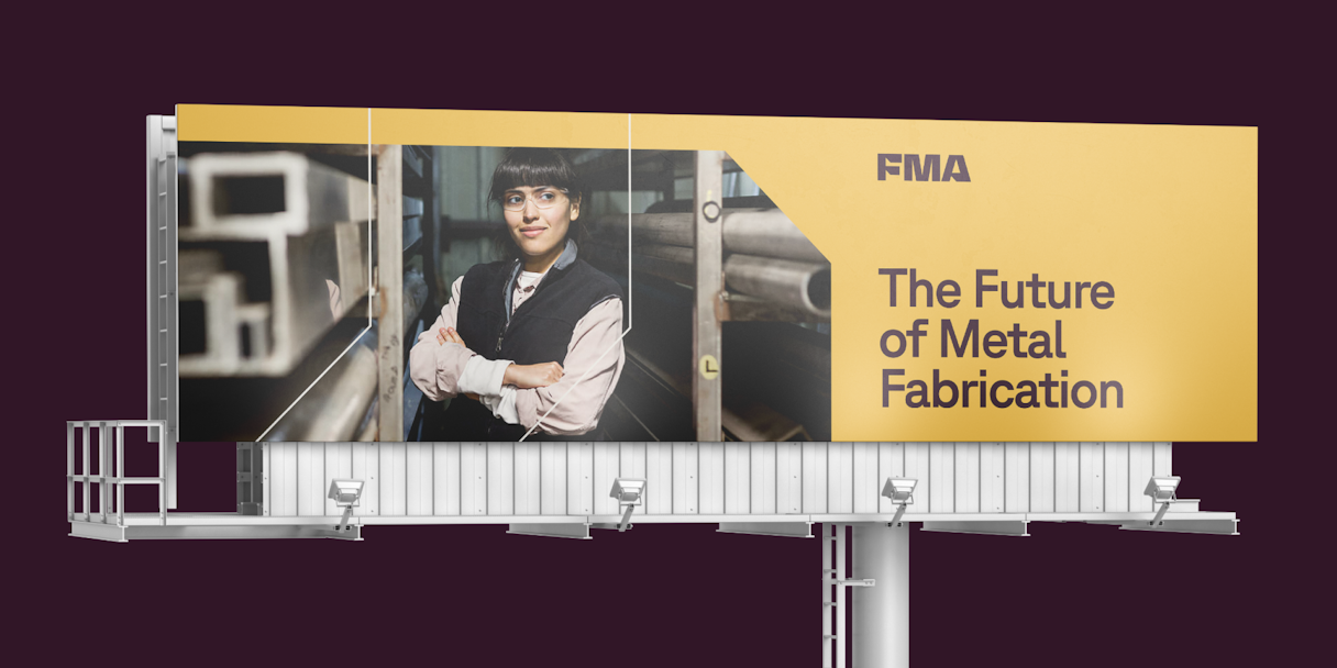
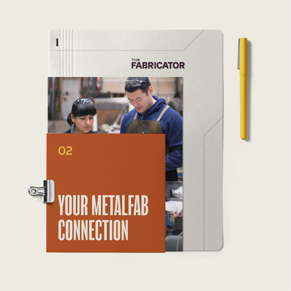
Community is front and center throughout FMA’s photography, focusing on the people and spirit of its industry and reflecting them at every touchpoint. We felt the best way to communicate these concepts was through intentional photos that show real people in the modern metal manufacturing and fabrication landscape.
Diverse subject matter was key, as was to show modern workplaces, in order to shift the perception of metal manufacturing from the old story of male-dominated, dirty jobs, and dark warehouses to the fulfilling, inclusive environment it is today (with robots!). Additional style definitions included candid subjects and a direct flash that conveys a spark or spotlight on the person and their craft.
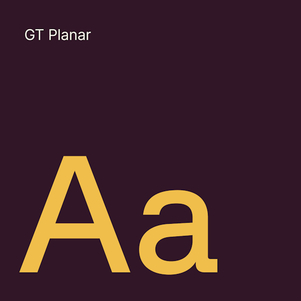
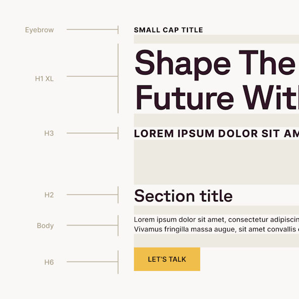
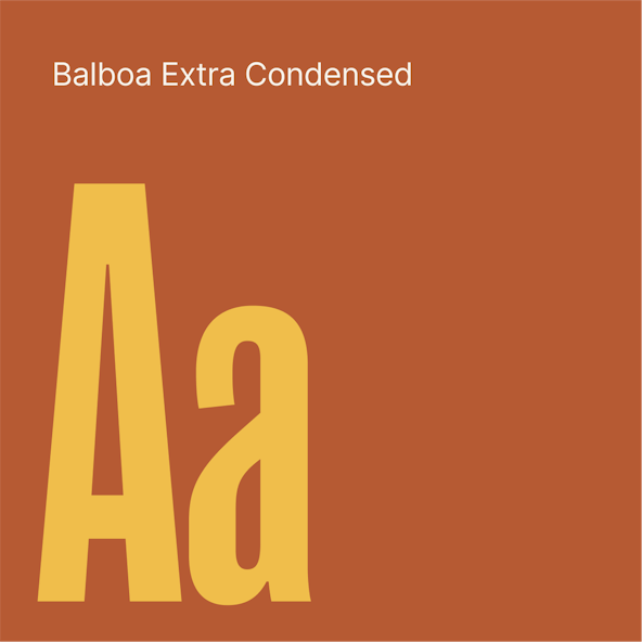
GT Planar, a workhorse geometric sans, is the brand’s primary typeface. GT Planar features quirks like prominent right angles with rounded outside corners on certain characters. The resulting letterforms often resemble bent pipe — a sight very familiar to the manufacturing industry. Other visual identity elements included a custom headshot style and branded iconography.
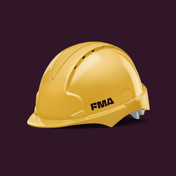
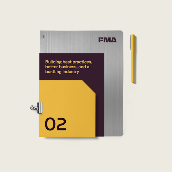
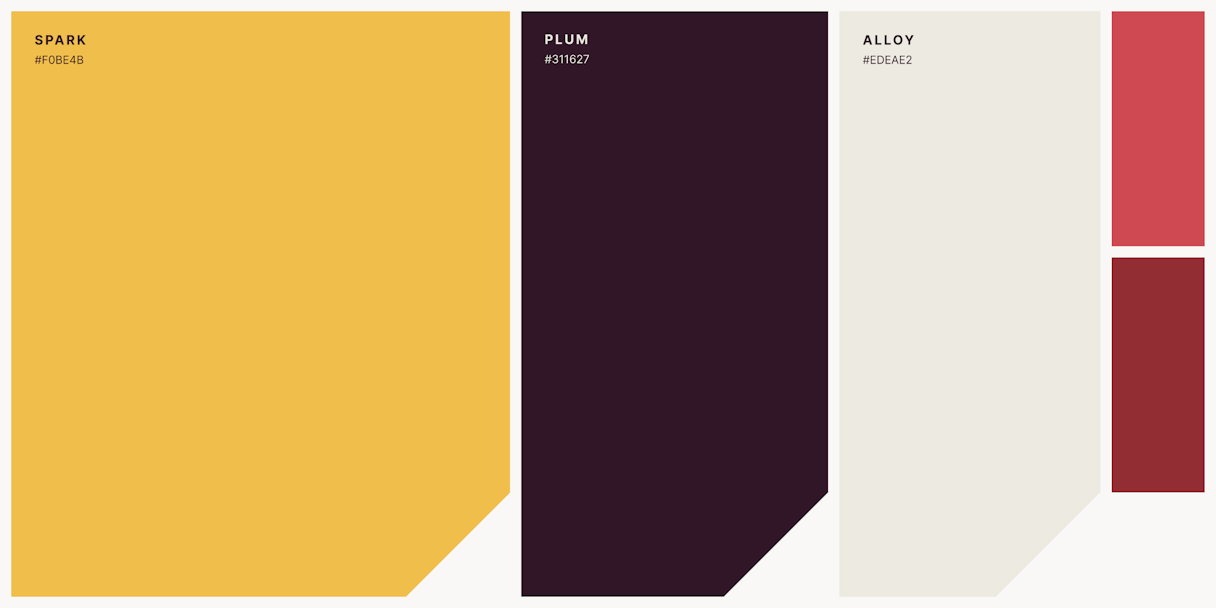
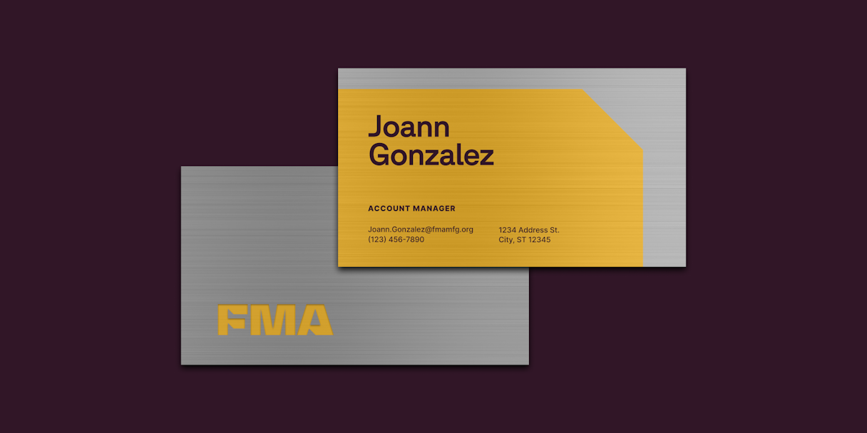
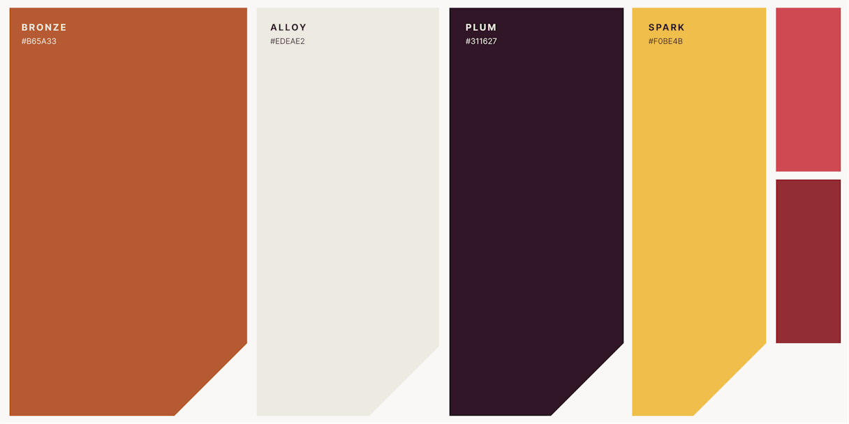
Yellow is the color of optimism. FMA’s primary yellow, named Spark, was chosen for exactly that reason. Not only does it capture the quality of bright futures, it is a color that many people associate with the industry (think highway signs, hardhats, and equipment). Spark was exactly what the FMA identity needed to stand out and capture its purpose. Spark is complemented by a rich plum purple, alloy range for contrast, and an accent red to use when needed.
We couldn’t let the opportunity to explore brushed metal pass us by. As an alternative to color and in use cases where it’s possible, FMA’s system opts to use actual brushed metal.
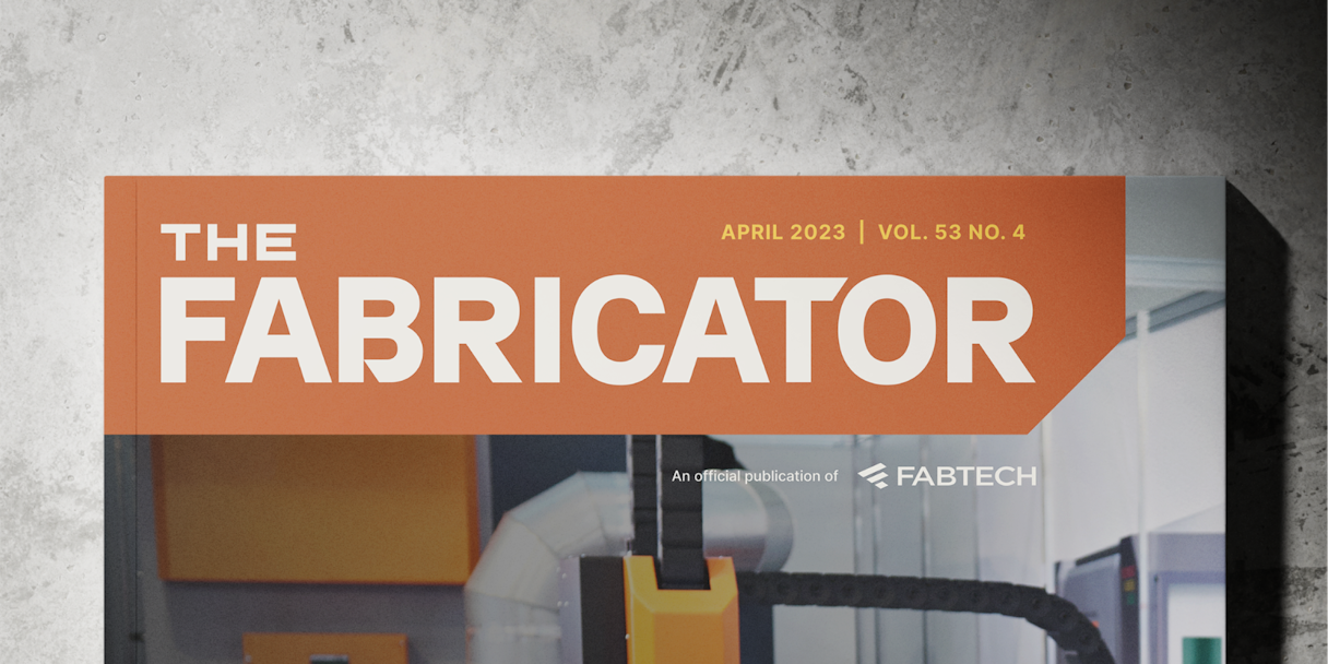
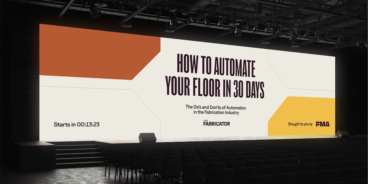
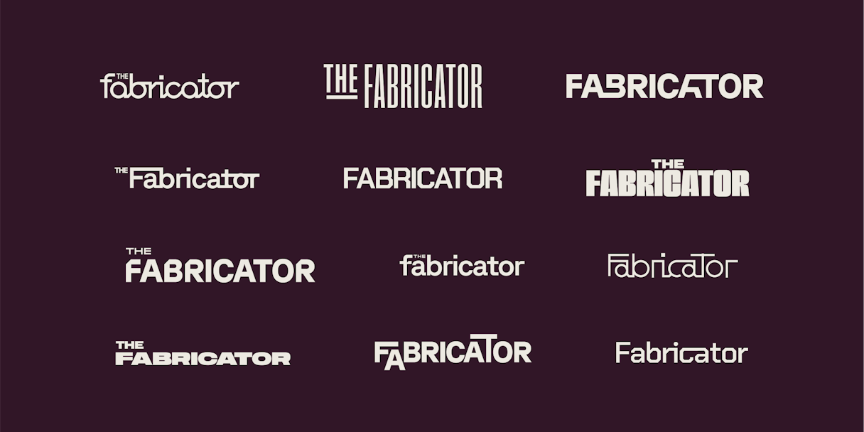
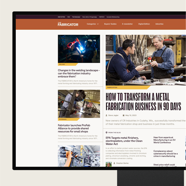
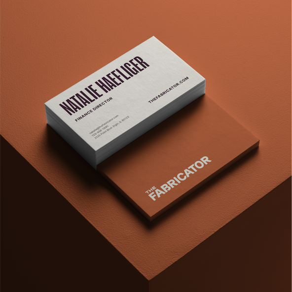
With the parent brand brought to life, we immediately began work on the publication sub-brand, The Fabricator. Our goal was to maintain the strong connection to the parent brand by creating a trade-inclusive publication experience that mobilized FMA’s mission of advancement.
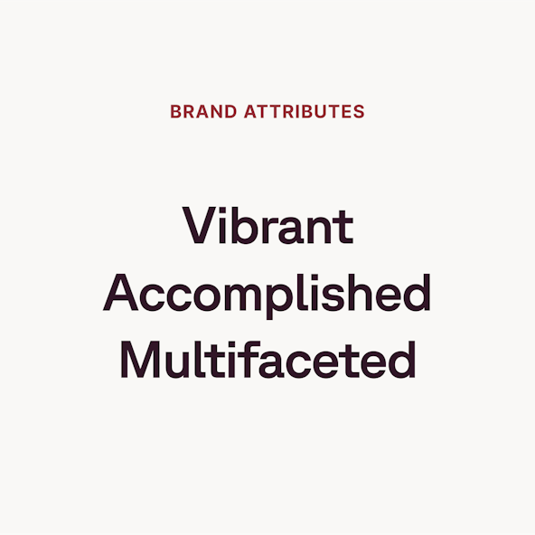
The Fabricator brand informs, inspires, and influences trade professionals so they can connect with others and contribute to the future of their identity. It does this through a multifaceted line of offerings including its flagship print publication, digital content, training events, and much more. Therefore, we knew we needed to amplify its perception of thought leadership, and we prioritized cohesion and accessibility.
The Fabricator’s point of distinction was abundantly clear to us from the outset: It is the only multimedia publication and content producer of its kind within the industry, and we intended to tout that. We wanted to position The Fabricator as the de facto source that appeals to subscribers, advertisers, and the larger readership with content of the highest quality.
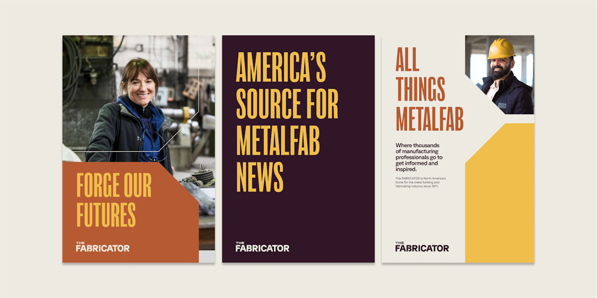
Early in our verbal identity work for FMA, we hit on the phrase “collective voice of metal manufacturing” as a way to describe FMA’s representation and reach. It was the perfect notion to bring into The Fabricator’s verbal identity, and we knew we wanted to build situational and audience messaging that would unpack that idea.
So, we focused on creating messaging that captured the breadth of verticals FMA and The Fabricator serve and speak to. We emphasized the variety of content types and topics available through The Fabricator, highlighting thought leadership and education. Most important was to reinforce The Fabricator’s role in carrying out FMA’s mission to drive the industry forward together.
Read the next case study
Zuora