Marketo

Marketing engagement leader Marketo approached us to redefine their brand identity after more than a decade operating under the banner of purple growth bars.

Marketo was rich in brand equity and loyalty but lean on a scalable, modern system. As happens when companies grow quickly, numerous sub-brands and assets had been hastily added over the years with little cohesion.

Even the iconic purple suffered from inconsistencies in application. Marketo’s content-rich brand experience needed clear hierarchy and strategic streamlining, and the visual and verbal identities warranted a fresh face for a bold and best-in-class company at the top of its game.

Growth redefined. The future of marketing is here.

Brand Strategy

We quickly exposed the limitations and shortcomings of the existing brand experience during an in-depth strategy process that began with an onsite kickoff in San Mateo with key Marketo executives and stakeholders. This experience helped us to intimately understand the dynamics of the company and the myriad challenges that we needed to address in the rebranding project. It also set a solid foundation for a working relationship that would sustain us in the many long months to come.

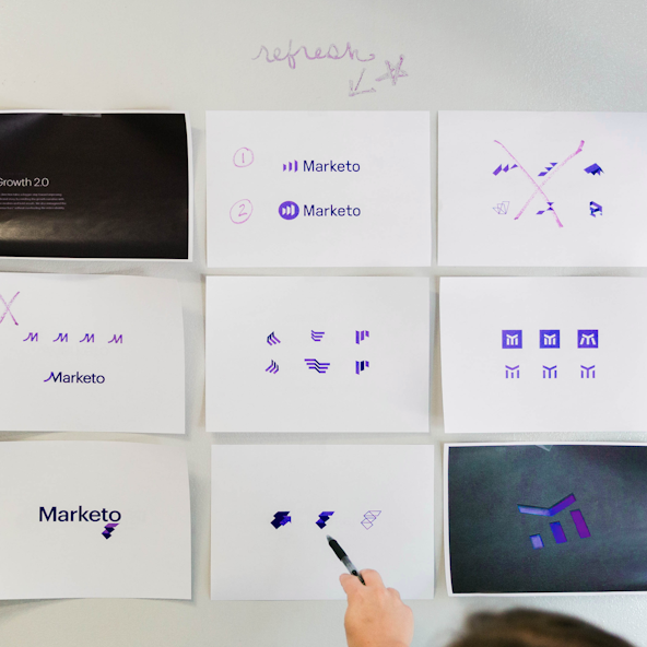
Brand Strategy revealed the significance of the numerous components of existing brand equity, from the rallying of the internal team around the iconic purple, to a noted consumer appreciation for the familiarity and approachability of the revenue bars. It was determined that a brand refresh would play on the awareness that Marketo has earned, and compete less with existing living assets. Therefore, our main objectives for the refresh became to mature the brand, create scalable and consistent brand visuals and applications, define and execute a verbal identity that felt relatable and inclusive, and to embrace boldness through secondary elements that tell the story of technological advancement, thought leadership, and a passion for the marketer.

Two members of Marketo's team look over Post-It notes during a strategy on-site.

Getting out "all the thoughts" in a strategy session

Marketo's team discusses their goals and challenges during the strategy session.
A person holds up a card that reads "Creator" - a brand archetype.

We endeavored to create an identity that honors the Marketo history but projects a strong vision of the future.

Early Marketo visual exploration posted up on a wall.
A designer talks through visual ideas in front of a whiteboard.

Visual Identity

In recreating a brand worthy of the Marketo caché, we quickly realized the need to modify the revenue bars and the accompanying logotype. Initially referred to as Growth 2.0, we honed in on a story that embraced growth, but retold it in a way that spoke to the next generation of marketing. So the longstanding four revenue bars were simplified, streamlined, and given dynamism and dimension. They were reborn as the Perspective Bars, which served to represent both a shift within the company and the empowerment of the perspective that Marketo insights and resources offer their audience. But the Perspective Bars went one step further: serving as a pathway to the future of marketing, and as a sequence of opening doorways that presented new opportunities to the marketing community.

A hand sketches out ideas for Marketo's mark.
Various sketches for Marketo logos.
"Welcome to the cultural transformation that is Marketo. And with it, a logo that honors our history but highlights heightened focus on unique perspectives and insights into businesses at all scales, and business that are scaling. Opportunity is knocking. The future of marketing is here."
A designer makes notes on his work.
The final mark is three pillars with edges that converge to a point. It can also be interpreted as an "M."

Marketo Motion Bumper

The Marketo logo diecut out of black paper.
A film still of a person illuminated by a projected M.
A brand guidelines booklet for Marketo

A simple yet powerful brand mark allows for a quiet approach when appropriate and a LOUD stance when duty calls.

Options for Marketo business cards
A large tradeshow banner that reads "The Future of Marketing"

Verbal Identity

To kick off voice and tone and messaging for Marketo, we engaged them in a brand archetype card exercise. Their passion for marketing was already clear in their brand voice: you could almost hear the purple. What needed further definition was the “why” behind their tone—the specific roles they play in their customers’, employees', and partners’ stories, and how best to express those relationships. During the exercise, the Marketo team determined that they were Creators, Mavericks, and Networkers. We made sure these facets of their personality rang true in their redefined brand voice, and in the new company messages we wrote. They sound relatable and inclusive—embracing the company and employee commitment to their audience as well as the community they’ve grown.

Never diminish the power of words. Words shape stories and stories shape brands.

Marketo Brand Reveal Film

I couldn’t be more proud to have you as our trusted partners in all things related to our brand.

Sarah Kennedy, CMO at Marketo

Post-Project Success

Read the next case study

Getida