Outreach
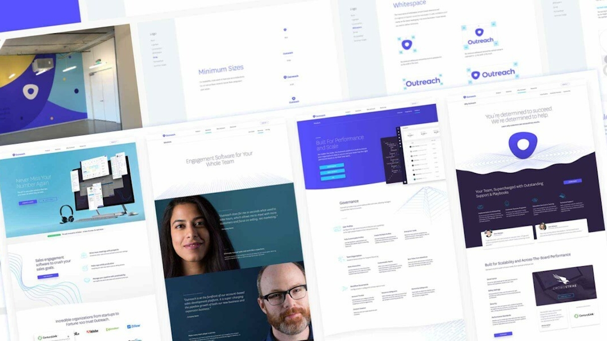
Outreach needed to re-energize an industry-leading sales engagement platform and promote a fun company culture. In a saturated, jargon-filled market, it was our first challenge to give this work-hard/play-hard team a stand-out brand makeover.
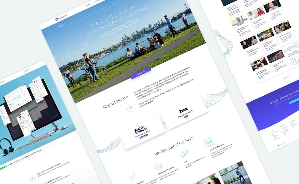
But the real challenge came in redesigning and developing a fluid website that could communicate how intuitive and rewarding their platform is to use — while capturing everything Outreach offers.
We helped Outreach tell their story through a bold new identity and a robust online experience.
Our Approach
Nearly every member of the team lent their magic to this project, which required a long, expertly managed project timeline. Not only did we build a whole new brand system to create content around, we got mega-strategic with information architecture to streamline content that had grown quickly with their success. Every pixel, every word, and every bit of code was laid out with intention in collaborative review with the client.

Focus Lab team strategy session. All great work starts with strategy.
Branding
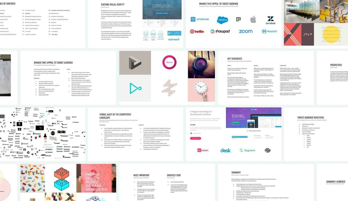
We kicked off brand strategy with a team exercise on the client side and a concepting round on our side to nail down brand essence. The result? A prescription for a brand that exudes authenticity, sales confidence, and grit.
But the visuals had a tall order: they needed to carry the boldness of a sales pro while feeling relaxed, to reflect how simple, yet powerful, the platform is to use.
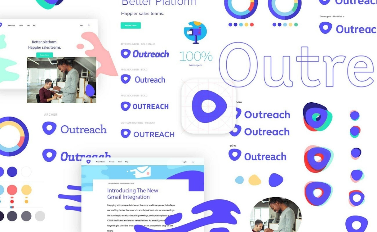
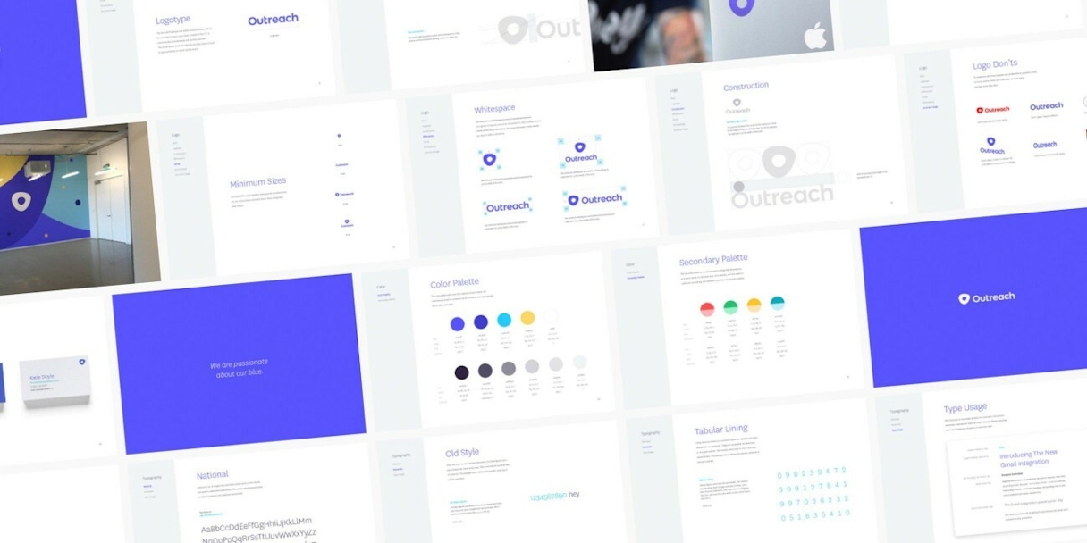
The key was adaptability. We started by creating a fluid mark we named the "Nucleo" and designed an organic system around it that scaled well. We chose one extensive typeface family that could morph across brand applications to feel all-inclusive. The leading color, Passionate Blue, formed the core of a lively primary palette. We derived inspiration for the secondary palette by taking a closer look at the Outreach product, to best fit their needs while complementing the primary palette.


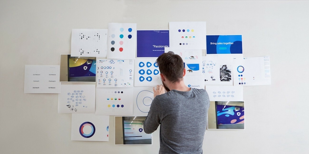
We named the Outreach mark "Nucleo:" a variant of "nucleus." It’s a central point around which action takes place — a perfect fit for their all-in-one solution.
Thank you for being such great partners throughout this journey. We're delighted with the final product and had a ton of fun along the way.
Katie Doyle VP of Marketing, Outreach
Communications
When sales pros speak, they need to sound smart and relatable. Unfortunately, few B2B companies sound like actual humans in marketing pieces. Communications strategy ran the gamut from defining verbal identity to co-writing and editing web copy for the new site, cutting jargon and fluff to sound genuine and conversational. We created a bold, engaging, authentic voice for Outreach, specifying how to write this way across channels in a custom style guide.
Content Strategy & UX/UI Design
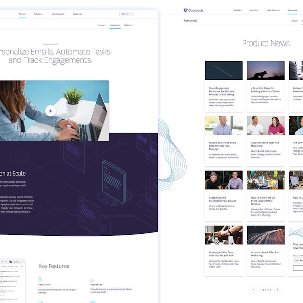
The large marketing site needed intensive information re-architecture and content strategy, including defining target audience personas and user stories; feature examination, regrouping and redefinition; and revised page-level content strategy across the site. After re-engineering their entire sitemap and renaming existing features for user-friendliness, we crafted better stories through content flow, page structure, and copywriting.
From content strategy to wireframes to page design, retaining the fluid simplicity of the product in visuals was key. The lighthearted new brand system encouraged creative flourishes in UX/UI design, like gentle parallax and concentric line-work that mimics a rippling effect.
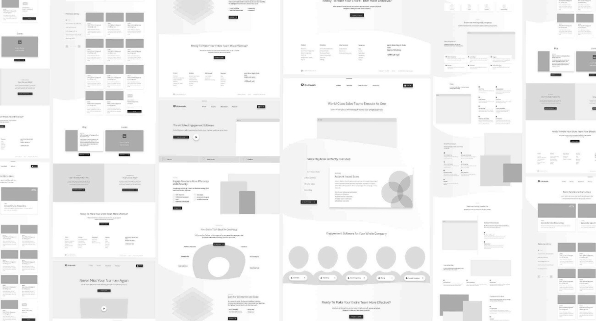
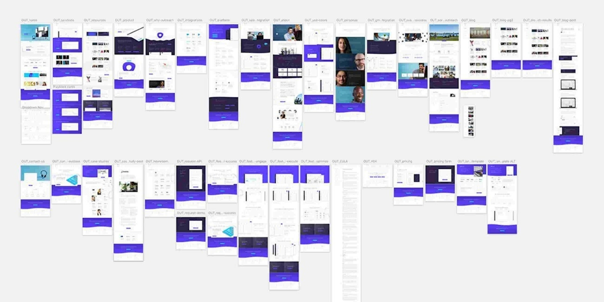
Wireframing was instrumental in gauging the needs for all 30+ unique page designs.

Custom iconography: We crafted a custom set of icons for Outreach that help to identify features and carry the story across the new website.


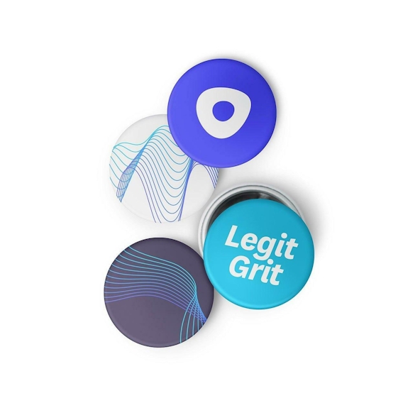
Focus Lab team - I just received the pins you sent over and have shared them with the extended Outreach team. They are delighted! Thank you for the thoughtful gift and thank you for being such great partners throughout this journey.
Katie Doyle VP of Marketing, Outreach

Post-Project Success
Read the next case study
Aptible