Focus Lab client partners come to us for a variety of reasons. Sometimes it's a big shift, like a merger, acquisition, or change in audience. But other times, it's small changes.
Logos begin to feel outdated, ideal customer profiles begin to evolve. Our partners' Spidey senses activate, and know their brand needs a change. But do they need to start from scratch? What about all that brand equity? In our work together, we peel back the layers to see what's worth keeping, and what's not — and if it's time for a full rebrand or an intentional changing of a few pieces of your identity with a refresh.
First, let’s break down the difference between a refresh and a rebrand. A refresh is more of an evolution (think of Google’s recent update to their “G”). Colors may get updated, the logo may get redrawn for better legibility, but overall, the change will be subtle. This is an intentional refinement of a brand that’s pretty good but could be better suited for your target audience and future goals.
A rebrand, however, is a bigger undertaking for companies experiencing a major mismatch of expectation vs. reality of perception. This gap may be due to a change in audience, a recent acquisition, or a significant shift in the market. A rebrand will usually involve a new logo, new colors, new messaging, and a new website. The level of transformation can vary, but a rebrand will be a noticeable change to a company’s identity.
Put succinctly, a refresh is an evolution of an existing brand and a rebrand is a reimagining.
On the other hand, a rebrand could see a logo undergo a wide spectrum of changes. Sometimes the logo performs well and it’s barely touched, while the entire visual identity around it is overhauled. Other times, the logo is changed completely. And of course, sometimes the change is somewhere in the middle; there might be elements of the original logo still present, but it feels fresh and new. Our work with ClickFunnels is a great example of the latter. We kept the red and blue gears of their old logo but broke them out of their previous browser window and into something new. {{dual-image}}
{{divider}}
Font and typeface
We’re type nerds who could wax poetic on a good descender for days, but we recognize we’re a niche group. For the general public, the typography changes in a refresh go unnoticed, and the impetus is often functional. Swapping out one sans serif for another may increase legibility at smaller sizes, lower licensing fees, or provide a more robust character set that supports expansions into foreign languages.
A rebrand’s new typography is more overt and carries brand strategy behind it. If all your competitors are sans serif, an emotive serif may be exactly what your brand needs to stand out and lean into your storied legacy. Or premium typography may be the je ne sais quoi that takes a rebrand to a new level.
With rebrands, the color palette is dictated by brand strategy. If a full rebrand is called for, it’s likely a new color palette will help support the new direction. For example, Popl had a color palette that relied on techy blue gradients that were appropriate for a start-up. But as Popl matured, their color palette needed to as well: We built them a palette of neutrals and jewel tones that feel premium, confident, and established for their enterprise clients.
With brand refreshes and rebrands, the right solution may be an expansion of an existing color palette. The hero color may stay the same (or receive a minor update), but more secondary colors can give the brand more flexibility and a breath of fresh air. For ClickFunnels, we kept the sky blue, navy, and red of the brand’s previous identity but added a subdued yellow, olive, and blush to the palette. The unexpected color combinations helped infuse the brand with new energy and maturity.
{{divider}}
Language and communication
In a brand refresh, verbal work often involves refining the company’s mission, vision, and purpose statements to better reflect its current identity and trajectory. As organizations grow and evolve, their value propositions may also need to be revisited, especially if new offerings or capabilities have been introduced since the last major brand initiative.
This is also an ideal opportunity to assess existing messaging. Over time, with multiple teams and contributors producing content for everything from blog posts and ad campaigns to product pages and feature announcements, brand voice and tone can become inconsistent. Conducting a messaging audit helps realign communication across touchpoints, ensuring consistency while allowing for updates to brand guidelines that may not have originally covered every use case.
A rebrand, however, may require a full scope of verbal identity work. For example, if a brand is maturing, it might be time to say “so long” to the snarky tone of the past and allow the brand’s voice and tone to mature as well. If a brand’s ethos is changing, how it shows up in copy will most likely need to change too. For mergers, core values from two companies will need to be melded (or completely rethought) for the new company. A new brand position would also affect verbal identity.
Do you need a rebrand or a refresh?
The decision between a brand refresh or a rebrand is made by the amount of transformation needed. A big organizational change probably needs a rebrand; think mergers, new markets, new positioning. A brand that feels dated or just forgettable may be better suited for a brand refresh.
{{divider}}
How often should you rebrand?
A strong brand with a foundation built on thoughtful strategy should be effective for close to a decade. FedEx’s current logo dates back to 1994 and Coca-Cola’s logo has remained relatively unchanged since 1887. While their logos haven’t changed, they’ve undergonea number of rebrands to stay relevant to changing consumer trends and adapt to business growth. So, a significant rebrand may be necessary when a company faces big changes, but that doesn’t mean throwing out all your brand equity.
{{divider}}
How often should you refresh?
Like upkeeping a car’s maintenance, strategic brand refreshes can help your brand identity last longer. Brands exist in the context of their industry and consumer tastes, which will inevitably change. Therefore, it’s wise to consider a cursory brand audit every three years, asking: How does your brand stand up to competitors? Does it still “feel” like the company? Are you regularly hearing feedback from customers that they’re confusing you with a competitor or struggling to remember you all together?
Branding isn’t an exact science, and the definition is somewhat subjective. No one can definitively say “if a brand changes more than 25%, it’s a rebrand, not a refresh.” Even in our own work, refreshes may spill into rebrand territory and vice versa. Maybe a refresh is all a brand needs, but the messaging needs a complete overhaul. Or a client is getting an entirely new visual identity, and the logo needs only a tweak.
Every project is a unique case that can be difficult to bucket into a refresh or rebrand. Ultimately, the right solution is the one that helps a brand reflect who the company is and who it will become.
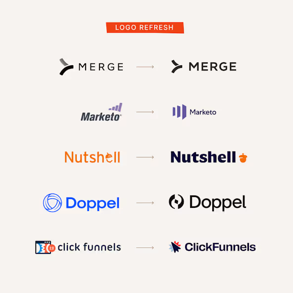
Refreshes from subtle to bold (but still a refresh)
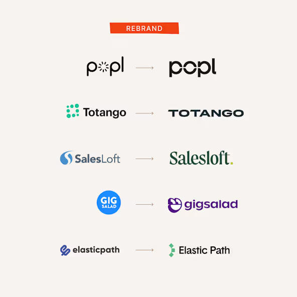
A rebranded logo is a more dramatic change
228
Shirts Sold
Fuerte shirts purchased
$22k
Organization Matches
Additional funds donated by Focus Lab and partner organizations
$26k
Donated to UNIDOS
Total amount donated to PR relief efforts through UNIDOS
More than anything, we want people to succeed, professionally and personally.
More than anything, we want people to succeed, professionally and personally.
Never miss a post.
Sign up for our occasional newsletter. No spam. Unsubscribe at any time.
Thank you! Your submission has been received!
Oops! Something went wrong while submitting the form.
By clicking the submit arrow above, you consent to allow Focus Lab to store and process the personal information submitted above to receive the In Focus newsletter. You can unsubscribe at any time. For more information, please review our privacy policy
By clicking the submit arrow above, you consent to allow Focus Lab to store and process the personal information submitted above to receive the In Focus newsletter. You can unsubscribe at any time. For more information, please review our privacy policy