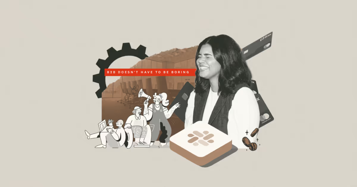
B2B brands, or business-to-business organizations, get a bad rap. People tend to think that, because they’re selling to companies, their brand should be buttoned-up and boring. They picture SaaS blues, fields of gray, convoluted corporate hierarchies, and generic stock photos.
And to that, we say, “no more!”
We’re proud of our focus on B2B clients and the work we do to expand the possibilities of what a B2B brand can be. And we’re not alone. We’ve pulled eight successful B2B rebrands — some we had a hand in, some we didn’t — to highlight here. A successful rebrand isn’t limited to aesthetics; it’s also about better communicating a mission, standing out in a crowded space, or sorting out complicated architectures.
Figma is a collaborative design tool established on the idea that great design is built collaboratively. This brand refresh by Collins focused on crafting a clear brand campaign and story, centering around the celebration of creating together. The brand worked to dispel the “Myth of the Lone Genius” and narrowed in on the big idea that “Nothing Great Is Made Alone.”
This refresh took Figma’s existing design and writing, elevating them all through very clear positioning in the landscape. Figma could be written off as just another design tool, but they dialed into a very clear differentiator at the brand level — collaboration — which no one else was celebrating. It inspires its audience and helps them feel heard.
Since this rebrand, Figma was nearly acquired by Adobe, is still valuated at a cool $9B, and remains a fan-favorite design software.
A SaaS company centered around customer support, Zendesk exists in a crowded category — and their rebrand helps to ensure they stand out. Their original (pre-2016) visual brand was friendly and approachable, but highly literal. They had leaned into a mascot and logo that related directly to the company’s name, and the visual language didn’t feel differentiated from the larger landscape.
With their rebrand in 2016, Zendesk reintroduced themselves as a clearly different competitor, with a visual rebrand that is elevated, a modular logo and visual language that sets them up for growth, and a color palette and type stack that exudes sophistication and maturity.
In 2023, Zendesk showed the B2B world what a great brand refresh looks like. After continuing to grow beyond the company’s rebrand, it was time to tweak and add new elements to the brand’s visual identity. The brand’s new expression also verbally asserts itself as an empathetic and robust brand partner, not simply a piece of software. Like any great brand, Zendesk keeps evolving its offerings and brand in tandem.
In our modern working world, Slack is synonymous with work. Used by teams of all sizes and industries, the brand’s product helps both distributed and in-person teams collaborate and communicate.
After being founded in 2013, Slack went through a brand refresh back in 2019 while on the precipice of massive growth. An update to their logo led the way for the refresh. Why change? Slack put it best in their internal blog announcing the change: “A good reason to change a logo is that it’s not doing the job you want it to do—and because a simpler, more distinctive evolution of it could do that job better.” Preach!
Visually, their old brand just wasn’t working anymore, leading to a lack of cohesion and an inability to scale successfully. When a brand is no longer able to tell its story with ease, it’s time to reconsider a better way to do so.
A few years removed from Slack’s rebrand, it can be easy to forget that people reallyhated this update to the brand. It’s another reminder that perception shifts with time, and that conviction behind rebrands pays off. A few months after the rebrand, Slack went public with a valuation of nearly $20 billion and was later acquired by Salesforce in 2021 for $27.5B. Just another company demonstrating the clear ROI of brand. 🔥
Serving a global audience of sales professionals navigating the shift to digital selling, Salesloft was poised for massive growth — but their external brand didn’t match their internal ambitions. The brand was lacking the energy and ambition its audience needed its brand partner to embody. As salespeople, Salesloft’s audience is tenacious and jockeying to win, and it needed a fast-paced partner in its corner.
Saleloft’s new brand now visually exudes movement and excitement, and it verbally appeals to its audience with clear, modern messaging that properly communicates its value.
Knowing your audience and communicating it with clarity is the sign of a successful brand, one that has conviction around who it’s targeting. With its rebrand, Salesloft speaks directly to its audience with confidence, appealing to exactly what salespeople need to elevate themselves.
There are a lot of reasons to pursue a rebrand, and a muddled brand architecture is one of them. Industrial Light & Magic is a revered brand in the film industry, but years of experience often equals acquisitions, which equals … confusion around how to fit brand puzzle pieces together.
In ILM’s case, the brand wasn’t communicating the storytelling and innovation behind the brand, and confusingly organized sub-brands and departments weren't helping the matter. The new brand organizes sub-brands in a clear format, using distinct but recognizable icon marks and the ILM prefix to make clear who the leading brand is.
As a whole, the new ILM brand maintains the rich history and magic of the company while creating clearer structure.
Artificial intelligence is a hot topic in the brand world right now. It seems like everyone is looking to grab a slice of the AI pie, largely by doing the same things. AI brands often look to communicate a cutting-edge approach, infused with innovation and forward-thinking. But who’s to say cutting-edge can’t be fun, too?
Vizard is an AI-powered video creation tool, helping its audience effectively and effortlessly create engaging content for their audiences. The new Vizard brand not only appears visually trustworthy and professional but also stokes excitement and magic in its users. Just like AI, Vizard truly creates magic — which means the brand has to be visually memorable.
The result demonstrates magic through mystical, exciting visuals. It’s not different only to stand out but to craft a story that truly stands apart. There’s no Vizard but this one.
A financial services company for businesses, Brex has exploded in growth since it entered the scene in 2018. Originally positioned as a corporate credit card for tech companies, the brand rapidly expanded to offer a wider group of services to a larger audience and found its brand to be limiting its desired growth. When it comes to reasons to rebrand, this is a smart one; your brand should serve as a container for not only what your brand is today (and the target audience it serves) but also what your brand aims to become in the near future.
Brex’s rebrand started with getting clear on their beliefs as a company — a clear brand foundation. Brex makes it clear that they aren’t only rebranding for this moment, but for the years to come. A sustainable, long-lasting brand is rooted in a clear vision of where your brand endeavors to go.
The result is a visual and verbal brand that is idealistic and innovative, expanding its appeal for a wider audience without losing sight of the intrinsic DNA that makes Brex unique. The result is a company valuation that has more than doubled since the company’s rebrand, signaling continued growth and success in the industry.
Gusto is a people platform that helps businesses create better workplaces by facilitating payroll, employee benefits, and other HR offerings.
Gusto has actually experienced two rebrands. The first was centered around a more significant shift from its previous name (ZenPayroll) to Gusto. As we’ve mentioned in other brands profiled here, a great reason to rebrand is the fact that your brand feels limiting, which often arises when a brand features a literal name like ZenPayroll. “Gusto” is abstract and full of possibilities, enabling the brand to expand offerings and audiences.
When it came time to refresh the brand identity again, it was because Gusto had continued attracting ardent fans that loved their platform — but the external-facing brand didn’t quite demonstrate what folks love about Gusto products. Within the refreshed visual and verbal brand, Gusto aimed to craft a delightful, enjoyable experience that mirrored the breath of fresh air that’s reflected in their product. The result achieves that goal and is refreshingly different than other solutions in the field.
B2B brands don’t need to conform to some preconceived notion of being “business-y.” We like to remind our clients that even if their customer is a business, there are humans behind that business. As with any successful brands, a B2B organization can still connect with those people — and their entire organization.
We know this, not just because we’re a B2B brand agency, but also because we’ve found ourselves on the other side of it. Focus Lab is a Gusto customer, and our team is a huge fan of the brand. We love opening our Friday payday email to a jaunty pig!
Brand is brand is brand — no matter who you are or who you serve. If you feel your organization has been swimming in the sea of sameness, that your brand has been holding you back and it’s time to let some personality shine through, it might be time to consider a rebrand.
{{divider}}
Key Takeaway: When Should You Rebrand Your B2B Company?
A successful B2B rebrand isn't just about aesthetics — it's strategic. Consider rebranding when your brand is limiting growth, confusing customers with unclear architecture, or no longer reflecting your company's vision and capabilities. The most effective rebrands stem from clear business needs: expanding into new markets (like Brex), simplifying complex structures (Industrial Light & Magic), or differentiating in crowded categories (Zendesk, Slack).
Focus Lab is a B2B brand agency focused on helping growth-stage teams clarify positioning and build scalable brand systems across web, product, and marketing.
Published February 11, 2025 · Updated June 26, 2026
228
Shirts Sold
Fuerte shirts purchased
$22k
Organization Matches
Additional funds donated by Focus Lab and partner organizations
$26k
Donated to UNIDOS
Total amount donated to PR relief efforts through UNIDOS
More than anything, we want people to succeed, professionally and personally.
More than anything, we want people to succeed, professionally and personally.
Never miss a post.
Sign up for our occasional newsletter. No spam. Unsubscribe at any time.
Thank you! Your submission has been received!
Oops! Something went wrong while submitting the form.
By clicking the submit arrow above, you consent to allow Focus Lab to store and process the personal information submitted above to receive the In Focus newsletter. You can unsubscribe at any time. For more information, please review our privacy policy
By clicking the submit arrow above, you consent to allow Focus Lab to store and process the personal information submitted above to receive the In Focus newsletter. You can unsubscribe at any time. For more information, please review our privacy policy