When it comes to your brand, color will send your audience a message — but what kind? When used poorly or unintentionally, color can conjure negative responses and feelings. (There’s a reason why we say someone “has the blues.” And oh, yes — we will talk about tech blue.) But if you use it wisely, strategically, and authentically, color becomes a rich asset.
As a team of design experts, we use color psychology to evaluate how palettes will resonate with your target audience. In this blog, we discuss changing color palettes (why, how, when, and the process) as well as why certain hues are often used — and identifying opportunities for your B2B tech brand to stand out.
{{divider}}
The Impact of Color Psychology in B2B Branding
Color psychology is the study of how certain colors influence an individual’s emotions and behavior. The meanings of colors can be learned through cultural or educational experiences, or are inherently felt — sometimes both.
We are taught that certain colors are associated with certain things through our experiences: blue is commonly associated with corporations, and green is often associated with environmental ventures. Other times, colors can evoke visceral feelings: blue is calming, and red is energizing.
Context is important for learned meanings of color but isn’t necessary at all for colors that inspire innate feelings. For example, when at a traffic light, red means stop. Green means go. Yellow means caution. When we aren’t driving, these colors can mean different things.
{{divider}}
What makes color soeffective and important?
Our brains are wired to recognize color first, then shapes, followed by symbols, and lastly words. A good primer on why visual design is so important, eh? This makes color an effective tool to convey emotion and intensity. The most successful brands become synonymous with the single color or palettes they choose — think Coca-Cola’s red, Apple’s stark white, and Tiffany’s iconic robin’s-egg blue. When your brand is immediately associated with a color, customer recall becomes stronger.
But whether learned or felt, color is subjective to the viewer. Remember the biggest debate of our lifetime: What color is this dress? White and gold? Blue and black? (LOL, the answer is “yes.”) If you say the color “red” to 20 people, there will be 20 different reds in people’s minds. There are many variations of red in the world but a limited vocabulary to express them
Color becomes important when it has cultural implications. A brand may choose certain hues that symbolize different things in different regions of the world. In Thailand, widows wear purple when mourning. In Japan, yellow is associated with courage. Green is sacred in the Islamic faith. While white may represent purity or peace in Western culture, it means death and mourning in China.
When EuroDisney used purple throughout its marketing material, they didn’t get the warm welcome they anticipated. Research revealed that purple symbolizes death and crucifixion in Catholicism, the most prominent religion in France. How did this happen in the first place? According to ID Magazine, “the CEO liked purple.”
{{testimonial-1}}
{{divider}}
Brand Differentiation Through Color
Whether you’re seeking an update to your color palette or an entirely new one, there’s a way to break free of the noise or chart a new path in your industry.
Of course, color is only one part of the puzzle when it comes to brand — but it’s an important one. Color is seen in a variety of contexts, and brands rarely use one color. To build a powerful and cohesive brand, it’s important to consider your whole color palette, and how those colors interact with one another. Does your type set complement your colors, or does it clash and communicate something different?
Let’s dive into the details behind each of the main colors of the color wheel, what they communicate, how they’re seen in B2B tech, and ways to reinvent them.
{{divider}}
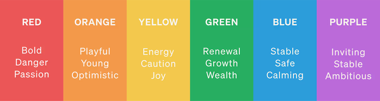
Cool Colors
Cool colors are colder in temperature and color, and tend to communicate calmness, serenity, and relaxation. They are more subdued and passive than colors on the warm side of the spectrum.
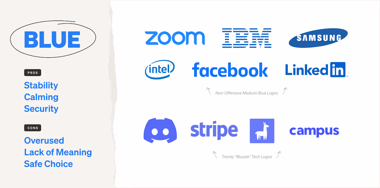
Blue
What it communicates: Stability and security. Blue speaks to safety — it both communicates it, and tends to be a safe choice for a brand. Blue is rarely controversial, isn’t overstimulating, and it’s hard for any shade to not feel calm. In fact, one 2024 study from Atom.com found that 49% of consumers associate blue with feeling calm.
How we see it overused: Blue is easily the most overused color in the B2B tech space, largely because of its quality as a safe color. Blue has never been an opinionated color, but because of its overuse it doesn’t tend to stand for much at all.
Ways to stand out with this color: Two shades of blue are especially overused in the tech world: a non-offensive medium blue (think Zoom, Facebook, or Intel) and the aforementioned “blurple,” used by tech brands in an attempt to appear innovative. Brands can do something different by stepping out of this box and exploring other shades of blue, like royal or baby blue. Because of its saturation in the industry, moving blue to a secondary position in the palette can help other colors take center stage.
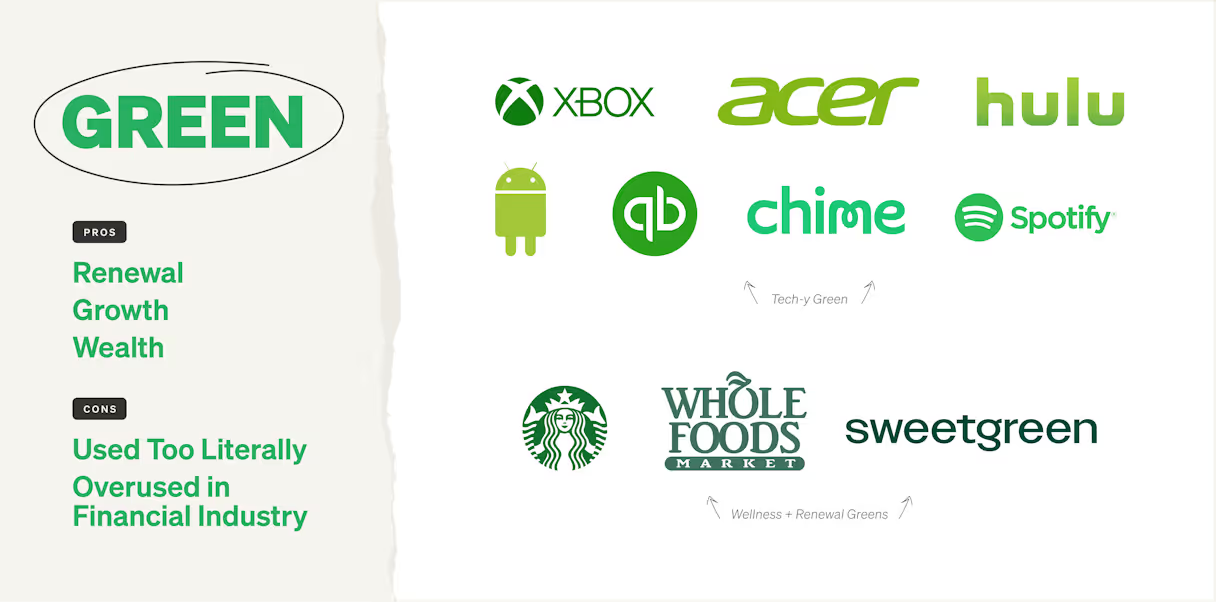
Green
What it communicates: Green is the color of spring — new growth and renewal. It’s also the color of money in the U.S., and can be associated with wealth, financial growth, and vitality.
How we see it overused: Green isn’t quite as popular as blue in the tech industry, but it’s a standby of many older and more established brands, especially in the financial field. Green is also often used in highly literal contexts — to represent money, or nature.
Ways to stand out with this color: There’s a huge opportunity to use green in more subtle ways, while still reinforcing its message of success and thriving. Darker and muted shades (like sage or emerald) enforce mature and sustainable expansion, not trendy or short-lived growth.
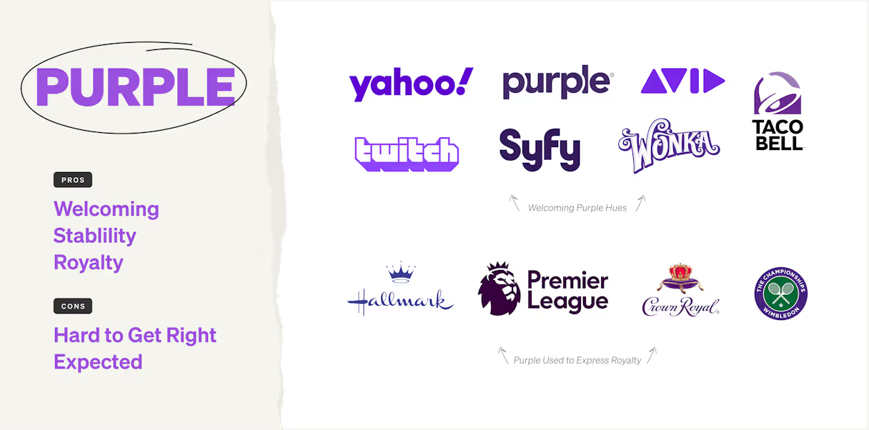
Purple
What it communicates: Striking the balance of red and blue, purple combines the security of blue tones with the energy of red. It’s both warm and cool, welcoming and stable. Historically associated with royalty, purple is both powerful and ambitious.
How we see it overused: Purple seems like a natural fit for many leading tech brands, but there are a wide variety of purple tones, and it can be a tough color to get right. Blurple is quite popular and overused because of its balance of calming and energetic tones. Its vivid and eye-catching, but overuse has rendered it expected. On the other hand, light purples and those saturated with more red are widely characterized as feminine, and are very rarely used.
Ways to stand out with this color: Deep purples are an excellent color opportunity for brands that want to appear luxe and mature. Purple can also be mysterious, mirroring the depths of space; it’s a great lead color for any company that wants to be seen as funky and forward-looking. Purple beats the status quo, but needs a strong brand message to stand behind it.
{{divider}}
Warm Colors
Warm colors are energetic and active; they have more dominating and activating vibration than cool colors. They also tend to have a polarizing effect in terms of emotion; they can be warm and inviting, or aggressive and overwhelming. It can be more difficult to land the right balance when it comes to warm colors, which is why they are often underutilized in the B2B tech space.
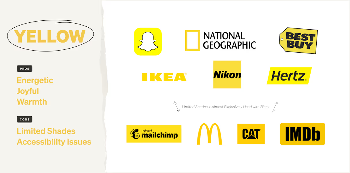
Yellow
What it communicates: Yellow is warm and joyful. It’s the color of the sun, which quite literally makes our lives warmer. It tends to be a happy color, representing energy and joy. It’s also a color often associated with caution in user experience.
How we see it overused: Yellow can be a tough color for brands; there aren’t as many shades compared to other colors, and the bright tone often used demands attention. As such, yellow is largely used as a primary color for brands with limited palettes and harsh neutrals, such as Mailchimp and Best Buy. Yellow is also a tough color for website accessibility, which is another reason why it’s not used very often.
Ways to stand out with this color: There’s a huge opportunity to use yellow as a less stark color, pairing it with softer tones. Mailchimp has softened its branding in recent years, pairing yellow with beige. Yellow also goes well with oranges and greens, painting a picture of an energetic and bold brand. Deeper yellows (like a mustard) could balance joy and energy with maturity.
Orange
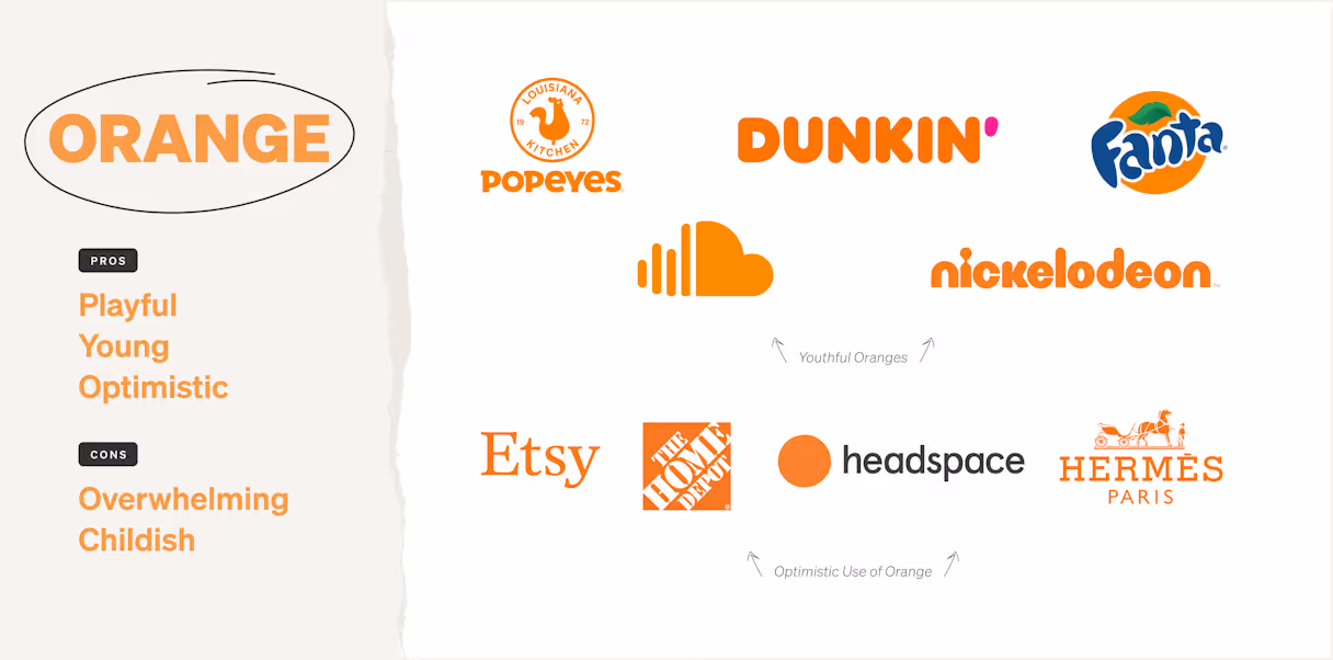
What it communicates: Similar to yellow, orange is joyful and happy. It’s undeniably positive and warm, seen in nature as a color of sunrises or sunsets, the mellowing of the bright and sometimes harsh sun. It’s an in-between color that combines the optimism of yellow with the passion of red.
How we see it overused: Orange is often seen in more playful brands, or ones that were once seen as more startup-y and casual. Amazon and HubSpot are significant in this category; although both of these brands have grown beyond their startup nature, they maintain an air of approachability and accessibility. Orange can still be seen as overly playful and even childish; it’s also a popular choice of youth-focused brands like Nickelodeon, Reese’s, and Fanta. We also see orange used quite often as a secondary color to largely blue brands, balancing out the palette with a bit of warmth.
Ways to stand out with this color: Like many other warm colors, orange can be overwhelming if it’s not used with strict guidelines. Because it’s often seen as a lead color and standing alone, or as a secondary color, it would be interesting to see orange share the stage with other lead colors. Deeper orange could give a balance to energy and maturity.
Red
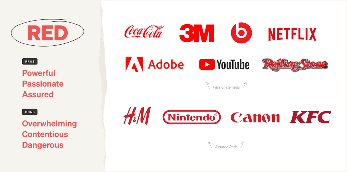
What it communicates: Red is arguably the most contentious color of the color wheel. It elicits a powerful feeling; some associate red with aggression or anger, and some see it as a color of passion and being assured, and 39% of consumers associate red with excitement, far more than any other color. Similar to yellow, it can be an overwhelming and loud color, and is often seen alone. Red isn’t an especially elegant color, and is generally viewed as utilitarian in nature. In user experience, it can represent an error or danger. It’s generally avoided in the healthcare industry due to its association with blood.
How we see it overused: Also similar to yellow, there aren’t many shades of red present in the B2B tech brand landscape. When it’s used, red is often paired with black or white, like Verizon or Netflix. Red makes an assertive statement, boldly taking up space. Red brands almost always grab your attention, and if the color palette isn’t managed well, it can easily get overwhelming.
Ways to stand out with this color: Reds on the darker side of the color spectrum (like burgundy) are pretty untapped in this market; they merge energy with experience and maturity. Red also often stands alone as a lead in many palettes, due to its energy and overwhelming nature. It would be exciting to see red balanced out with cooler or calming tones, bringing down its energy to achieve an equilibrium.
Pink
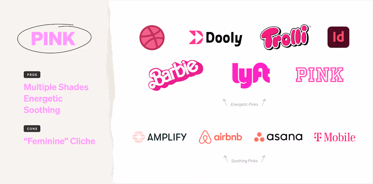
What it communicates: Classically associated with feminism and female-focused brands, pink is a color that is actively undergoing a renaissance. Pink is a warm tone that can uniquely be calm and soothing in lighter shades, and energetic and attention-grabbing in brighter shades.
How we see it overused: Pink began to be associated with feminine brands and products in the 20th century and although this association persists, it’s waning. No longer relegated to cliched products that are meant only for women, tech brands like Lyft and T-Mobile have owned bright shades of pink to help their brands stand apart. But unfortunately, only bright pinks really exist as part of the palette of larger tech brands; it’s a color that’s ripe for reinvention.
Ways to stand out with this color: Lighter pink is a fantastic color for caring and calming brands; it’s a great alternative to the overused blue. Asana is a brand that has led well with this color.
{{divider}}
Neutrals
Neutrals are meant to quiet and calm a palette. Any color can be neutral; a deep shade of green does a similar job to black, and a light shade of pink can do the job of a soft white or gray. These are the most common colors we see used.
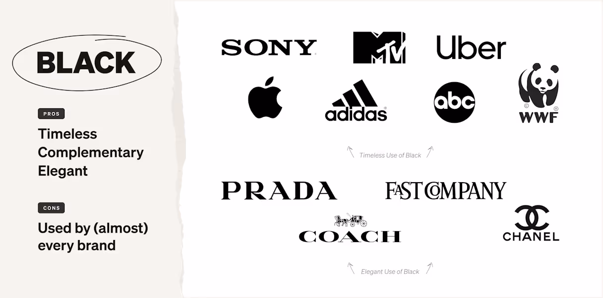
Black
What it communicates: Fashion designer Christian Dior said, “You can wear black at any time. You can wear it at any age. You may wear it for almost any occasion.” It’s a color that’s truly timeless, and complements almost any other color. It’s a mysterious color (think black holes), but universally appealing and elegant.
How we see it overused: Black is incredibly popular in the tech world, representing innovation and boldness. Because of web darkmode’s long standing association with developers and technical web users, black persists as a popular choice for brands that work in the web and software development space. It’s not dramatic to say that nearly every brand uses black in some way, shape, or form.
Ways to stand out with this color: Brands can stand out by not using black at all, or by using it in new and innovative ways. Instead of black, other dark neutrals (such as navy, dark gray, or burgundy) are attractive alternatives, which also supply another way to engage your audience. Black is ultimately an empty vessel, and using a dark color that communicates the qualities of black while layering in another color could create ownability and a unique brand experience.
{{divider}}
White
What it communicates: Although many consider white to be the ultimate neutral color, it communicates a lot. When viewed alone, white is stark and clinical, but also inspires creativity — it can be reminiscent of white space and a fresh start. It’s representative of newness, and a vast open space. It also represents purity and peace.
How we see it overused: White is a default color. When you create a new website, the background color almost always defaults to white; printed documents are on white paper; and it’s the background of any graphic. White exists in the background, rarely used intentionally. Especially for beginner brands, white can overwhelm its brand system, creating a crisp yet clinical feel. Without personalization and intentional usage, white can cheapen a brand.
Ways to stand out with this color: Use white with intention and care. Instead of a white background on your website, graphics, or printed pieces, how can you create color floods that are aligned with your brand experience? And how can you place white throughout the brand experience to create moments of breath and peace, intentionally placing it where it matters most?
{{divider}}
Beige
What it communicates: An approachable and down-to-earth personality. It’s a warm and inviting neutral, but “beige” can be synonymous with “boring.”
How we see it overused: When beige is overused, it can be boring. Beige often balances or softens a palette, and is best used as a supporting color. When it’s used as a lead color, it can lack panache or communicate a brand as trying too hard to be approachable. But, we rarely see beige as overused in the tech world.
Ways to stand out with this color: Use beige as a neutral, in place of a cool gray or stark white. It warms up the palette and provides a touch of friendliness and authenticity.
{{divider}}
Many of our perceptions about color are learned, and popularity is what teaches us.
The only way to stand out is to take a risk, and do something different. And ensure that differentiation is aligned with what your audience seeks.
We hope you walk away from this with a new perspective on color, and helps you develop a discerning eye as you look toward your B2B brand. And if you’d like an expert point of view, don’t hesitate to reach out!
Additional funds donated by Focus Lab and partner organizations
$26k
Donated to UNIDOS
Total amount donated to PR relief efforts through UNIDOS
Color is effective when it can quickly associate with emotions that connect people to one another through deeply held beliefs. Color is a power which directly influences the soul.
More than anything, we want people to succeed, professionally and personally.
Wassily Kandinsky
More than anything, we want people to succeed, professionally and personally.
Never miss a post.
Sign up for our occasional newsletter. No spam. Unsubscribe at any time.
Thank you! Your submission has been received!
Oops! Something went wrong while submitting the form.
By clicking the submit arrow above, you consent to allow Focus Lab to store and process the personal information submitted above to receive the In Focus newsletter. You can unsubscribe at any time. For more information, please review our privacy policy
By clicking the submit arrow above, you consent to allow Focus Lab to store and process the personal information submitted above to receive the In Focus newsletter. You can unsubscribe at any time. For more information, please review our privacy policy