Rebranding Focus Lab

Founded in 2010 as a two-person design and development partnership, Focus Lab has grown into a globally renowned B2B brand agency. Our previous brand served us well for a decade, but we've expanded and matured since that first logo was drawn on a napkin. It was time to give Focus Lab the Focus Lab treatment.

“The cobbler's children have no shoes” — and the brand agency had no brand guidelines. As we often see with our clients, our brand had developed organically as elements were needed: a website refresh here, a new illustration style there. However, it lacked strategy, story, and — critical for scalability — documented rules.

With a process and personality known and trusted by some of the world's largest brands, we were poised to level up to become one of the top B2B brand agencies in the world. To do that, we needed a distinguished brand position — one that reflects our industry thought leadership and the fact that the work we do is important.

After a decade of growth, Focus Lab needed an identity that matched our industry reputation and our ambitions.

Brand Strategy

The strength of our process is a major differentiator and a key part of our clients’ success, so we knew this exercise couldn't be half-baked. It was only appropriate that we go through the same experience. The Focus Lab partners became the “client” with the same responsibilities as any other: initial homework, timely feedback, and approvals. Our team's time was scheduled as it would be for any client project. Deliverables were robust, revisions were deliberate, and deadlines were respected.

Teamzoom
Fl brandattributes v2
Fl strategyimage drk

Focus Lab competes with B2B brand agencies, a category saturated with enterprise firms, small shops, and everything in between. While sharing many of the same service offerings — branding, verbal identity, design, and strategy — Focus Lab's industry tenure, proven process, and commitment to delivering exceptional experiences are unmatched, cutting through the clutter and directly engaging with organizations moved to transform.

Our brand attributes were Focused (naturally), Proven, and Humble.

Our primary audience is B2B technology companies who have been tasked with a new branding project for their own organization. They value process and results, so Focus Lab’s proven success empowers them to become agents of change for their company and enables them to win against modern competitors.

Bfbf 2600

Verbal Identity

While we've always prided ourselves on our people-first values and humble, down-to-earth culture, our verbal identity tilted too much toward personal appeal and lacked an earned boldness. We needed a confident, clear voice to reflect our expertise and industry credibility. And to grow, we needed to clearly state our value — and the value of brand in general — to individuals who may not be savvy to the value of brand-building in their business trajectory. Finally, we'd transitioned from a branding and web development agency, to solely a brand agency, to B2B brand specialists. TL; DR: We had some communications work to tackle.

Most of all, we needed to answer, “So what?” Why does all of this matter to our clients?

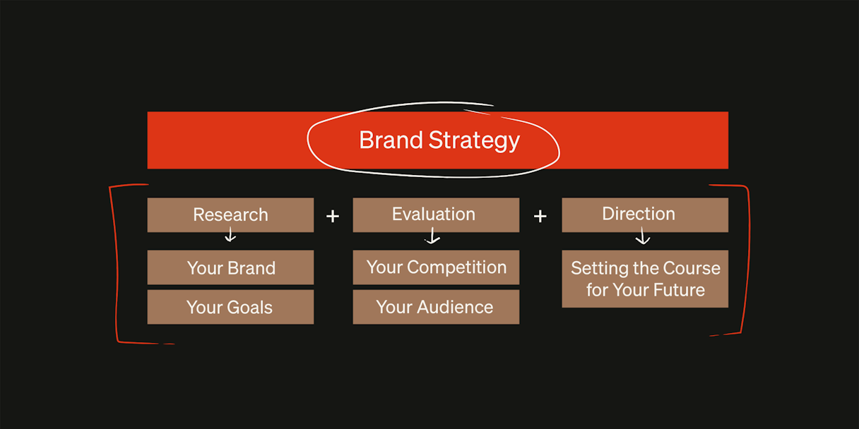
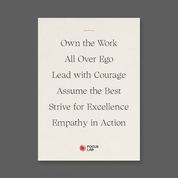
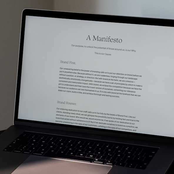
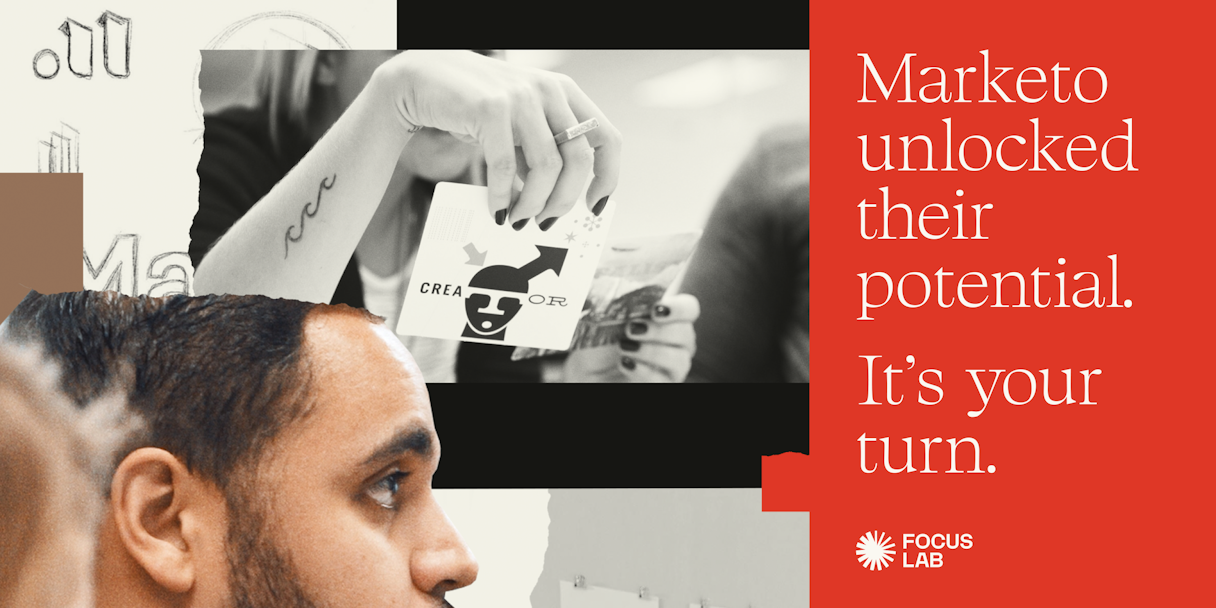
We created a robust messaging framework that included insights about our audiences, the competitive landscape, and our existing messages — all of which informed our refreshed verbal identity guidelines. This framework served as our north star to communicate who we are, what we do, and why it matters. It included powerful messages that truly reflect our brand, such as our revised purpose, “We exist to help unlock the potential in the people around us.”


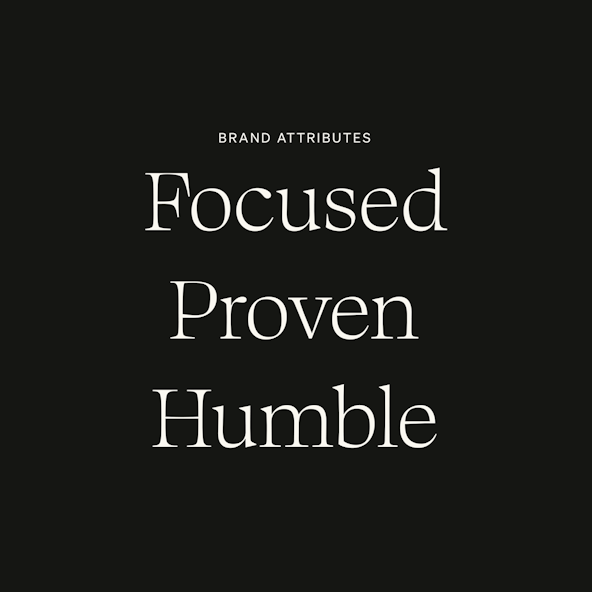
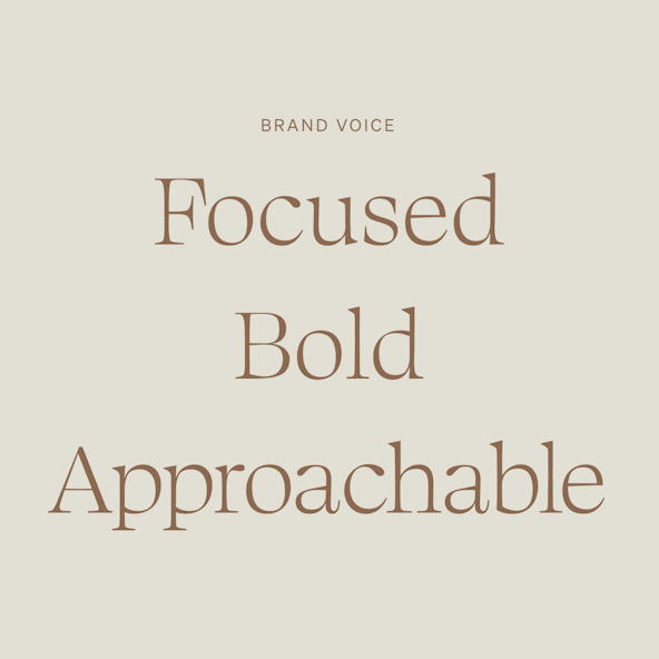
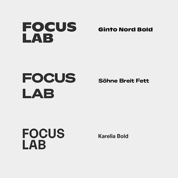
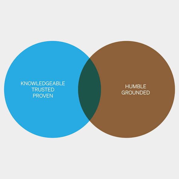
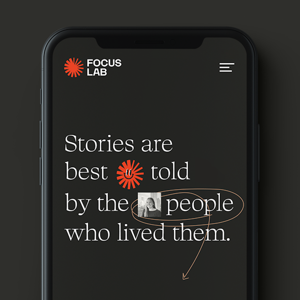
With what we wanted to say documented, we needed to define how we wanted to say it — our brand voice. Reflecting our brand personality, attributes, and the emotions behind our words, we identified our voice as bold, focused, and approachable. Focus Lab’s confidence comes honestly from hard work and experience. Our voice starts conversations, leads with purpose, and inspires change. Above all, we are secure enough to speak and listen, succeed and falter, teach and learn.

Fl mockups13 0004 fl creamcard
Fl valuecard
Fl process
Fl manifesto1300
Fl brandvoice

Logo

The logomark started with a feeling. That feeling when something clicks. A burst of clarity when you discover exactly who you are. The exact moment when you realize that all the potential — something that’s been in you this whole time — has finally been revealed. That's what we want to bring to our clients and what we believe brand is capable of.

We explored asterisks, star bursts, keyholes, fractals, comets, and more asterisks. Eventually, we found our Flare: asymmetrical with a sense of motion, simple yet unique, classic and timeless. We paired it with a logotype built from a modified version of the Karelia typeface. It carries a mechanistic, grotesque flavor while showing uniqueness in its irregularities. As a logotype, this is the sweet spot between wild and conformist, fitting in and standing out.

Fl logotypeexplo
Fl markexplo1300v2
Fl earlybooks

We also considered a refresh of our previous logo.

Fl refresh45
Fl refresh marks

Visual Language

For visual strategy, we leaned heavily into an editorial design aesthetic. A premium and robust type-driven system shines in the competitive landscape and adds flexibility and proper informational hierarchy. A mix of serif and sans-serif gives a trustworthy yet approachable distinction. This editorial style reflects the position of leadership we've built over the course of hundreds of client projects.

A collage-like, mixed-media illustration style is a subtle nod to branding and its process, feeling grounded and human while also meticulous and intentional. Paper tears add texture and a hand-crafted element, while saturated colors energize the system. Overlays add extra texture, warmth, and visual intrigue.

Fl makreto vizlanguage

We're makers. Paper tears and gestural lines nod to the art of “making,” even though we've gone largely digital.

Fl 45paperv2
Fl sqgesture
Blogs 0003 brandresilience3
Fl guidelines2600

Custom Typeface

As a brand agency, we're acutely aware of the power of typography. As design nerds, we get very excited about custom type. We also had an incredibly talented type designer on the crew. The typographic stars aligned and we got to work on a custom typeface. Our initial exploration of a display serif led us to a very purposeful conclusion and ultimate direction: something that was extremely ownable and distinguishable yet didn’t draw too much attention to itself. Serifs are also largely absent from the brand agency landscape, and even more so from the B2B space. We saw an opportunity.

Focus Display is a proprietary typeface specifically crafted for Focus Lab's new visual identity. It combines traditional serif characteristics with modern, human nuances. Sharp cuts and angles contrast the organic curves of the terminals. Extra long serifs add ownability. Teardrop terminals contrast sharp serifs.

Fd floridians
Fl qqqq
Fl ampersand
Fl cloister

Color

After a decade of red, was it time for a change? Looking at our competitive landscape, reds are common. Greens are almost nonexistent. It was worth exploring. A hunter green felt best with our attributes: humble, proven, and focused. Green is a color that has a strong sense of right or wrong, inviting good judgment. It sees both sides of the equation, weighs them up, and then takes the moral stand in making appropriate decisions.

Ultimately though, green felt disconnected and lacked the energy we were trying to capture within our brand.

Fl greenvenn
Fl green strive

In an alternate reality, Focus Lab went green.

R2 devin
R2 bud

It was time to revisit red. Red was tied to a decade's worth of equity and felt aligned with our vision toward the future. Our previous red needed a refresh, however. We moved from the salmon-y, reddish-pink to a more confident red. As is Focus Lab’s mantra, we use color sparingly and with purpose.

We complemented this energetic and proven red with a humble palette of neutrals — cream, black, and copper.

FL Color red transition
FL Colorpalettehex

Motion

Considering “unlocking potential” is at the crux of our rebrand, motion was a necessity. We reached out to Focus Lab alum William Kesling to define Focus Lab's movement.

The logo animation is designed around characterizing a force that creates progress and growth. The motion is reactive and feels very natural within the composition. It mimics the effects of multiple forces coming together to make a single piece of art — the new Focus Lab brand. In a burst of energy, and with the addition of a gravitational circle, all of the elements of the Focus Lab mark began to work together.

Fl motion sketch

Interactive

An organization's website is one of their most powerful marketing tools, and Focus Lab is no different. After years in operation, we could confidently identify our audience, their pain points, and our differentiators. We also had hundreds of hours of sales calls to learn from our potential clients directly. We approached our website strategically, always speaking to the audience and advocating the value of brand.

Our homepage can be broken down quite succinctly. It begins with a strong statement proving our commitment to our clients' success: “Be the brand that customers want and competitors envy.” Then we quickly explain what Focus Lab is: “Focus Lab is a global B2B brand agency.” Got it. And what do we want you to do next? “Learn more about our brand process,” aka one of our key differentiators and an important consideration for individuals embarking on a branding project. Then, samples of our work and client logos offer social proofing that we not only talk the talk but also walk the walk.

From a design perspective, we wanted the website to embody the Focus Lab brand but in a subtle enough way to not compete with our client work. Our custom typeface showcases our messaging in big, beautiful serifs that distinguish Focus Lab from our clients. The bold illustration and collage style is limited to our own blog content, where it won’t detract from our client work.

Our website was created to speak directly to our audience, leveraging a decade of experience and client conversations.

FL Interactive Lo Fi 45
FL Interactive Hi Fi
Fl screenshots2
A phone reads, "Stories are best told by the people who lived them."

Brand Support

A brand's work is never done, which is why we offer Brand Support as a service to our clients. This service provides support to organizations who've rebranded with us. We go the next step and create tangibles — slide decks, templates, blog posts, and more — that reflect the new brand's strategy, and verbal and visual identities. We've had to think in a similar way with our rebrand.

As Focus Lab expands into new avenues and new platforms, new challenges emerge. Luckily, our focused brand process provides the framework to keep it consistent. With established guidelines, we can push further, but with intentionality. Because the external audience may or may not be familiar with our work, anything external should feel distinctly “Focus Lab.” The experience of watching our YouTube channel should match the experience of browsing our website should match the experience of our presentation at a conference. Consistency is crucial.

Internally, however, we can have a little bit more fun. Our beloved Flare logo got the mascot treatment and our employees dubbed them Spokey.

A Focus Lab employee hangs up a pennant reading "Brand First. Brand Forever."
A black tote bag with red straps
Saucemockup F Ltrio
Fl yt sq
Spokey evo
FL tape
Fl shirtmock

Post-Project Success

Read the next case study

ASAPP