Kasada

Kasada is simple yet sophisticated — the team and technology that stops the most advanced automated attacks on businesses without disrupting customers and the user experience.

These attacks are carried out by bots, which pose many threats to web- and mobile-centric companies: They steal sensitive data, take over accounts, hoard e-commerce inventory, and more, all of which undercuts companies’ revenue and erodes their brand equity. Kasada partners with globally renowned brands, including Fortune 500 enterprises, to implement an easy-to-use and effective solution to a complex problem.

Unlike competitors who simply defend against existing attacks, Kasada proactively drives away bots and their creators through layered defenses that evolve alongside threats and resist adversaries’ attempts to bypass detection.

However, both visually and verbally, it wasn’t immediately clear how or why Kasada differs from its competitors.

Kasada’s brand blended into a sea of sameness and failed to express its proactive, dynamic bot protection that gives its audience peace of mind, comfort, and confidence.

Brand Strategy

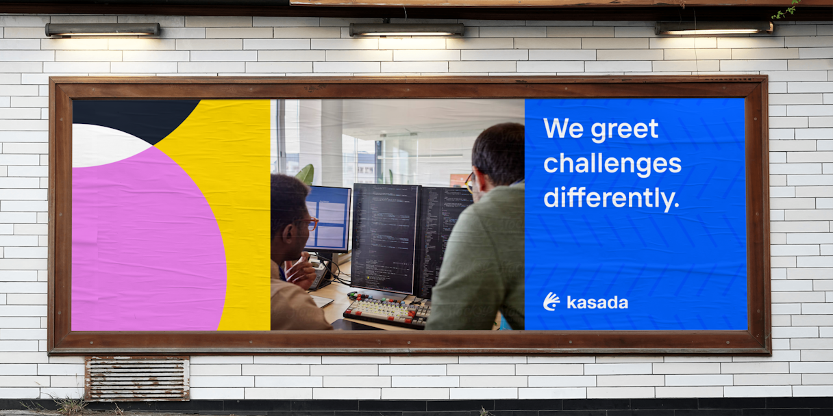
The landscape of bot management is historically convoluted and emotionless — and that’s not Kasada. Kasada's deep and personal connections with its customers are a key differentiator; for a company that battles bots, its relationships are anything but robotic.

With that in mind, we aimed to explore visual and verbal recommendations that bolster Kasada’s goal of a bolder and more visionary brand identity — one that stands apart from the crowd, building trust and conviction through its professional nature while remaining approachable and welcoming.

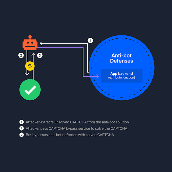
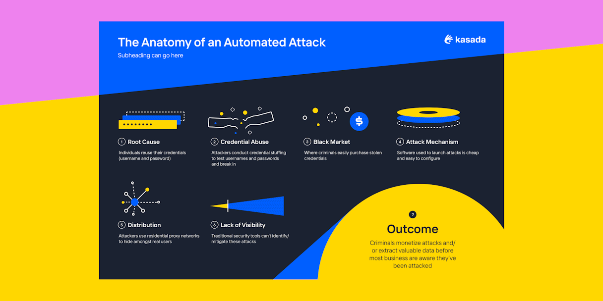
In order to craft this bold and visionary identity, we recommended elevating Kasada beyond bot management, framing itself as the leader who understands adversaries and their techniques with unmatched expertise. Instead of treating symptoms, Kasada combats the root cause — the human minds behind automated threats.

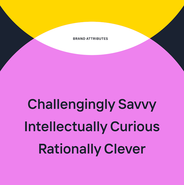
Furthering the characterization of a trustworthy and innovative brand, we identified three brand attributes along with the Kasada team. Challengingly Savvy represents confronting the status quo through dynamic, nuanced, and thoughtful approaches. Intellectually Curious demonstrates how Kasada is driven by experimentation, and is constantly learning and improving. And Rationally Clever expresses the brand’s proactiveness while always keeping the customer's best interests at heart.

Similarly, their primary brand archetype was the Explorer, which complemented the company’s ethos and culture. Like Kasada, the Explorer ventures ahead of mainstream thinking, having no limits, yet remaining true to self.

Kasada Attributes
Kasada moretoolss

Verbal Identity

We had quite the challenge — and an amazing opportunity — to create messaging that not only separated Kasada from its competitors, but showcased precisely how the Kasadians and their expertise make our world better and safer. We had to unpack what it meant to be and go “beyond bot management,” and why that’s so important.

Beginning with core messaging — purpose, mission, and vision statements — we helped Kasada build a foundation that expressed its culture and unconventional thinking. That meant a purpose statement fueled by the desire to make the internet safer and more beneficial to everyone. A vision of transforming the web into a human and authentic community. And a mission to protect brands and their customers through unique knowledge: expertise in the tools and human minds behind evolving threats.

That last piece — understanding the human minds behind automated threats — was key, and we helped Kasada thread it through the company’s situational messaging (unique selling proposition and value proposition), Audience Messaging Framework, and more. It also featured heavily in Kasada’s Brand Story, as we explored phrasing around “the big shift” — how adversaries are able to bypass traditional bot management solutions by posing as human users, but how Kasada’s radical approach prevents them from doing so.

With clear messaging that expressed Kasada’s next-level expertise and technology — and culture-focused statements that underscored its commitment to people, community, and authenticity — we worked with the brand to develop distinctive voice-and-tone descriptors. These descriptors, or “chords,” convey the brand’s personality and can be modulated to accommodate varying occasions and mediums. The chords we landed on: Warm, Wise, and Witty. An alliterative trio that are not only immediately understandable but highly memorable, so anyone writing for Kasada can develop quick brand muscle memory.

Kasada sign2

Logo

This logomark — dubbed the Sleuth — is bold and visionary, demonstrating Kasada's ability to see what's next and keep an eye on the emerging threats. This mark symbolizes Kasada’s clever approach that shines a light on the darkest corners of the internet. The Sleuth’s vigilant eye means that threats can’t hide, and bad bots don’t win. Framing the eye is a hand, representing the personal care and guidance Kasada gives its partners. Purposefully crafted to blend technical expertise with human understanding, the Sleuth is as unique as it is formidable. Just like Kasada.

The logotype is crafted from the typeface Pragmatica. It is bold and forward-looking, while also maintaining approachability.

Together, the mark and logotype form a picture of a clever and curious customer-centric brand. The logo is intriguing and exciting, eschewing the buttoned-up and overly corporate logos that crowd the competitive landscape.

Kasada Krefine
Kasada logotype
Kasada cover2
Kasada linkedin

Visual Identity

We saw an opportunity to visually position Kasada as the sleuth that's shining a light on the darkness in the industry. We leaned into two-dimensional design and simple shapes that created visual intrigue and movement.

Drawing from the bold color palettes, we anchored into a neutral beige and dark blue. The supporting palette contains a mix of bright tones, and it strikes the balance between tech and emotion — and is truly ownable.

Kasada billboard
Kasada visualization
Kasada color

TT Interphases Pro is Kasada’s primary brand font used for headings and body text. It is a modern and approachable san-serif that adds depth to the brand. While many elements of the Kasada brand are bold, the typeface adds a dash of rationality and savviness.

Kasada interphases
Kasada typestack2
Shapes
Kasada bizcards
Kasada book

The Kasada light patterns are used to communicate the idea of shining a light into the darkness to rid the internet of threats. The variety of crops and shapes represent the shifting landscape of threats, and Kasada's ability to meet those threats no matter how quickly they move.

Kasada hiring
Kasada signmock
Kasada Socks

Interactive

Kasada does things differently and needed to make that clear on their website.

In recent years, motivated actors have begun to directly target the products used to defend apps and fool them into thinking attack traffic is from real users. The arms race is underway and traditional tools can’t keep up. That’s where Kasada steps in. We worked with their team to design an Adversary Techniques page to demonstrate that Kasada knows exactly what the bad guys are up to, and that Kasada is a step ahead of them. Screenshots representing hacker forums give Kasada’s customers a look into the bot battlefield playing out across the internet. We utilized a dark mode style for this page to feel more “underground” — spying on the hacker’s HQ.

Kasada site
Kasada prefooter
Kasada accessibility
Kasada icons
Kasada diagram
Kasada menu

Brand Support

To set the Kasada team up for success during their rollout and beyond, we created a number of key assets in Google Slides that non-designer teammates can easily access and update. Kasada's bold, graphic visual language creates brand cohesion across every touchpoint. We also worked on case studies, trade show booth assets, sales decks, data sheets, social posts, and more.

Kasada bsslide none
Kasada bsvenn2
Kasada bs infographic
Kasada bigsign

Post-Project Success

Read the next case study

Surfe