Keymaster Games

For new and experienced players alike, Keymaster is the board game brand that integrates approachability without sacrificing outstanding art and production quality. This uncompromising approach inspires imagination and human connection for generations to come.

After standout success with Kickstarter, Keymaster Games was poised and ready to compete on retail shelves. It was paramount to retain the charm that fans fell in love with, while making the brand more accessible to new audiences. As fans ourselves, we were honored when their team approached us to collaborate with them on a rebrand to set the stage for their continued growth.

Keymaster Games was founded on the belief in the power of simple acts of connection. The success of Keymaster’s flagship game, PARKS, has spawned a great following of enthusiasts and brand advocates, solidifying the brand’s credibility and value. The company has grown due to its commitment to expertly designed games and gameplay, while remaining leaders that encourage all levels of users to join the hobby. Its ethos is one of optimism and community — valuing the impact that learning and sharing a new game can have on an individual and their most important people.

We collaborated with the Keymaster team to create a brand that retained its unique character while gaining a polished identity to communicate the distinction it brings to the board game industry.

Key chrome green

Brand Strategy

We worked with Keymaster Games to retain the history of the beloved brand, while adding a stable parent identity to carry them far into the future. Board games invite connection and that was at the center of our efforts.

Keymaster identified their brand attributes as crafted, imaginative, and artistic. The tactile experience of a beautifully designed game is timeless and special, particularly when compared to a digital world constantly vying for attention. The quality of a Keymaster game is one to be displayed and lovingly shared, not tossed into a basement box. The emphasis on fine art and illustration work engages customers even before they start playing, and acts as an important distinction for them in the industry. Their themes, design, gameplay, and IPs are meant to spark the imagination and love for a world that you didn’t know you loved before.

For Keymaster, the beauty of its brand experience is that it is so personal. The memories made through gathering people together to connect over a new experience. Each round of play has the power to write millions of stories.

Charisse
Key attribute

The Keymaster ethos is one of optimism and community — valuing the impact that learning and sharing a new game can have on an individual and their most important people.

Verbal Identity

The most enduring brands are built on purpose, so our communications team worked with Keymaster to refine their purpose, vision, and mission statements. From there, we strengthened positioning to clarify the brand’s differentiation to players and within the competitive space. Voice and tone guidelines and a house style guide provided a framework for their team to express messaging and positioning in the Keymaster voice.

Unique to Keymaster’s verbal identity work was the creation of a product-specific creative brief template. Because each game builds its own world, the verbal identity must flex to fit those distinct environments. The template allowed their entire team to brainstorm and plan communications and content for each product while upholding their values and voice.

Key voice
Key positioning

Logo

We started on a key journey with a hexagon and a monogram. We evolved and agreed on better synthesizing the brand narrative with the mark itself: the hexagon was simplified to a circle, a nod to connection around the gameplay table. The mark is simply named the Key, always at a 45-degree angle and almost always in gold.

A key serves the start of a new discovery — opening a treasure chest, learning, and exploring something new.

Key keymarks

The Keymaster original keymark and two early explorations

Key pin

With an expressive typographic system, we needed to balance for a practical logotype. The search was on for something legible and objective while being distinct and fulfilling the key brand attributes. Every single letter was adjusted at one point. The final logotype is based off the Keymaster display typeface, Nichrome, customized collaboratively by Focus Lab and Keymaster.

Key lettering
Key logolockup

Visual Language

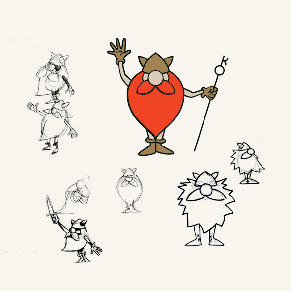
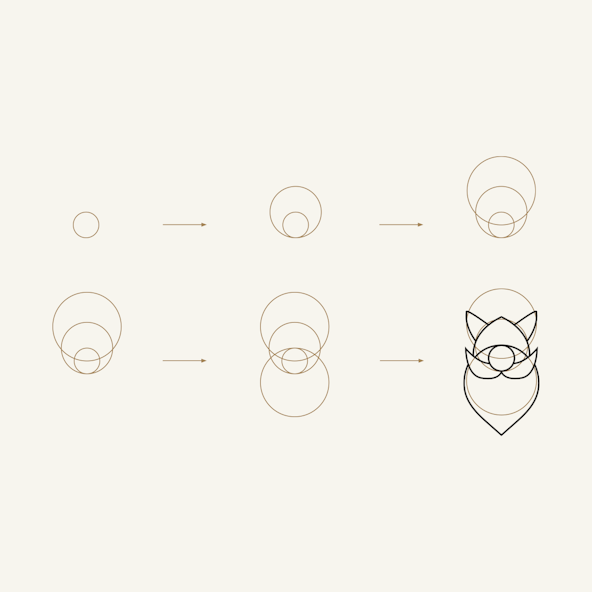
During our strategy work, we identified an opportunity for the visual language: nostalgic themes and the pastimes of board games, reimagined for today. Nostalgia ties in with happy memories of connection so important to the Keymaster vision and sets the stage for the brand to distinguish itself as the champion in its industry.

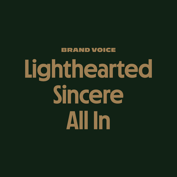
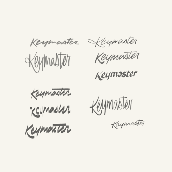
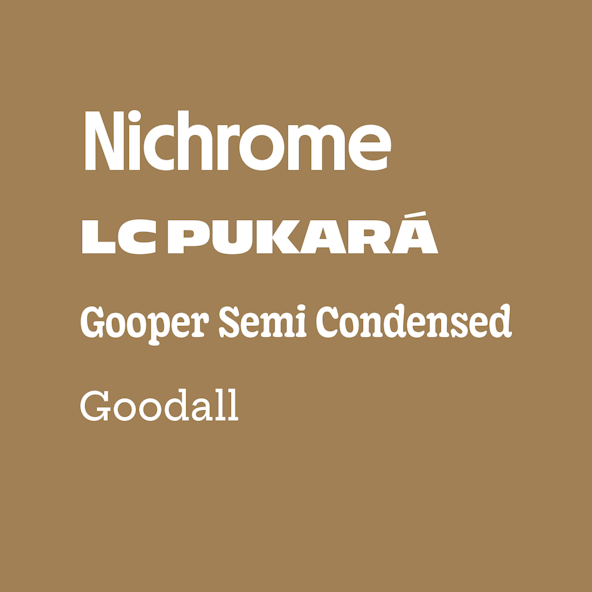
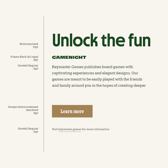
Typography is a key (heh) asset to a visual identity system. We sought expressive, but refined, fonts with intention. It was a careful balance of feeling nostalgic and familiar, without feeling dated and out-of-touch. We selected Nichrome for the display face; it references the typography of paperback science fiction from the '70s and early '80s. The rest of the typographic system supports the brand's attributes without feeling too narrow.

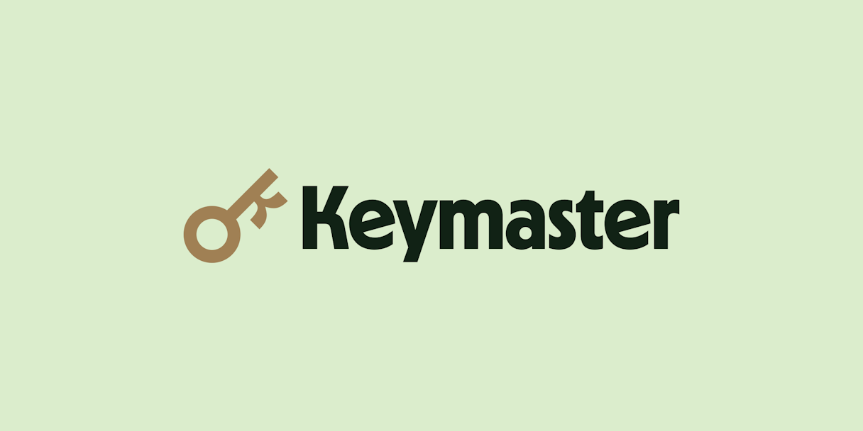
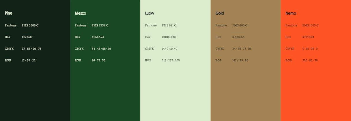
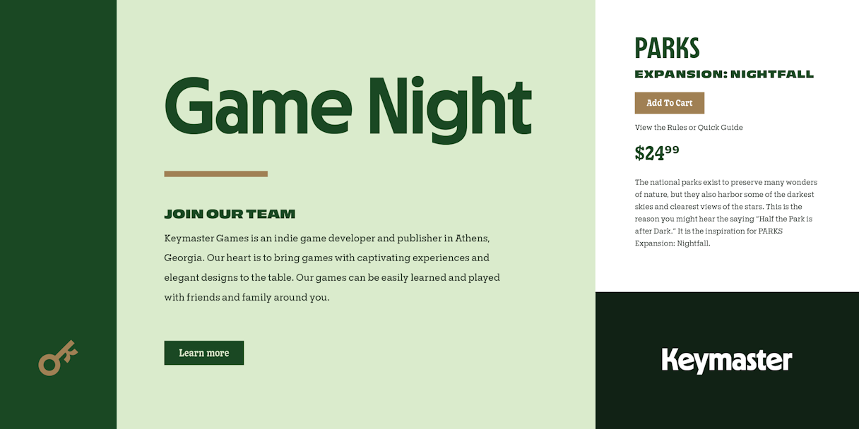
As typography within the Keymaster brand is vibrant and dynamic, the color execution is reserved and limited. The brand was already honing a strong color palette, but some legacy instances resulted in inconsistencies. We worked with them to simplify the palette to a trio of greens, gold, and orange.

This hit a perfect blend of nostalgia and craft while still pushing a contemporary feel — using quality fonts with intention.

Key gameboy

Two early concepts

Key boneyard
Key color2
Key typefaces
Key type2
Key type

Mascot

Successful mascots do not replace a logo. Successful mascots point to the brand without getting in the way or obstructing a seamless encounter between brand and customer. A great mascot consists of a few crucial elements: simple and memorable color patterns; easily reproducible; based on clear proportions and basic shapes.

Red is a prime example of the collaboration that went into this project. The Keymaster himself, Kyle Key, contributed sketches for Red and their team was instrumental to his final form. It was a joy to see how they continued to refine and evolve Red.

Key earlyred

Early iterations

Key redshapes

Red lives in the world of Keymaster’s identity. Somewhere between the games and the logo system, Red has found his treasure. But alas, the trove is locked and only the key mark will free his riches.

The lingering question was: Would Red have a voice? Verbal identity work played out to the very end of this project and determined Red would be effusive in gesture but reserved in speech. When he’s not plotting his next plunder, he’s only thinking about one thing: Keymaster Games. He can be found venturing through portals to social media, marketing, and the world wide web, all in search of that golden key.

Key web
Key onproductmacro
Key trails1
Key trails2600

Packaging and artwork by Keymaster

The brand positioning work executed during this project was the deciding factor in a six-figure deal from Target, putting our latest game on their shelves.

Kyle Key, Founder, Keymaster Games
Key gamenight3

Post-Project Success

Read the next case study

Aptible