Locally

As a B2B2C platform, Locally is the easier way for people to “shop local,” with the modern conveniences shoppers have come to expect shopping online.

Locally enables retailers and brands to connect with people looking for a more efficient online-to-offline shopping experience. Centered on a unique B2B2C model, Locally helps over 300 million shoppers search for products and source items from more than 500 brands for local pickup. Shoppers are the common thread for Locally and its other audience segments (retailers and brands). But because of its historical emphasis on the B2B segment, Locally needed to refocus its target audience and identity to ensure a more holistic B2B2C brand experience.

Locally’s myriad offerings — and evolving design and voice — meant the current brand was inconsistent and didn’t reflect its robust capabilities and powerful story.

Locally mural

Brand Strategy

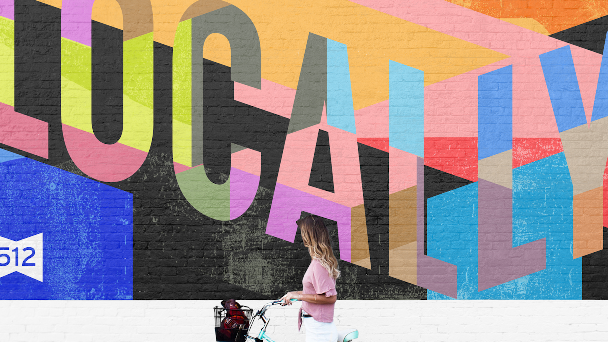
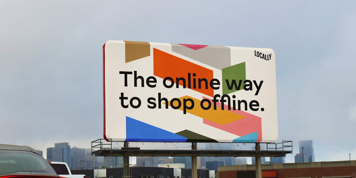
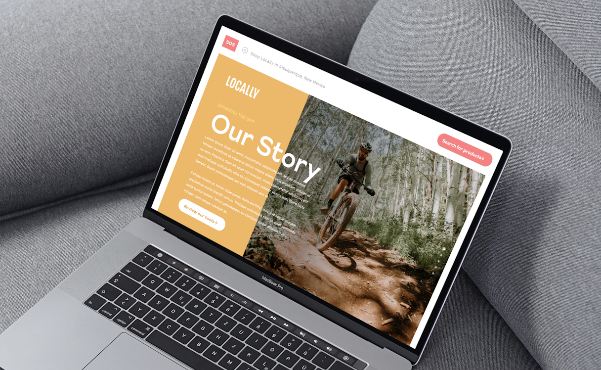
Locally stands apart because its robust product capabilities enable an easier and more connected online-to-offline local shopping experience for both businesses and consumers. Along with the company’s mission to democratize retail and disrupt e-commerce giants, we found none of these elements were expressed in its existing visual and verbal identity.

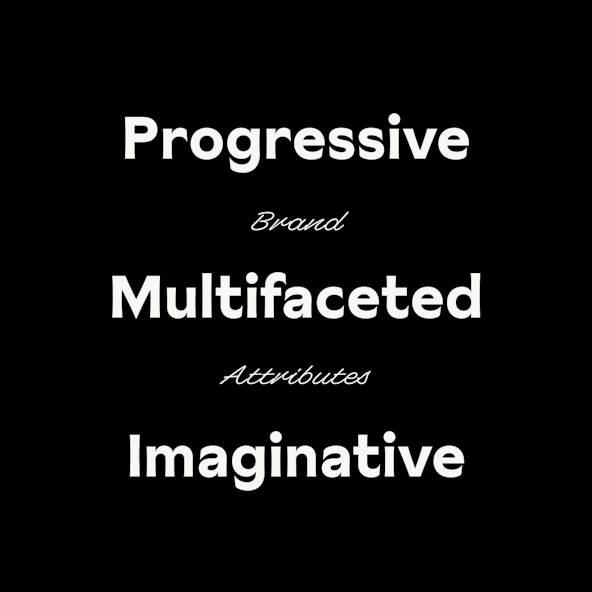
We helped Locally pinpoint their brand attributes as Progressive, Multifaceted, and Imaginative. These inherent qualities inspired our effort to position the brand as the common connection point between brands, retailers, and shoppers. Locally facilitates an emotionally resonant relationship between these groups, which enables them to form deeper and more fruitful relationships.

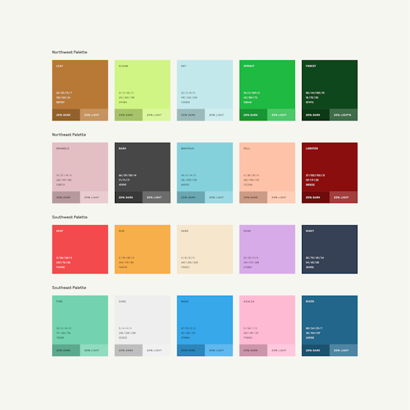
As Locally moved toward the consumer as its primary audience, it became increasingly important to create clarity around who Locally is for, and the difference in its brand’s offerings. So, we evaluated the company’s brand architecture — the intentional structure of products, services, and components that make up the brand's portfolio of offerings.

Within brand architecture, we found that a lack of product hierarchy and visual differentiation muddled the user experience, leaving it unclear which offerings were meant for whom. The quality and quantity of Locally’s audiences are its source of power; we helped Locally emphasize this at the brand level, while creating a supportive structure that makes it clear which offerings are meant for each section of its audiences.

Locally attributes

Verbal Identity

E-commerce was supposed to make shopping better, but somehow it feels like it’s gotten worse and borderline unfair for shoppers. At Locally’s heart is an earnest desire to right this wrong by democratizing retail — to declare a different point of view. Initially, though, Locally was too focused on product functionality over articulating a brand experience to buy into. This was a missed opportunity to entrench users in the brand, not merely product capabilities.

We wanted to present Locally as the Outlaw — a brand archetype full of moxie and fearlessness, and always at the forefront pushing the envelope. The brand’s voice is welcoming, candid, and dedicated. Locally’s core messages (purpose, mission, vision) and situational messages (unique selling proposition and value proposition) are foundational to all aspects of the brand identity. Along with a deep understanding of each audience in their unique B2B2C relationship, we were able to convey a compelling brand story: “Locally is everywhere you are.”

Locally billboard

Logo

Locally’s logotype is a completely custom condensed sans serif. It stands tall as the authority on online-to-offline shopping. The flexible logotype system is built on the X, Y, and Z axes of a block and can wrap in the provided perspective. The shorthand logotype is easily scalable and provides instant recognition in instances such as an app icon.

Locally wip
Locally logoillo
Locally socks
Locally businesscard
Locally escalator

Visual Language

Locally’s visual language blends the goals of shoppers, brands, and retailers to create something entirely new. The photography style highlights the features, terrain, and overall environment of the audience’s location. The approach to illustration creates small scenes that tell an immediate story. Iconography is inspired by street signs and takes cues from the logotype. Color becomes a reflection of the regional environment. Depending on the audience’s location, a geographical palette is assigned to their experience. Locally’s typography reflects the style of U.S. road systems and storefront window signage, handmade by local artists or the shopkeepers themselves.

Locally typestack
Locally shirt
Locally ui Colors2
Locally ourstory
Locally sneakers
Locally tote
Locally areacode
Locally shopsicon
Locally pin
Locally restaurant
Locally explode

We took a long time to settle on a firm to handle an extensive rebrand. Focus Lab stood head and shoulders above every other company we met with. Their process and deliverables far surpassed our expectations... leading us to a place we couldn’t have even envisioned.

Mike Massey, Founder and CEO, Locally
Locally store
Locally crosswalk
Locally NYC

Post-Project Success

Read the next case study

Very