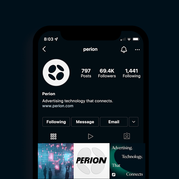
Perion

With a single universe of cutting-edge technology solutions, Perion empowers advertisers and publishers to connect with consumers across the world in ways that resonate with them.

How? With an approach that is artful and human as it is technologically sophisticated. And with a deep belief in advertising’s power to drive the economy forward. That’s passion.

Perion brought that passion to Focus Lab with the goal of fully showcasing a unique perspective and developing a cohesive brand identity. Cohesiveness was especially important.

Following a series of acquisitions, Perion sought a unified brand that would not only signal a bold approach to advertising technology, but also celebrate its people and their diverse expertise.

Perion Intro

Brand Strategy

Globally successful companies like Perion are inherently complex. Perion has long been an established player in the adtech space and, as it’s grown, its structure has evolved. So, one of the very first tasks of the branding project was an assessment of that structure. Our Focus Lab brand strategist looked closely at Perion’s trajectory, its goals for the branding project, and evaluated several brand architecture approaches that created the cultural cohesiveness Perion sought while complementing its future business strategy.

Outside of the business’ structure, Focus Lab collaborated with the Perion team to select four brand attributes: Brave, Confident, Dynamic, and Innovative. These authentic representations of Perion’s essence and personality helped the project team craft a positioning strategy, brand concept and, eventually, new visual identity.

The Focus Lab team created a brand concept to inspire messaging, both verbal and visual. That concept: Vantage.

Why Vantage? Because Perion’s perspective is so different. Perion’s technology, and how it predominantly serves to create that connection between people and the brands. It’s quite literally an advantage. Pioneering. Always out front. Pushing the boundaries of the possible.


Perion Previous identity
Perion Attributes
Perion concept
Perion Verbal weare
Perion report

Logo

In keeping with the Vantage theme — and representing an elevated viewpoint — the project team created a logo named Apex. With four orb-like elements working in concert to create cohesion and dimension, Apex embodies and evokes the very best of Perion.

Its 3-D effect conjures dynamism — the kind that directs light, knowledge, and knowhow in all directions. In the logo’s negative space we see where art and science blend to create compelling advertising technology. And the logo’s four shapes represent Perion’s people — their diverse backgrounds and areas of expertise. The combined effect is a symbol that is cohesive, representative, and enlivened with the kind of energy that rallies people, and connects them.

Coupled with the logo is a custom logotype that literally embodies Perion’s drive to be out front, ahead, and brave. When locked up with the logo, the effect screams acceleration and takes the brand to a place no other can claim. For this reason, and inspired by our brand concept, we call the effect The Perspective Shift.

Perion Refinement
Perion logodetail
Perion I Gpost
Perion bizcard
Perion Final Logo

Visual Identity

Stemming from the logo, the orb-like elements extend to create dynamic effects, made possible by textures inspired by pop art. The result is a portal effect, enhanced by one of the brand's primary colors — Peri, an electrified, reddish purple — and violet, which serves in the secondary palette. In addition to Peri, black and white make up the primary palette. And the brand lives on black backgrounds, evoking artful, technical, and bold vibes.

Other features — orb-like photo cropping and compositions — further extend the logo and unify the brand. Meanwhile, typefaces like Flecha M — Perion’s primary font — blend artful and structured effects to communicate the brand’s premium feel. The result? Sophistication without rigidity.

Perion guidelines
Perion Color typestack
Perion Color bars
Perion Color charts
Perion Pattern
Perion 102
Perion Mockups
Perion letterheard
Perion stage
Perion billboard

Interactive

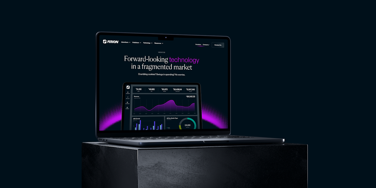
Once we’d established Perion’s visual identity, we worked with their team to create high-fidelity mockups — complete with conceptual copywriting — to make the brand’s website come to life.

A key design involved the main navigation and footer, key areas that not only create a cohesive experience for users, but also communicate the intentional and unity of a brand and its offerings.

Perion hierarchy
Perion U Ikit
Perion UI mockup
Perion Page
Perion Footer
Perion laptop dark
Perion UI mockup

In the end, it gives you a lot of confidence that you're partnering with someone who's a professional and they know what they're doing and they can justify it and they can support it.

Sharona Meushar, VP Marketing Communications

Video created by Perion

Read the next case study

PolyAI