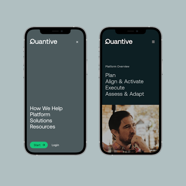
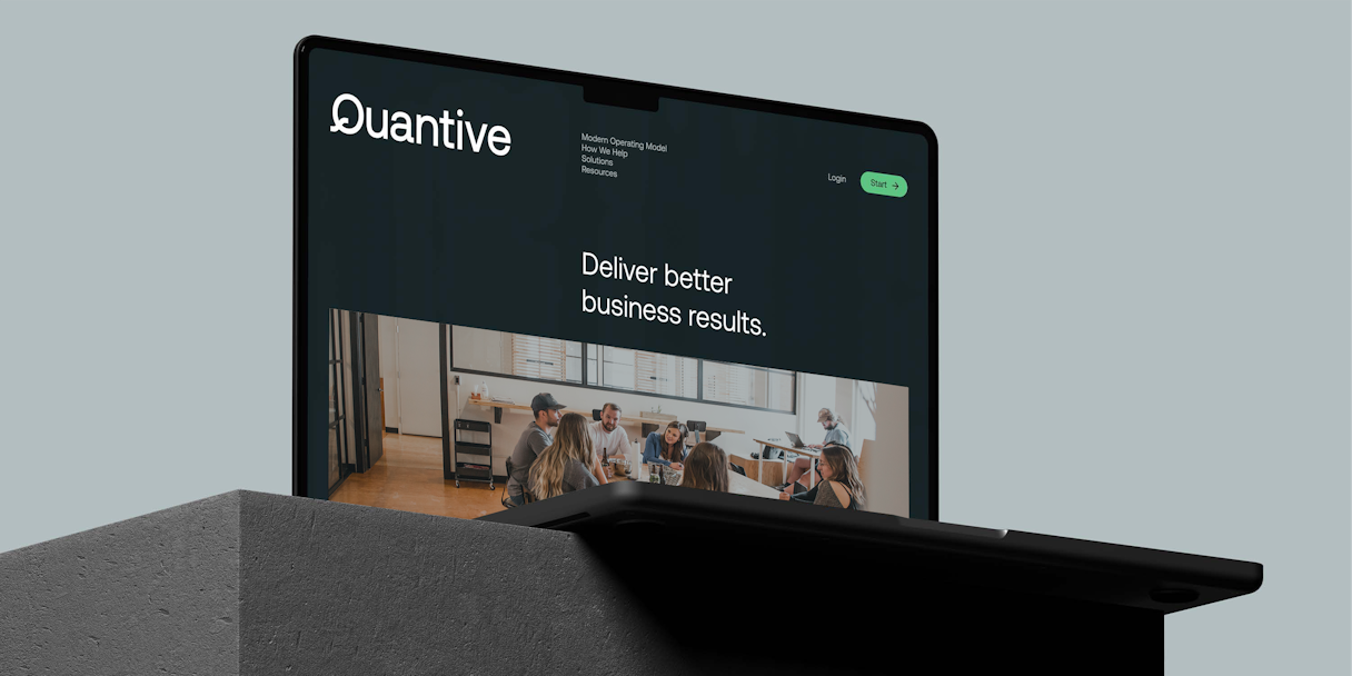
Day-to-day business operations are more complex than ever, making it hard to make progress on what matters. Quantive helps companies achieve what's possible.
Formerly Gtmhub, Quantive is purpose-built OKR software that helps ambitious companies of all sizes close the strategy execution gap. The brand stands alone as the most powerful solution — the only choice for companies seeking better strategy execution. However, the previous identity felt nondistinctive and commonplace with language that was only touching on table stakes. We knew Quantive needed an assertive brand to kickstart visionary conversations and set the tone in their industry.
Quantive required a brand identity to match their big, audacious vision and showcase they are not just software or an idea — they are an entirely new way of working.
Quantive serves an audience of industrious business leaders that are ambitious, competitive, and seeking to maintain momentum. But, the lack of a centralized, quickly understood solution meant misalignment between larger goals and the work being executed. Quantive creates a clear pathway from strategic goals to the day-to-day work required to meet those goals using the OKR methodology— all in a solution powerful enough to wrangle magnitudes of data, but fluid enough to ensure consistent momentum, even when things change.
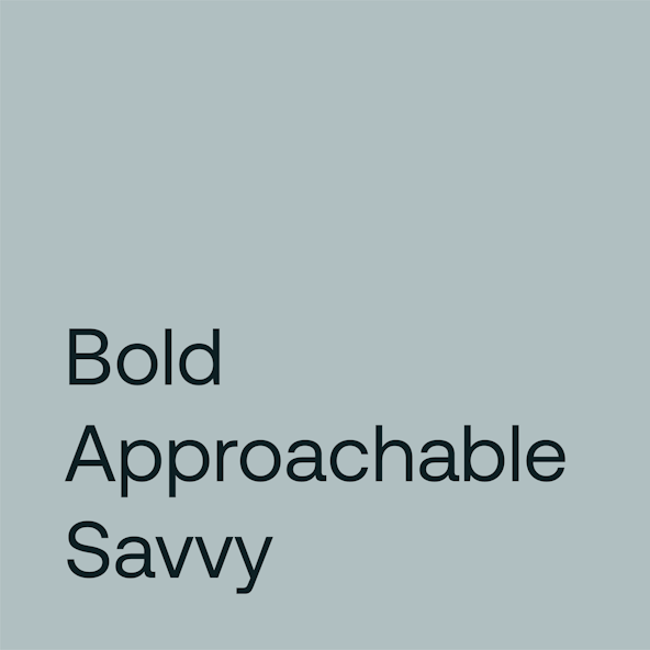
In addition to their brand attributes — Savvy, Bold, and Approachable — we set out to position Quantive as the ubiquitous choice; the brand synonymous with the strategy execution space. So, we showcased their ability to help companies shift, move, and flow — not only to achieve goals, but uncover the potential that lies beyond them.
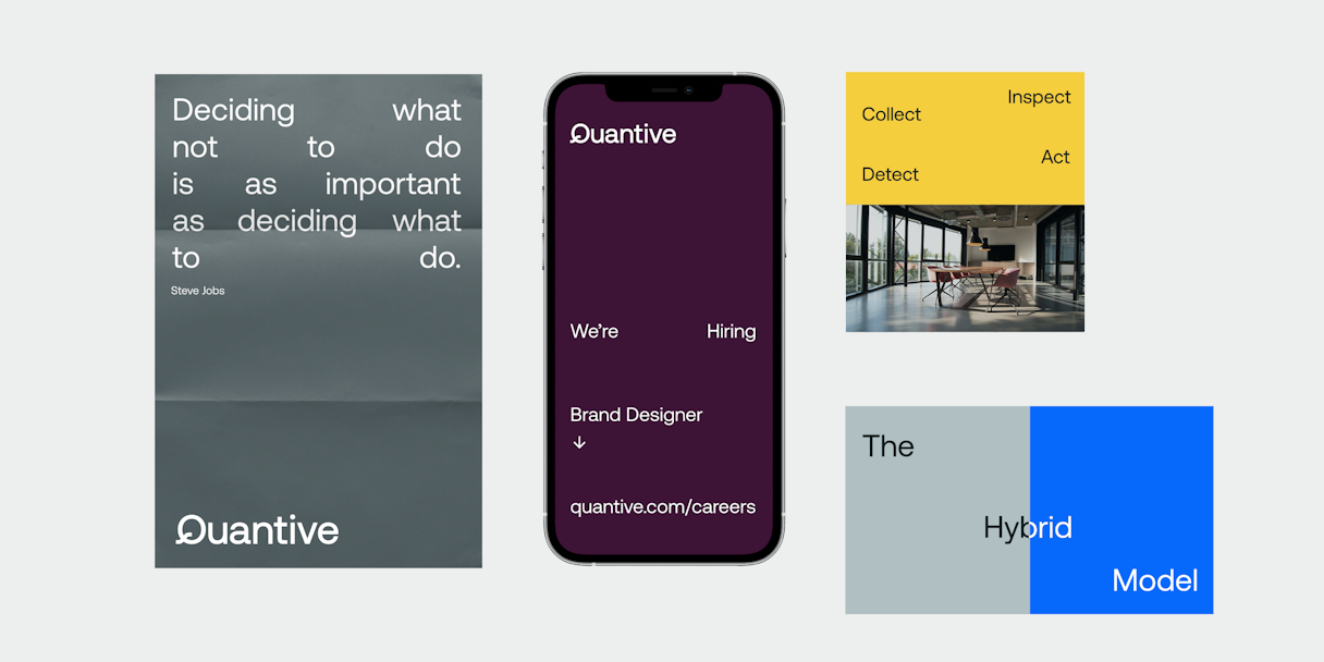
As a company in high-growth mode, Quantive struggled to organize the brand in a way that was easy to manage and made sense to their audiences. We proposed a Hybrid brand architecture that would grow alongside the brand. Within this unique architecture, an Endorsed brand structure is leveraged when speaking to a broader audience through events and content marketing initiatives like podcasts, and a Monolithic structure is used when speaking to a core audience through Quantive’s products. This allows short-term initiatives to be tailored, playful, and engaging to a specific subset of the audience who may need to be drawn in and introduced to Quantive's more visionary ideas. Yet, it plants a flag in the ground for its existing products which are beloved by loyal followers.
We found Quantive was largely product-focused and didn’t communicate a bigger, emotionally resonant vision. The brand struggled to go beyond the cost of entry and start visionary conversations integral to their position. Focus Lab helped Quantive connect their greatest strength — configurability and scalability — to the audience’s deep desire to close the strategy execution gap.
Opinionated, Approachable, and Inspiring, Quantive’s voice reflects the drive to help its customers not only achieve goals, but smash them. Their desire to leave a substantial, lasting impact raises the bar and encourages everyone to strive for the “best possible.”
Along with our voice and tone work, we led Quantive on how to convey the brand’s distinct outlook, as well as audience-specific messaging to help Quantive’s distributed teams tell the same story in a way that matters to a specific audience.
The final two components of our verbal identity work included tagline exploration and a brand story. We experimented with 50+ taglines that could encapsulate the drive, ambition, vision, and competitiveness shared between the brand and its customers. The winner: "Achieve what's possible.” Finally, we worked with the Quantive team on a brand manifesto, written as a rallying cry to its customers to strive for greatness.
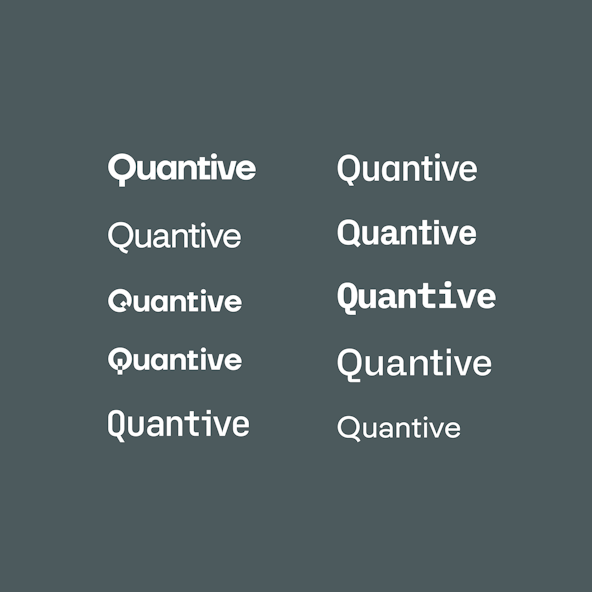
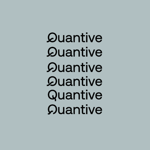
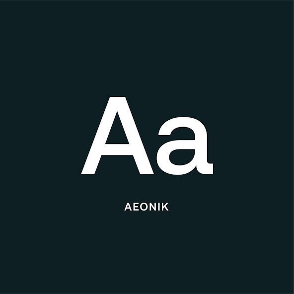
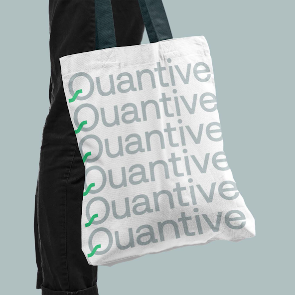
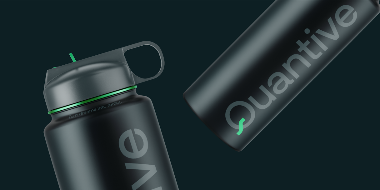
Building on the attributes of the Quantive brand, the logomark represents performance, growth, and success. It takes on the brand’s ability to pack light — only needing the essentials and nothing more. The logotype uses the typeface Aeonik with subtle, customized elements that speak to Quantive’s flexible and frictionless spirit.
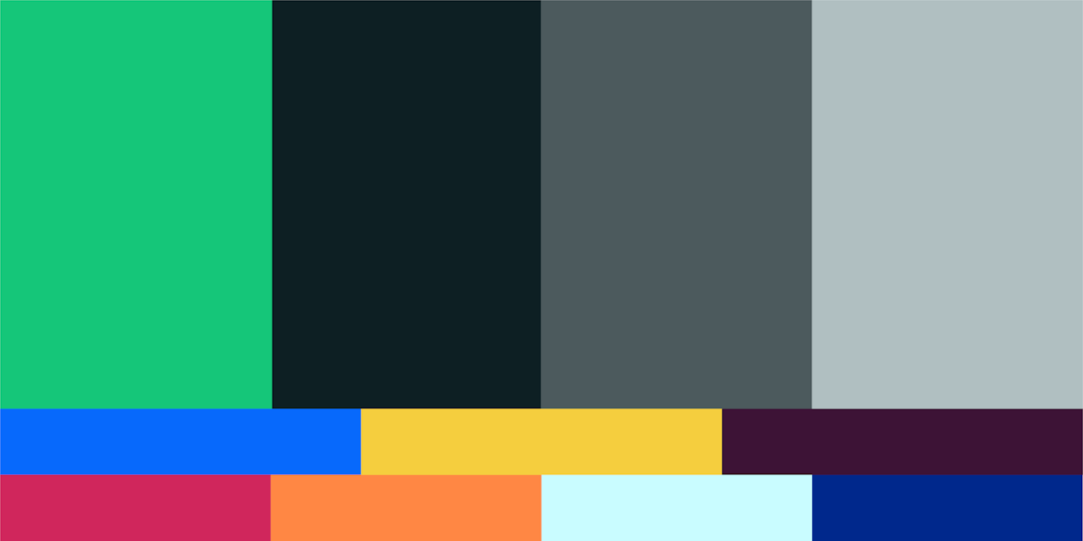
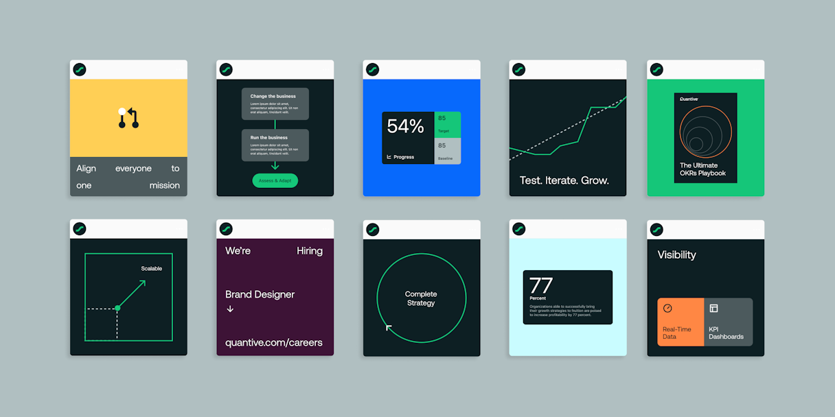
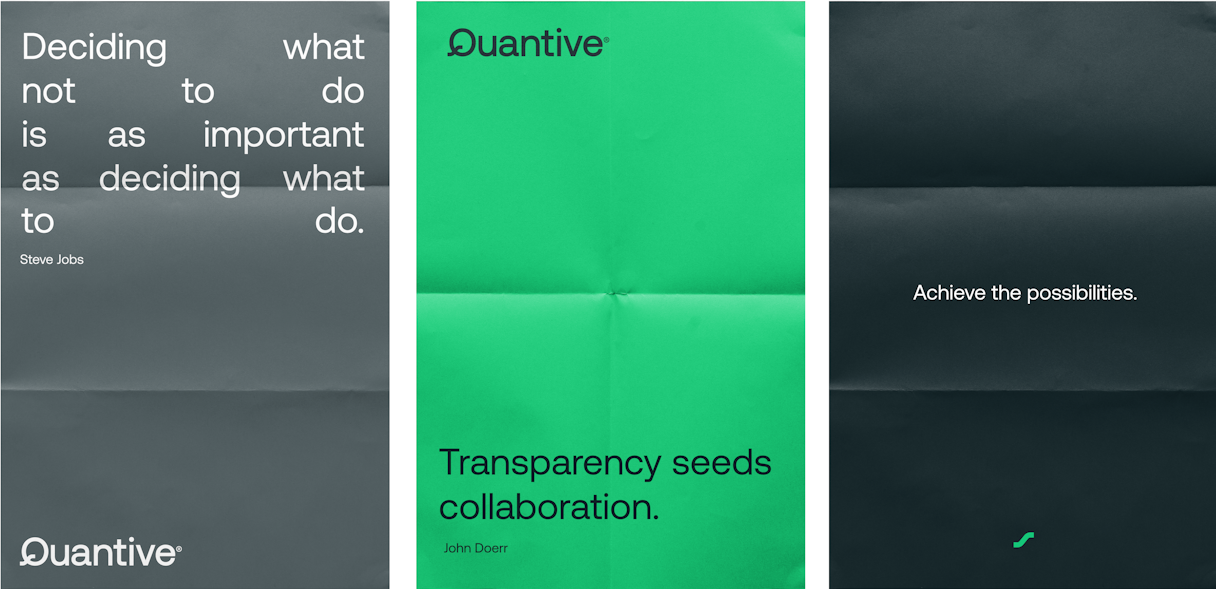
The color palette leads with a confident green that commands feelings of energy and performance. A dark neutral blue and a cool gray play a minimal and dynamic supporting role. We reinforced the minimalist, lightweight mindset with Aeonik — a workhorse font whose rigid shape feels bold and timeless. Echoing the logotype keeps things streamlined and carries the branded Q throughout communications. Expressive type allows the brand to create simple, typographic visuals inspired by ideas around scalability, agility, momentum, and configurability.
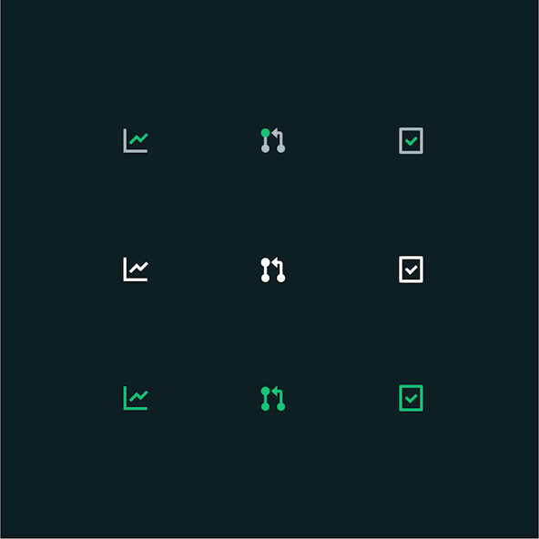
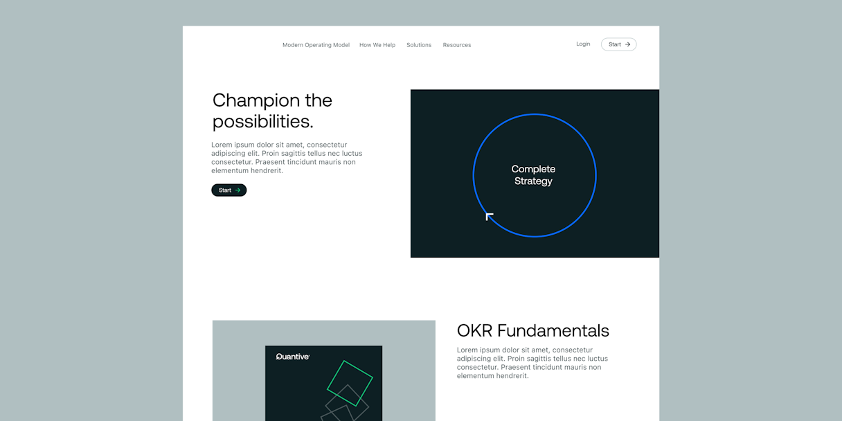
A conceptual and abstract illustration style allows Quantive to articulate ideas and enables the brand to be more flexible through iconic lines and shapes. Iconography adds a subtle layer to support content, further expanding on the minimalist visual language.
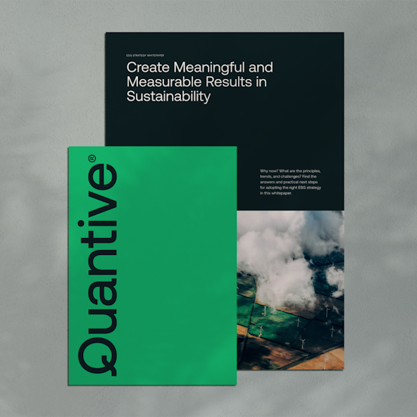
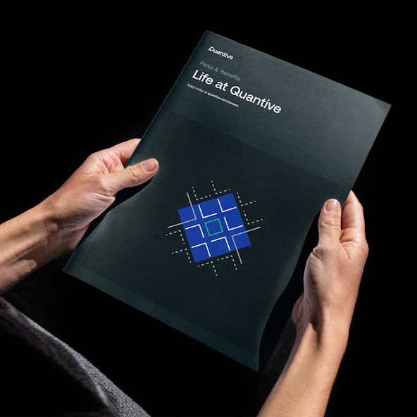
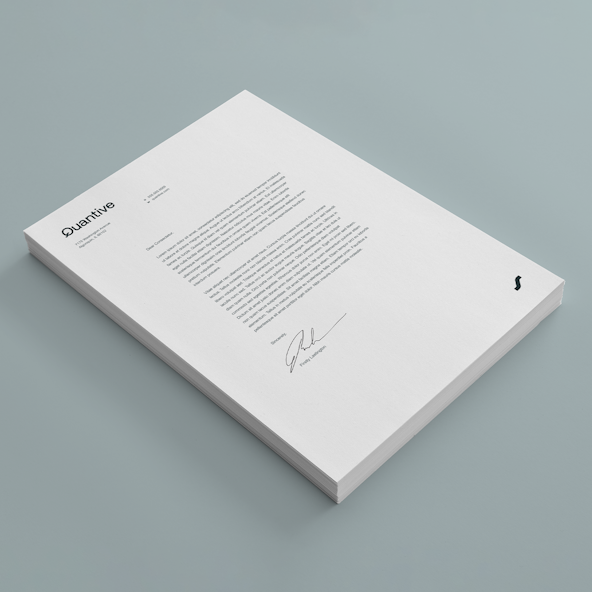
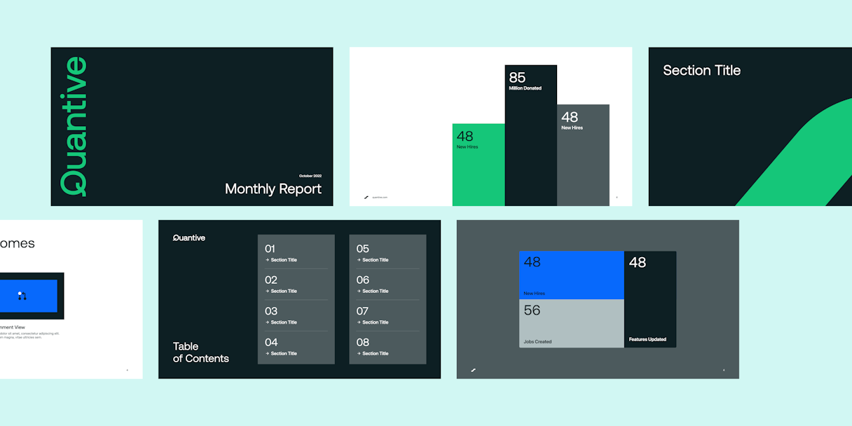
Rolling out a new brand affects hundreds — if not thousands — of elements. Our Brand Support offering helps organizations learn how their brand guidelines translate to their specific collateral needs. For Quantive, our auxiliary design work included letterheads, recruiting materials, presentation slides, and more.
In the news
Quantive Acquires AuxinOKRRead the next case study
Tango