From day one, Real Thread had delivered on two commitments: creating the highest quality screen printed shirts and taking care of people and the planet while doing so.
In the process, Real Thread has built a reputation for soft shirts, custom prints, and exceptional support— while keeping sustainability at the core of its business practices. Real Thread is beloved and worn by designers and design-focused fans, but with rising competition growing in recognition throughout the landscape, meaningful differentiation is paramount to the brand’s longevity. One glance at the visual trends of competitors was enough to validate the need for a fresh strategy and brand identity.
The next phase of Real Thread is full of great opportunity, expansion, and growth — but will manifest through focus. The future brand will retain the commitment to excellence, proven quality, and consistency Real Thread is known for, packaged in an elevated, authentic way that clearly articulates how it’s made matters. By returning to these qualities that have always been true of Real Thread, its identity will be one that immediately conveys its distinction to the world.
In a crowded landscape, Real Thread needed an identity that differentiated them by embodying their philosophy of “how it's made matters” and commitment to excellence.
Real Thread defined their brand attributes as Intuitive, Idealistic, and Approachable: Unrelenting in a pursuit for excellence. Relatable, welcoming, inviting.
In addition to their main attributes, we honed in on the word real. Not in a gimmicky or surface-level way, but in a way that reflects a word with profound meaning. Real has the power to represent the many facets of how Real Thread is different from its industry competitors. It relates back to the company’s commitment to sustainability, its product quality, its curated number of inventory SKUs, and its high-touch customer experience. More so, it’s a word that can resonate with their audiences’ desire to bring their stories to life. Real Thread is genuine, heartfelt, and palpable.
We eventually settled on a concept around a common thread. Common ground. Common values. Common good. A t-shirt is a simple and common wardrobe staple that Real Thread has elevated through quality and dedication.
Our verbal identity work had to develop positioning, deliver on strategy, and above all, define what we mean by “quality.” Our core messaging work was designed to have an impact, vividly conveying Real Thread's passion and purpose in short form.
In researching competitors, we found they all either sounded the same (often straightforward and upbeat but entirely unoriginal or memorable) or aggressively salesy and out of touch. The window of opportunity was wide open.
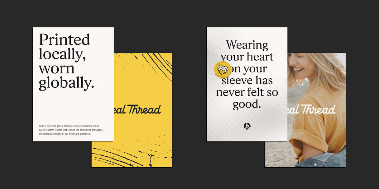
We returned again to the idea of quality: what Real Thread sounds like should be just as intentional and well-made as their products, culture, and character. We wanted to give Real Thread a voice that felt rich, enticing, and authentic. Confidence is buffeted by being chill — they’re bold, solid, and visionary, but not arrogant, inflexible, or inaccessible. A sense of fun pervades their culture and welcomes imagination and creativity.
A powerful brand story brought together all of those pieces to provide Real Thread with a concrete way to express their brand internally and externally. “When you care about your brand, you care about the way you tell its story. Good stories don’t fade.”
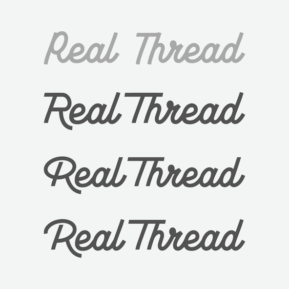
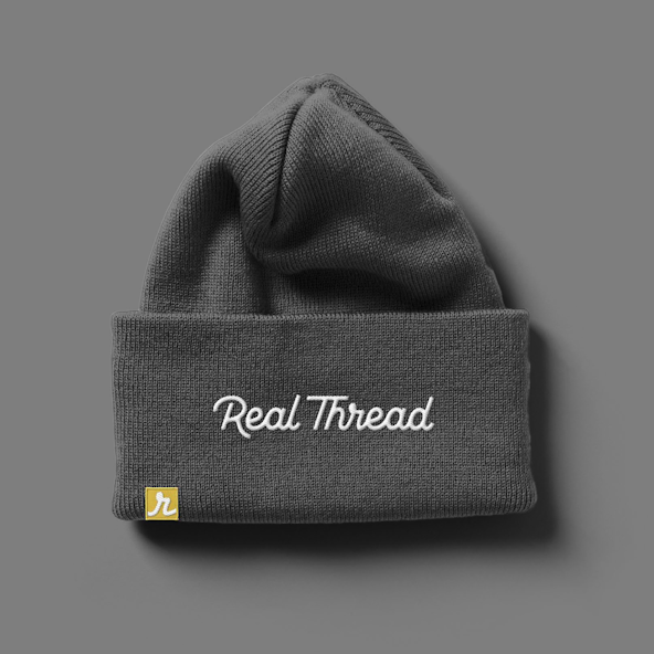
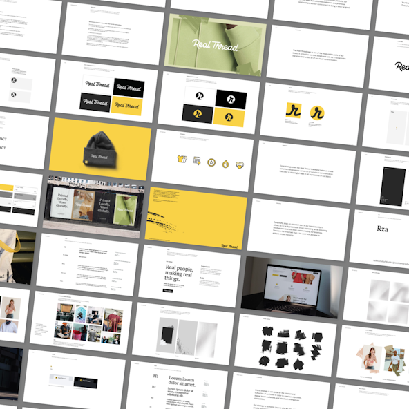
The logotype was inspired by the “common thread” concept. Through our exploration, we wanted to find a new way to share Real Thread’s commitment to elevated simplicity and quality that you can feel. We started by exploring ownable script logotypes that felt handcrafted. Geraldica by Etewut Foundry had a great flourish, but due to the number of repeating letters and tricky spacing in “Real Thread,” it needed some adjustments.
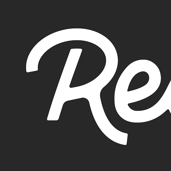
Building on the attributes of the Real Thread brand, we created a secondary mark that conveys the common thread while putting visual emphasis on real. This secondary mark is designed for app icons, favicons, and smaller applications.
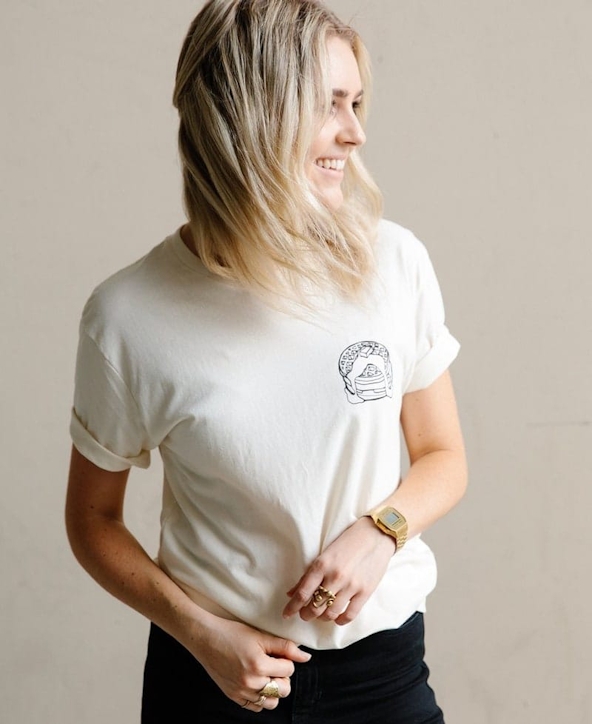
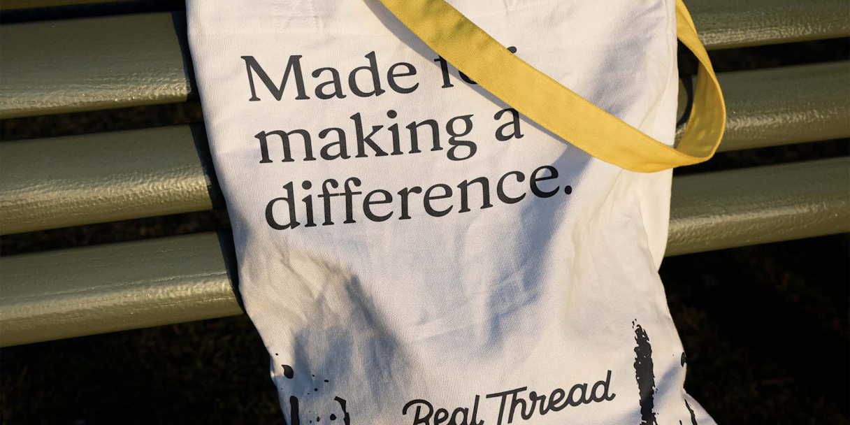
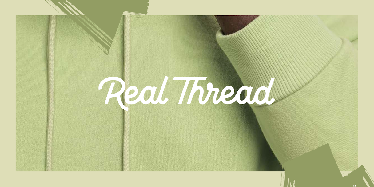
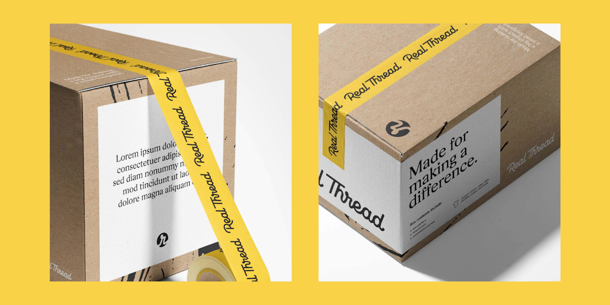
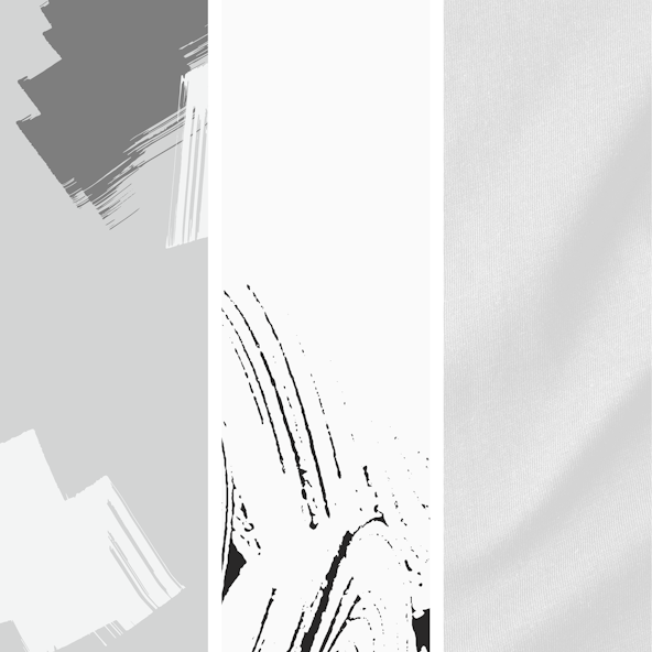
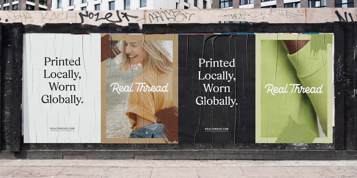
For the visual language, we looked to what Real Thread is known for: quality shirts. The fabric of its tees gives the visual system added texture, bringing tangibility to the brand's differentiator and giving the brand identity an ownable, human touch. Another utilized texture is the squeegee: a reference to screenprinting that balances clean lines with a suggestion of the messy behind the scenes.
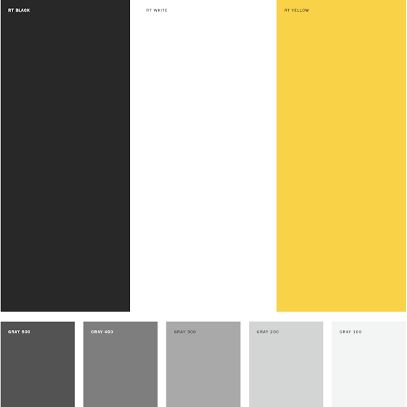
Real Thread's primary color palette is limited black, grays, and a signature yellow. The yellow feels appropriately vibrant and optimistic. Additional colors can be pulled from accompanying photography, allowing an endless supply of colors to choose from without diluting the brand.
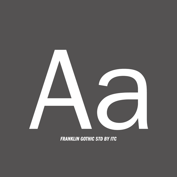
Rza is the leading display type for Real Thread. Its nuance adds approachability to Real Thread's voice, and as a trusted, intuitive serif, it's something nonexistent in a competitive landscape full of sans-serifs. Selecting ITC Franklin Gothic Std as the supporting type system offers clean balance. It is strong yet soft spoken and brings a subtle, handcrafted quality to the overall brand aesthetic.
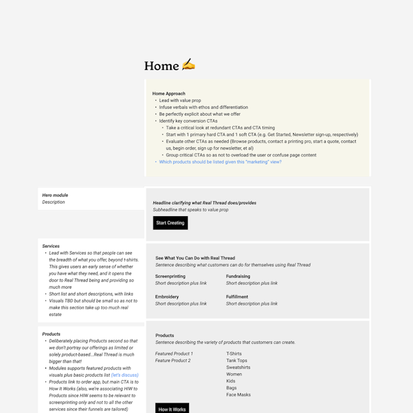
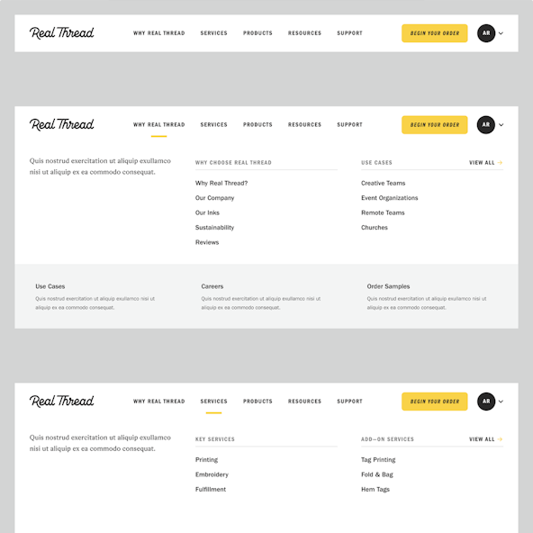
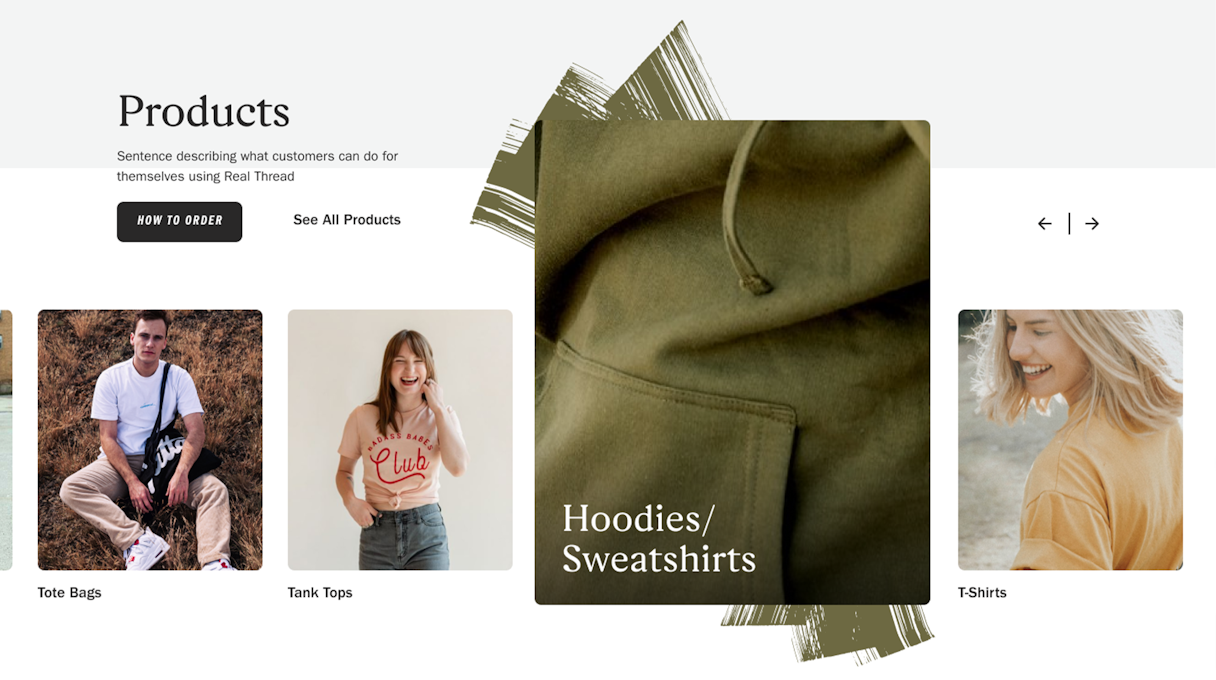
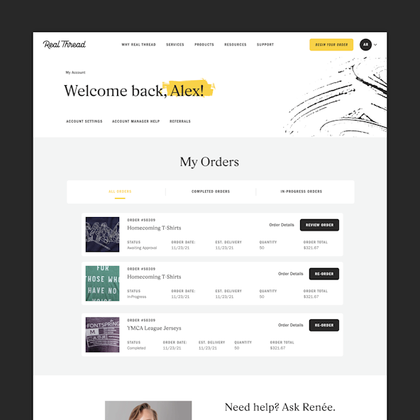
Our interactive work for Real Thread kicked off with content strategy. Ultimately, most websites have a common goal: to convert visitors to customers. Verbal and visual identity is a huge component of that journey, but user experience and wayfinding is just as important. We dove into their navigation, aligning the header and footer navigation for consistency, categorizing links with intention, and adding emphasis to featured content in the menu.
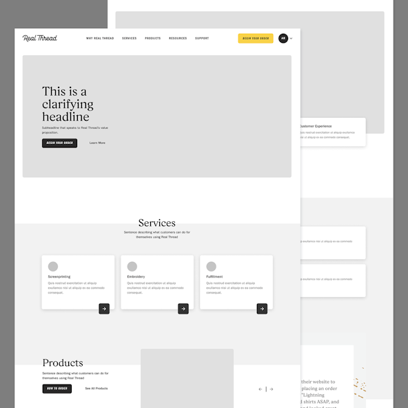
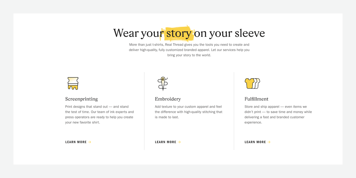
For the home page, we wanted to lead with a clear and compelling value proposition. Through our branding work with their team, we identified what makes Real Thread special; we wanted that front and center on the website. Next, we wanted to be explicit about Real Thread’s offerings, which go beyond t-shirts and printing. We were able to emphasize all that Real Thread has to offer by placing their services at the forefront. Every page we put through content strategy was thought about with similar intentionality.
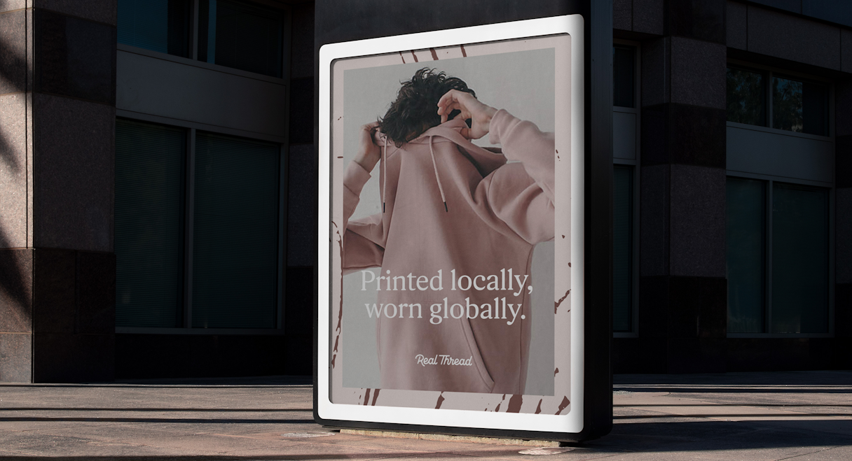
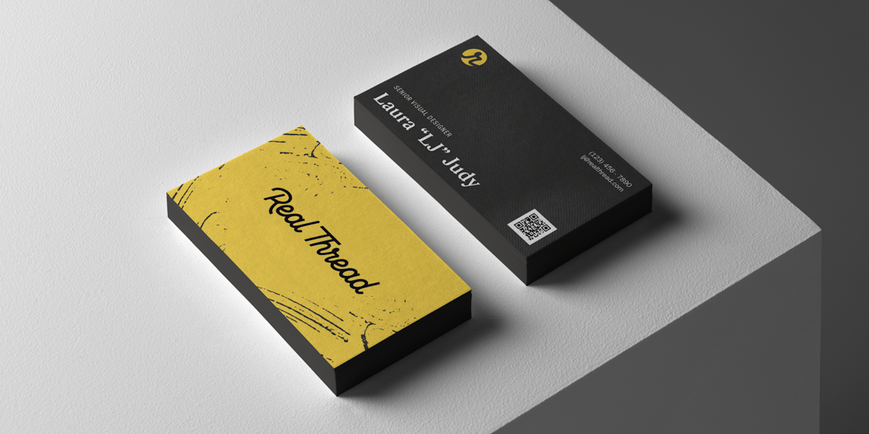
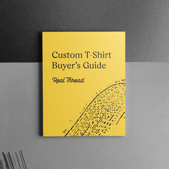
A rebrand goes beyond a logo, messaging work, and a website. To be effective and consistent, all the little pieces need to reflect the new brand as well. And as an established and beloved brand, Real Thread had a lot of collateral to update. Our Brand Support team stepped in to help Real Thread prepare for launch. Our team tackled business cards, auxiliary website pages, display ads, expanded iconography, and more.
The focus that you guys have on just brands is really awesome and helps the process and the experience on this side.
Dru Dalton, CEO, Real Thread
In the news
The “Why” Behind Real Thread's New LookRead the next case study
Artifact