Vecteezy

Vecteezy is an online marketplace where users can license stock photos, vector graphics, and stock footage directly from artists.

From its beginnings over ten years ago, Vecteezy’s goal has always been to inspire and serve its creative and design communities.

After adding photography assets to their content library, Vecteezy needed to consolidate under a single brand name and distinguish themselves in a saturated competitive landscape with a brand that highlights their modern user experience.

Vecteezy needed a fresh identity to communicate their dedication to creators by bridging availability, affordability, and an innovative search platform in a saturated industry.

Our Approach

As it continues to innovate its platform with better quality, functionality, and features, the aim is a Vecteezy brand that communicates the leadership and distinction it brings to the industry. We needed to create an identity for Vecteezy that presents all content assets under a single, solidified brand; one that personifies its friendly, authentic qualities and offers an effortless, dependable experience.

Brand Strategy

The world of stock assets is crowded with competitors, and we needed to distinguish Vecteezy strategically and visually. Teals, blues, and greens dominate the landscape, along with somewhat incomplete visual systems of uninspired typography and whitespace. We knew Vecteezy was poised to connect with creators through a thoughtful brand system and stand out in their industry.

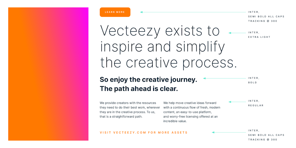
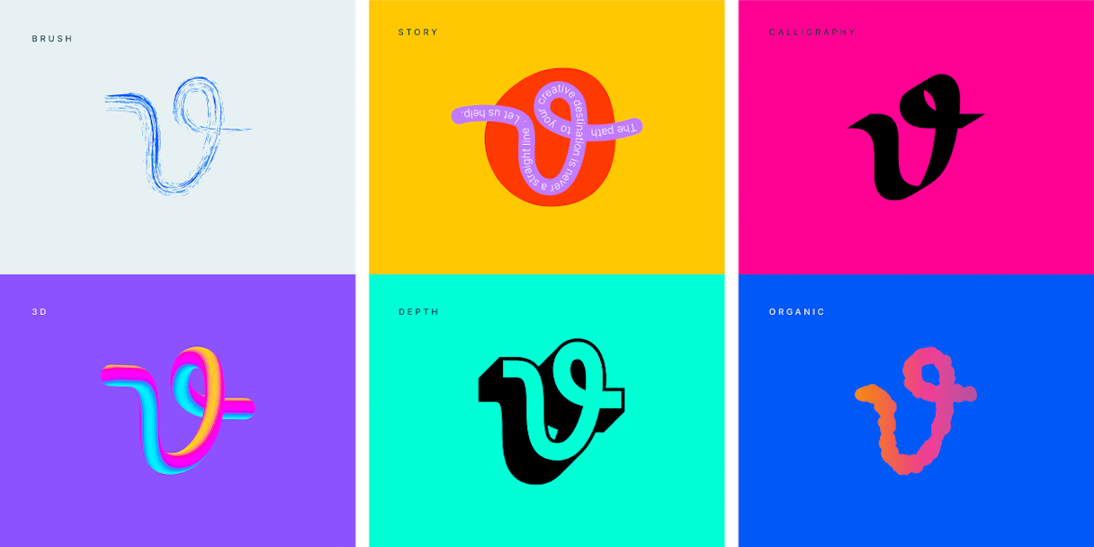
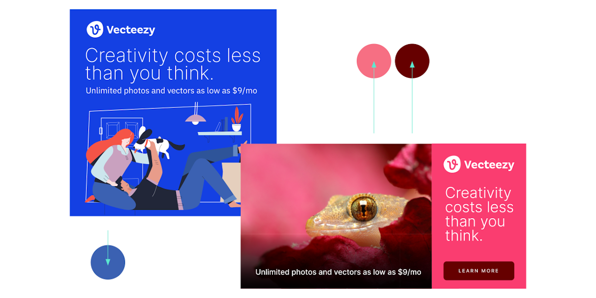
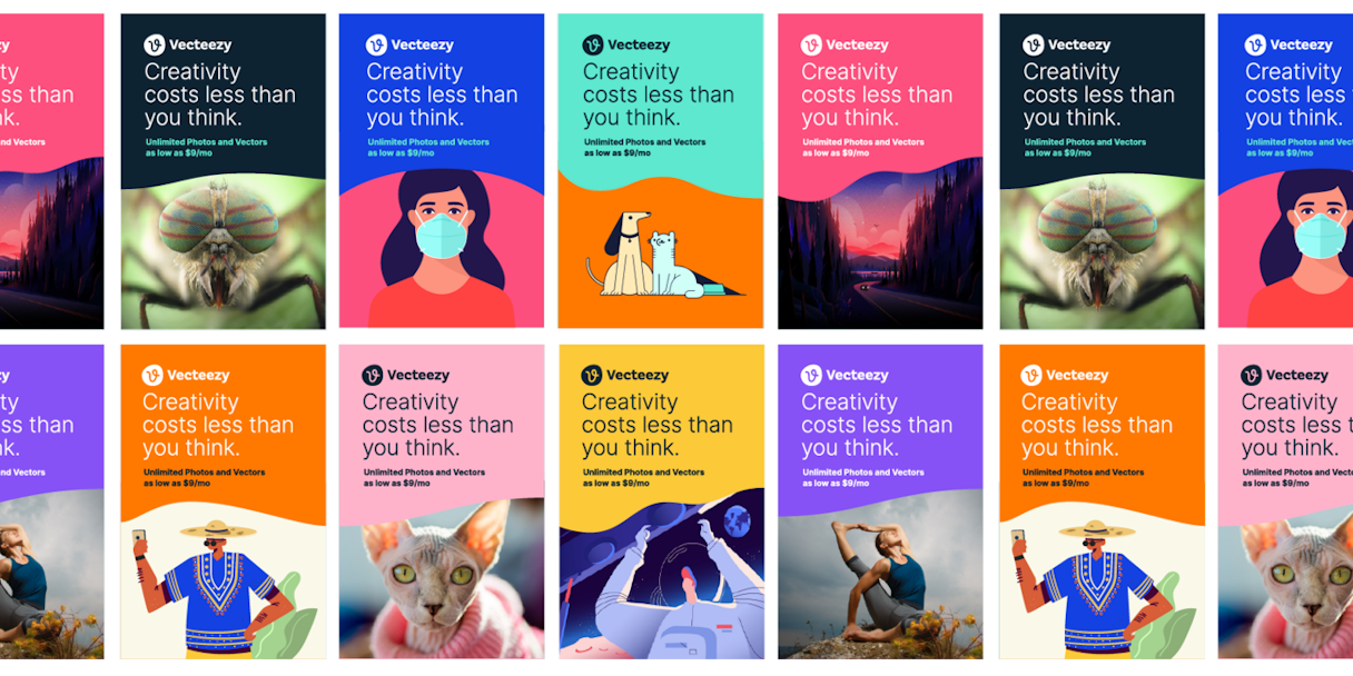
We worked with Vecteezy to identify their three brand attributes as friendly, modern, and effortless. Vecteezy's brand hinges on communicating their supportive community, high quality content, and an intuitive user experience built with creators in mind.

Vecteezy strat paper2

Brand Story

A brand story is the root ideology, weaving purpose, mission, and vision into a visual language. Vecteezy's brand story is incorporated throughout their identity — ensuring every brand element relates to their purpose.

Vecteezy’s purpose is to inspire and simplify the creative journey.

Vecteezy figure V

For those who heed the call to create, one thing is certain: The creative journey is never a straight line.

The creative journey is a long, winding path full of uncertainty. Creators must have the courage and perseverance to put their boldest ideas out into the world. Many ideas are lost along the way. The journey can be arduous.

They need a guide to encourage them to keep moving. A guide that understands creative paths are never straight.

Vecteezy guides creative ideas forward with a continuous flow of fresh, modern content, an easy-to-use platform, and worry-free licensing offered at an incredible value.

So enjoy the creative journey. The path ahead is clear.

Vecteezy Vextended2

Verbal Identity

Vecteezy makes modern creative resources available to all designers, whether they’re with a well-heeled agency or a solo-run startup. They not only understand the creative journey, but they’re dedicated to making it better.

The Vecteezy voice is encouraging, confident, and authentic. It’s a mix of passion and expertise, vision, and pragmatism inspired by their brand archetypes (the Creator, the Sage, and the Ruler) and driven by their future.

Vecteezy Voicev6

Logomark

Vecteezy's mark took its own path to end up where it is today. It was originally inspired by an ampersand: bringing together creators and contributors to Vecteezy.

Vecteezy markpathv3

We call their mark "The Path." The path symbolizes the creative journey and Vecteezy's important presence in that process. Never straight, but always moving forward.

Vecteezy markcolorsv2

Logotype

Finding a wordmark that paired well with the mark, without detracting from it, proved to be a challenge. We explored a number of options including some custom typography before settling on Basic Sans. Finding the perfect pairing was our own creative journey.

Vecteezy logotypeexplo4
Vecteezy finallogtypev2

Visual Language

Vecteezy's previous branding was orange and we loved that as an ownable color for them. Few of their competitors were using orange and the vibrant hue communicates the excitement around their community and assets.

We tweaked the orange to provide more contrast against white and introduced a secondary palette to lighten the mood and highlight the fresh, modern content that Vecteezy offers.

Vecteezy color

The Vecteezy brand type family is Inter. Inter pairs well with Vecteezy's brand attributes of friendly, modern, and effortless. It offers enough weights to create a dynamic type stack and create an easy visual hierarchy where needed.

Vecteezy type

Special Cases

The Path represents the Vecteezy mark but can also be used as a graphic device. For use cases of the Path as a visual element, virtually no rules apply; it can be used wisely and used widely.

Vecteezy specialcase srgb3

Art Direction

With over a million assets at their disposal, curation is crucial for Vecteezy's collateral. Photography and illustrations featuring bold colors, simple layouts, diverse styling, and limited subjects will pair best with the Vecteezy brand system.

We also developed their unique opportunity to leverage the color palette of their creative platform's assets. Putting the creative community in the forefront, the Vecteezy color palette can play chameleon and adapt to fit the paired imagery or vector artwork.

Vecteezy adaptivecolorv2

Display Ads

Referencing the story of The Path and the curves of the mark, we used curved headers to visually annotate Vecteezy display ads. It is a simple tool to enforce the visual identity.

Vecteezy swoops
Vecteezy ads whitebg

This latest evolution of our brand better reflects who we are and what we do. We’re excited for this new look and everything it represents!

Shawn Rubel, CEO, Eezy
Vecteezy specialcasehero

Post-Project Success

Read the next case study

Frame.io