Zello

Building on their existing status as the most popular (150+ million users) and reliable push-to-talk app in the marketplace, Zello was ready to pivot from a consumer social category to business communications. The company was already building a product and team to better target enterprise clients and needed a brand that matched their future.

Working primarily with frontline workers, Zello connects individuals and groups through the power of the human voice. In situations where seconds matter, Zello is the most reliable and effective choice to communicate instantaneously. Whether a logistics worker checking on a shipment or a first responder communicating to their team, Zello helps groups work when nothing else is working.

Zello had already built the most popular push-to-talk app, but it needed a brand that spoke more directly to enterprise and business communication clients.

Brand Strategy

Organizations with frontline workers, who often must move fast and interface remotely, urgently need a product like Zello. Speaking more directly to these organizations — and their decision-makers — was an important consideration for our work.

These audiences are searching for a product and brand experience that is reliable, simple, and intuitive, and makes their lives easier through direct, asynchronous voice communication. Without Zello, all audience segments are frustrated by inefficiency and a lack of authentic-feeling communication. They are all bound by the emotional desire to connect specifically through the human voice in order to nurture community in an unfettered, natural, and nimble manner.

Our strategy focused on how best to embody Zello’s brand attributes of Simple, Helpful, and Approachable through verbal and visual communication. We saw a dynamic opportunity for people-focused visuals and verbals —something almost completely absent in the industry landscape. The narrative around the power of the human voice reinforced more person-centric photography, messaging, and elements throughout the brand system.

Zello attributes3
Zello mobile

Verbal Identity

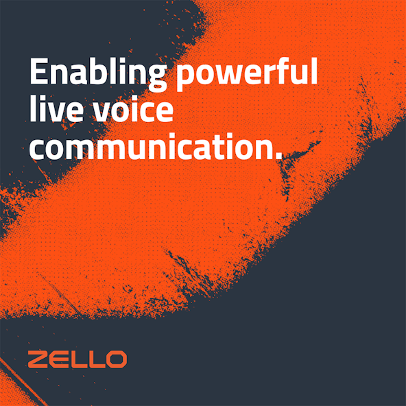
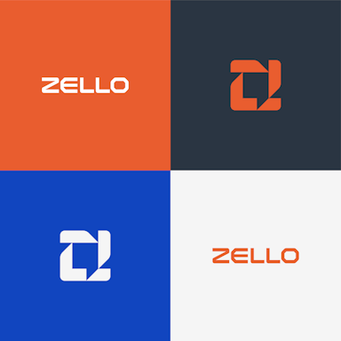
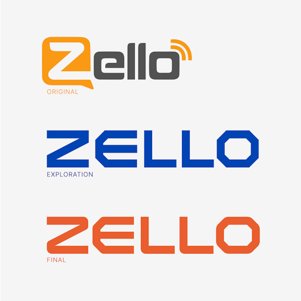
In a landscape of brands primarily dedicated to live voice communications, we found that none of Zello’s competitors has a unique voice. Not one expresses the full character of the people they serve and the means by which they do it; this is a major missed opportunity, since voice is literally the focus of their offerings. What better time to display the nuance and richness of voice than in one’s communications about it?

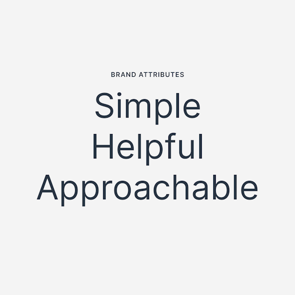
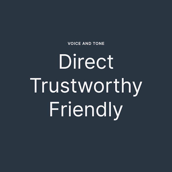
We recognized that Zello had a chance to sound genuine and empathetic. We worked with their team to bring in the grit, ruggedness, conviction, and clarity that will resonate with both enterprise buyers and frontline workers, suggesting that Zello is experienced, grounded, and in the trenches alongside them. Zello needed a verbal character that reinforces all the qualities of their solution: durability, simplicity, longevity, toughness, and ease.

In addition to their voice and tone, we also collaborated with them to hone their core messaging and develop a brand story that embodies Zello's reason for being. “At the end of the day, we’re here to make things simpler and easier for people who don’t do simple or easy things. To be a vital tool in the frontline worker’s toolbox. To make it possible to get the big, life-changing work done.”

Zello vt
Zello enable

Purpose: To harness the power and clarity of the human voice so that people can hear and be heard, connecting on an authentic level, getting work done, and impacting the world.

Worker using angle grinder
Zello colorblock1300v2 01

Logo

Link, the Zello app icon, is inspired by what Zello does best. By combining the ubiquitous chat symbol with a subtle “Z,” all held together by points of connection, boom: we have an app icon that is unique and recognizable to Zello.

Modern yet bold. Rugged yet approachable. Nodding to the past while embracing the future. Unique to the landscape and beyond. That’s Link, and that’s Zello.

The logotype is fully custom. It feels technical and trustworthy, but with softened corners to still feel approachable.

Zello logotype
Zello 0002 Zello hat
Zello logotypev2 01
Zello biz
Zello linkprocess
Zello marktexture
Zello cement

Visual Language

The Zello visual language continues a concept around “Courage in Motion.” Frontline workers are the boots on the ground, tackling daunting real-world challenges every day. They pour their blood, sweat, and tears into their work — all to ensure that things keep moving for the rest of us.

The textured icon treatment is used to communicate that Zello is on the ground with their customers, while the grit texture is based on real environments. It is a dynamic visual element and is encouraged for larger applications.

Colors are strong and the primary typeface — Inter — is a real workhorse, carefully crafted for digital experiences. The photography feels authentic and in-the-moment.

Zello inter2
Zellocolor 01
Zello illo4
Zello photo2
Zello texturecard
Zello shirt
IG zello 0000 anniversary

Your process helped force us to resolve positioning hurdles a step at a time. The debate and feedback was useful, and we are delighted with the result. The brand story and the visual identity phase have been remarkably effective.

Bill Moore, CEO, Zello
Posters

Post-Project Success

Read the next case study

15Five