Surfe
More than a tool, Surfe is the modern company for the next wave of revenue teams.
Surfe is a connected workspace for revenue teams struggling to eliminate monotonous, low-value work in their daily routine. Reps can find, enrich, and qualify leads across their data sources in an instant. A more mature, premium identity became increasingly vital to elevate Surfe’s startup feel and galvanize its place among competitors.
The product was growing beyond its borders.
Surfe had to evolve from simply a tool to a brand garnering serious consideration by high-growth and first-generation tech companies, all while balancing a sense of premium and playfulness.
Brand Strategy
What began as a simple tool has evolved into a proper tech company. Surfe’s competitive advantage is its ability to be the most agile connected workspace for sales and revenue teams. Offering a seamless and integrated experience across the widest suite of preferred tools proved to be a huge strength for the brand. However, we found that the longevity of this position could be challenged.
We worked with the team at Surfe to identify its brand attributes as free, bold, and playful. In bailing on convention, the brand became known for its sense of ease, playful nature, and performance-based characteristics commonly associated with surf culture.
No other brand delivers this type of experience the way Surfe does. We recognized opportunities for Surfe to connect with their audience through the thrill, freedom, and limitless potential of their work — while also delivering moments of joy.
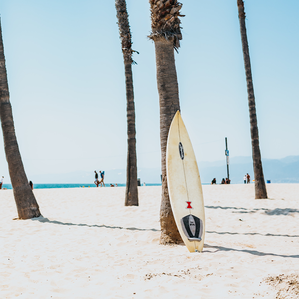
Photo by Tyler Nix
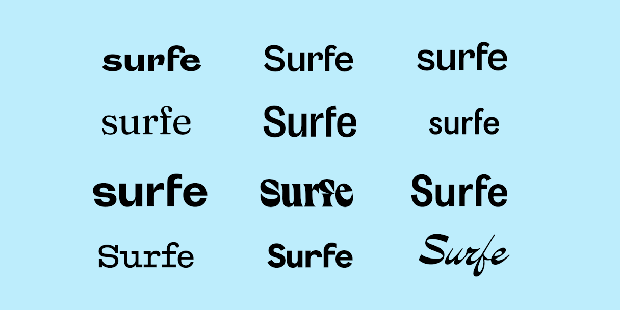
Logo
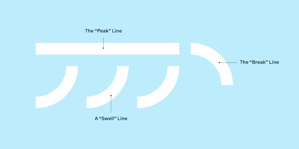
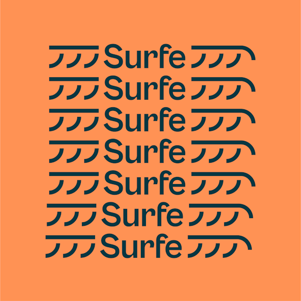
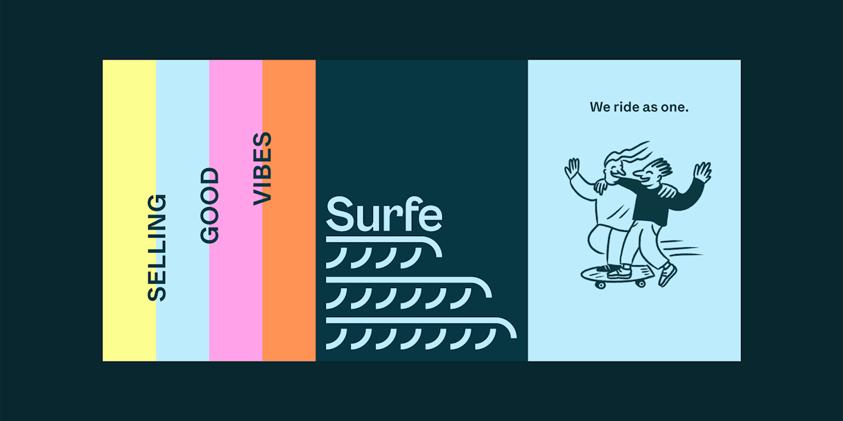
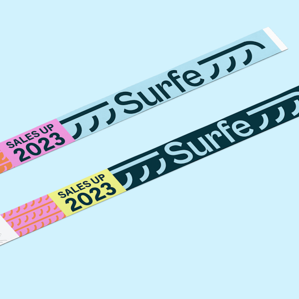
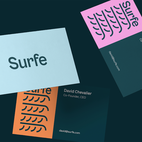
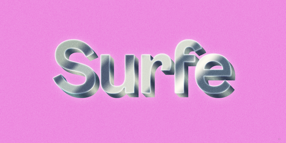
The logo is inspired by the sense of flow and flexibility required to ride a wave as well as respond to its ever changing nature. The system is made of four core components: the primary logotype, the Puddle Jumper for small-scale legibility, the Floater, and the Barrel. These lockups are built with a “Swell” line, “Peak” line, and “Break” line, allowing them to endlessly stack and extend into the brand’s visual language.
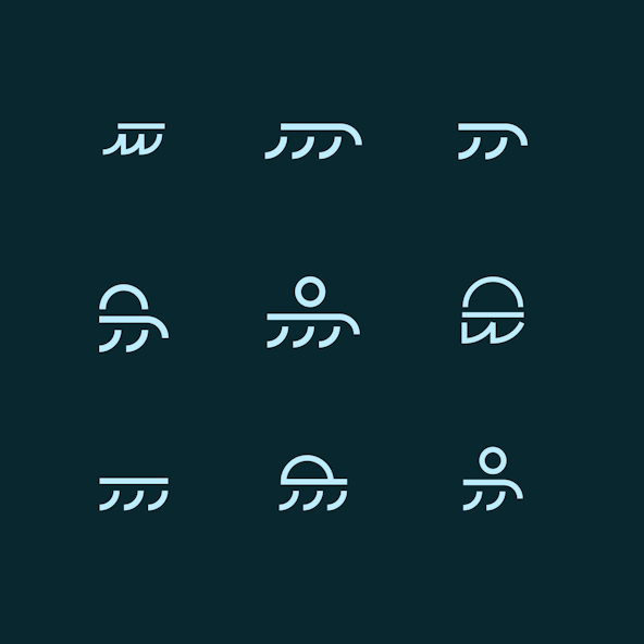
The Puddle Jumper
The Floater
The Barrel
Visual Language
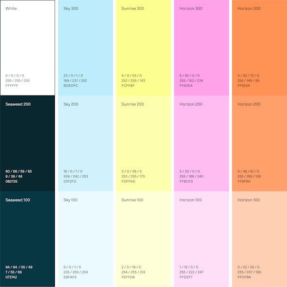
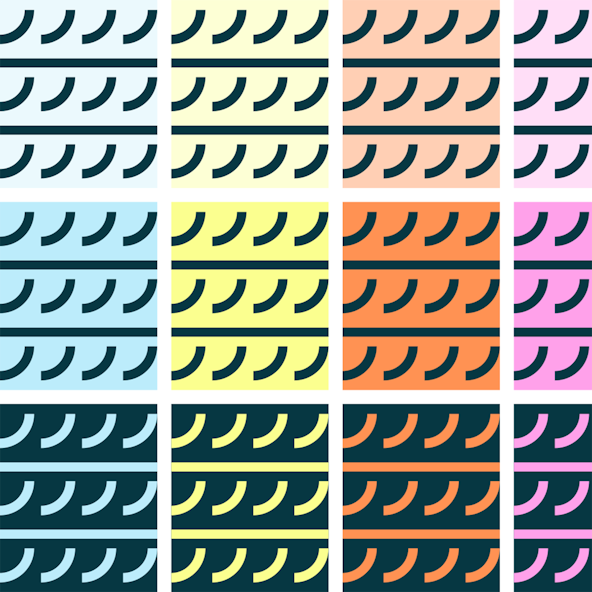
Surfe needed to retain credibility with high-growth and first-gen tech companies, but anything corporate just didn't fit the brand. So we explored various ways to convey Surfe’s playfulness and joy while not leaning kitsch. Colors are exuberant, and photography has an undertone of summer vibes. Imagery and graphic components are inspired by the tail shape of various surfboards.
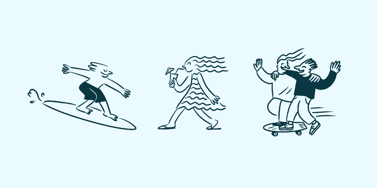
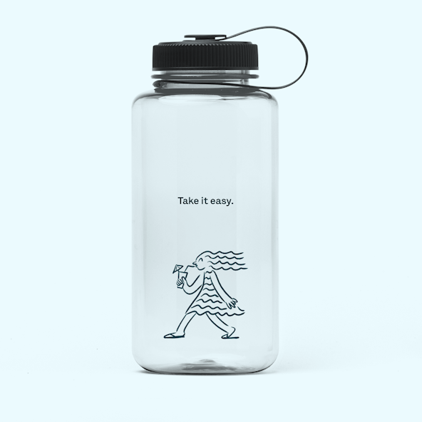
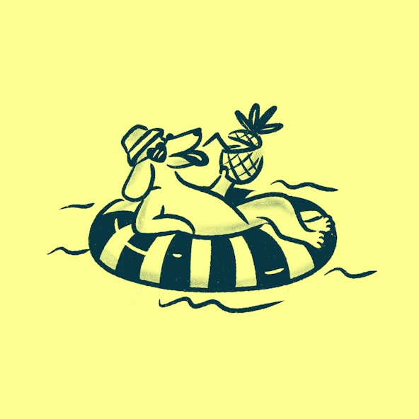
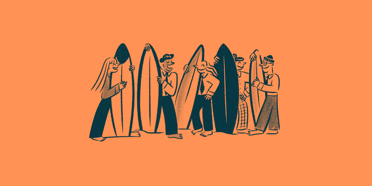
Illustrations by Maria Mileńko embody the theme of “moving freely.” The style amplifies humanity and personality. Illustrations are used to strategically meet people where they are — a newsletter, hero section, callout, or social media post.
Lettera Text is Surfe's exclusive and primary brand font. It carries the playful, upbeat, motivating, and laid-back communication style and doesn't compete with all the other bold visual elements at play.
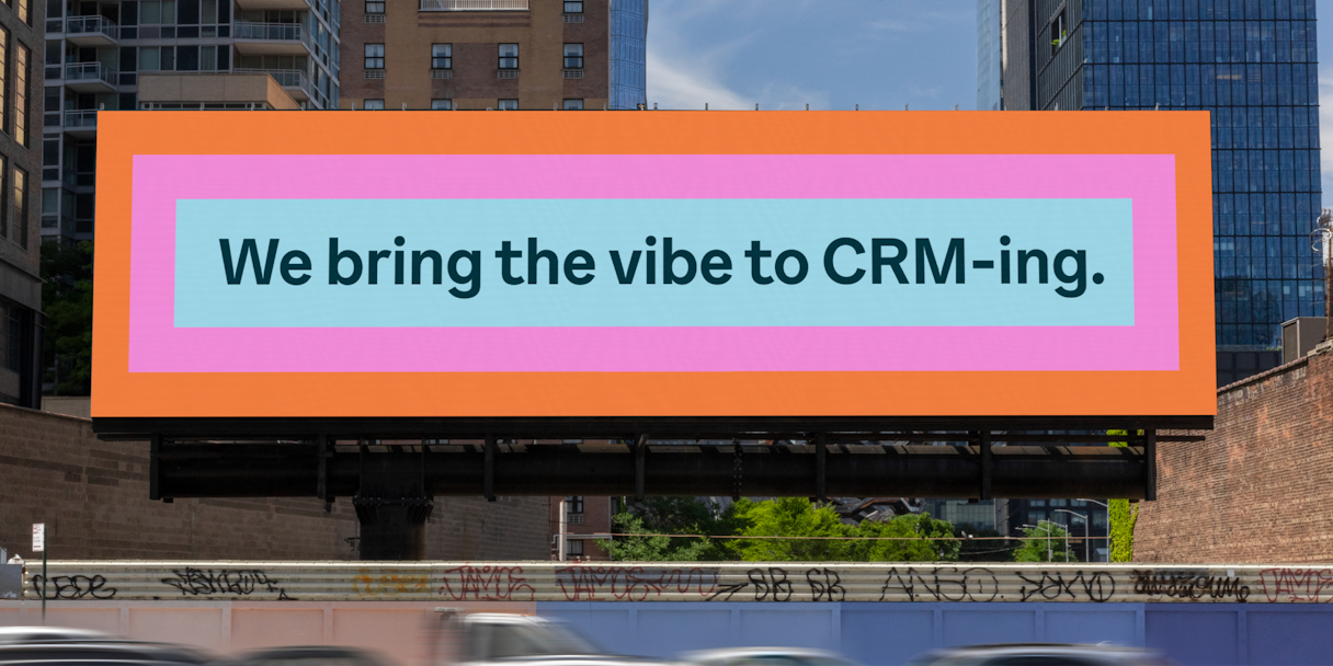
How Surfe Expanded on Our Work
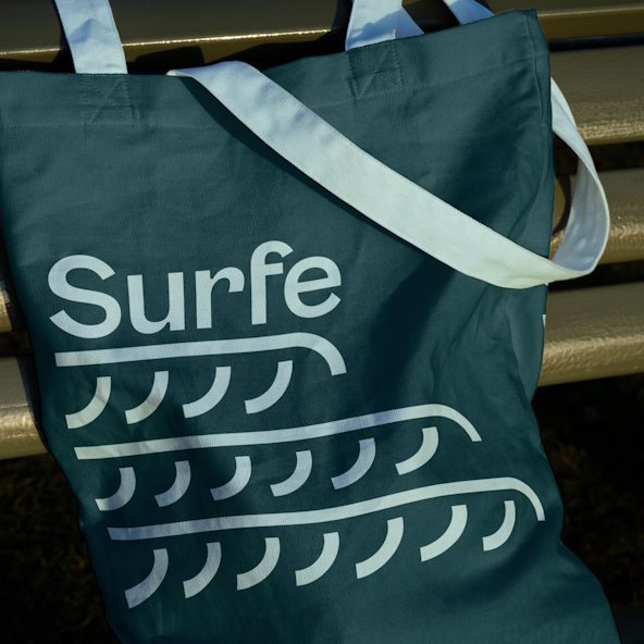
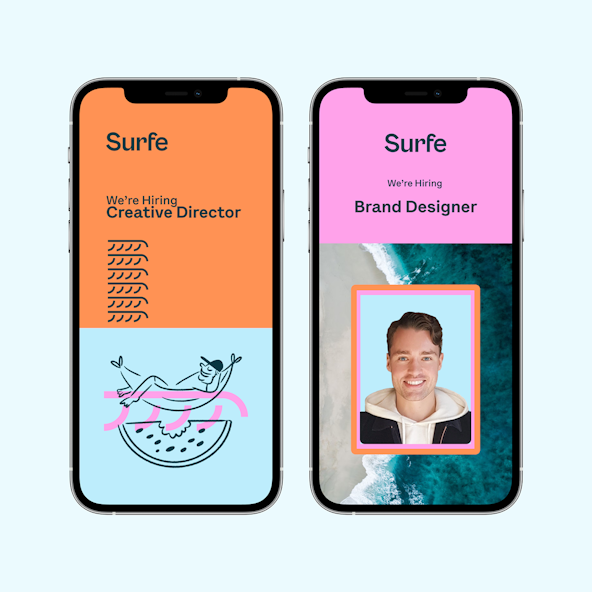
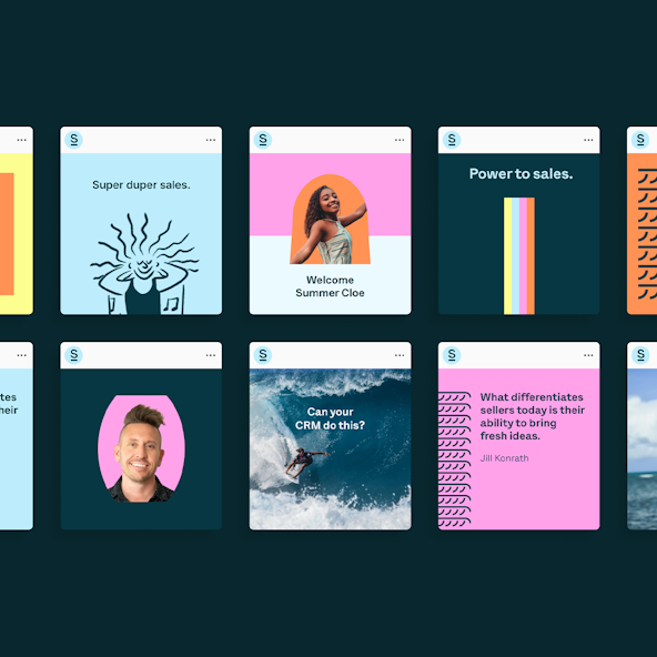
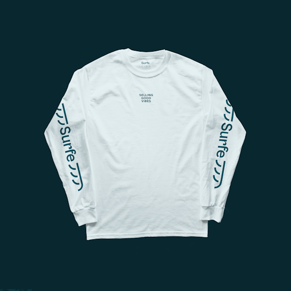
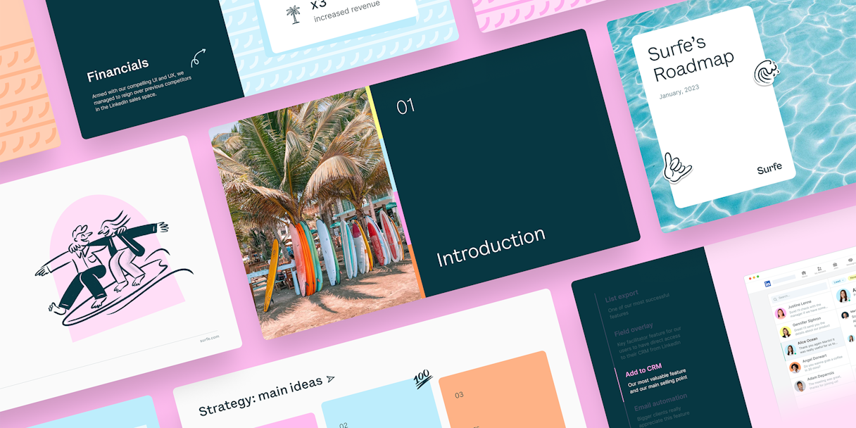
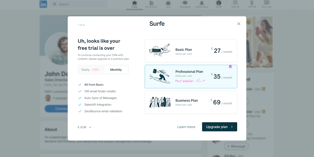
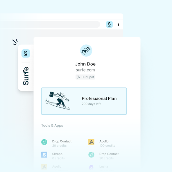
When our work together concludes, your brand’s new identity is just getting started. Clear and comprehensive brand guidelines set your team up to apply the brand across every touchpoint, which is exactly what Surfe did beautifully. The samples here were created by the Surfe creative team and additional contractors they enlisted.

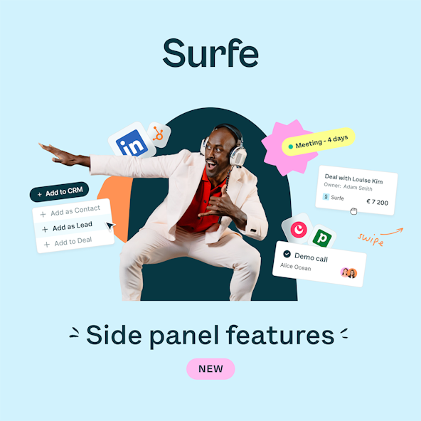
Post-Project Success
In the news
Surfe Raises €4 Million in Seed RoundRead the next case study
Locally