Getida

Every year, Amazon FBA (Fulfillment By Amazon) sellers experience discrepancies that can add up to billions of dollars in lost or damaged inventory, overcharges, and other reimbursements that go unclaimed. Getida exists to put a stop to this. Today, the company is a world-renown FBA auditing and reimbursement solution provider.

As former FBA sellers themselves, Getida knows firsthand how challenging it is for sellers to manage discrepancies — and the importance of every dollar of revenue to an Amazon business. Through its custom-built platform, Getida automates the discovery of reimbursements. Claims are then managed between Getida and Amazon directly. Together, its technology and team provide a best-in-class experience and a partnership that creates win-win outcomes for sellers of any size.

With fierce competition, an upstream target of enterprise businesses, upcoming product enhancements, and the opening of its UK headquarters (with more global expansion on its heels), it was time for Getida to channel its ethos into a distinct identity.

Getida was ready to claim its rightful spot as the global leader of Amazon FBA Auditing and continue its mission to educate, inform, and help Amazon sellers reinvest in themselves and their businesses. Brand was the key.

Getida Intro

Brand Strategy

The world of FBA reimbursements is complicated and Getida was up against a number of misconceptions. Although beloved by customers, competitors pushed a narrative that Getida was some faceless offshore operation, or that Amazon’s regulations limited Getida’s efficacy. The brand was doing itself no favors; with a lack of consistency and quality, Getida was not perceived as credible enough to combat these misunderstandings.

Getida Previous Identity
Getida Attributes
Getida Pattern

We saw a huge opportunity for Getida to make itself known through education and thought leadership, while building trust and brand equity. We also advocated for more information about Getida, the company — values, culture, people — to be made publicly available and part of its brand. This type of content is where brands can communicate the intangibles prospects look for in the buying journey, and these values already existed inside Getida’s walls. The teams are real people dedicated to seeing their customers succeed. This is not a one-off tool. It’s continual and connected opportunities for growth.

Getida identified their brand attributes as Dedicated, Dynamic, and Intuitive. Together, these attributes offered a larger story of a confident brand that delivers on its word today and has a vision for the future. We saw ample opportunity for these attributes to express the company in a way that empowered audiences to join Getida’s impactful story and created meaningful distinction among rival companies, who compete on price with no sense of leadership.

By uncovering Getida’s story and sharing it proudly, the next brand evolution of Getida could clarify its strong purpose: a company called to share its own knowledge and experience so businesses can better succeed in the world of Amazon.

Verbal Identity

A few clear goals came out of brand strategy that shaped our verbal identity work: Getida is the Sage (their brand archetype) that will guide FBA sellers to their best reimbursement solution. Messaging needed to emphasize the partnership Getida offers to build trust, while the brand voice needed to feel caring, confident, and clever.

Getida had two audience segments to consider: entrepreneurial small and medium-sized businesses (SMBs) and enterprise. It’s important to understand and speak to each audience specifically. Entrepreneurial SMBs may be looking for greater freedom in their business and looking for a partner that “gets it.” Conversely, enterprise users may care more about maximum efficiency and integrations with their current tech stack. We crafted their Audience Messaging Framework for both audiences.

In addition to the AMF, we also built out core messages, a brand story, and tagline to be proud of: “More than money back — it's the way forward.”

Getida Verbal 1
Getida warehouse

Logo

The Getida logomark celebrates forward-thinking and a dynamic approach with the movement of an arrow. The logomark is not only an arrow but also evokes a plus mark, symbolizing growth and prosperity.

While Getida’s old logo contained an arrow inside the “G,” the arrow pointed backwards. The new arrow holds significant storytelling potential about looking forward — embodying Getida's legacy, community, values, and culture within a simple symbol.

Getida logo exploration
Getida logo detail
Getida Logomock

Visual Identity

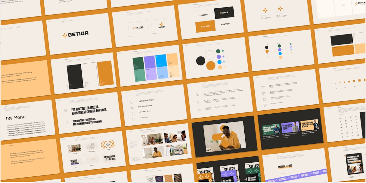
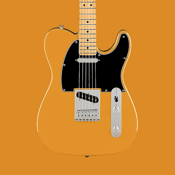
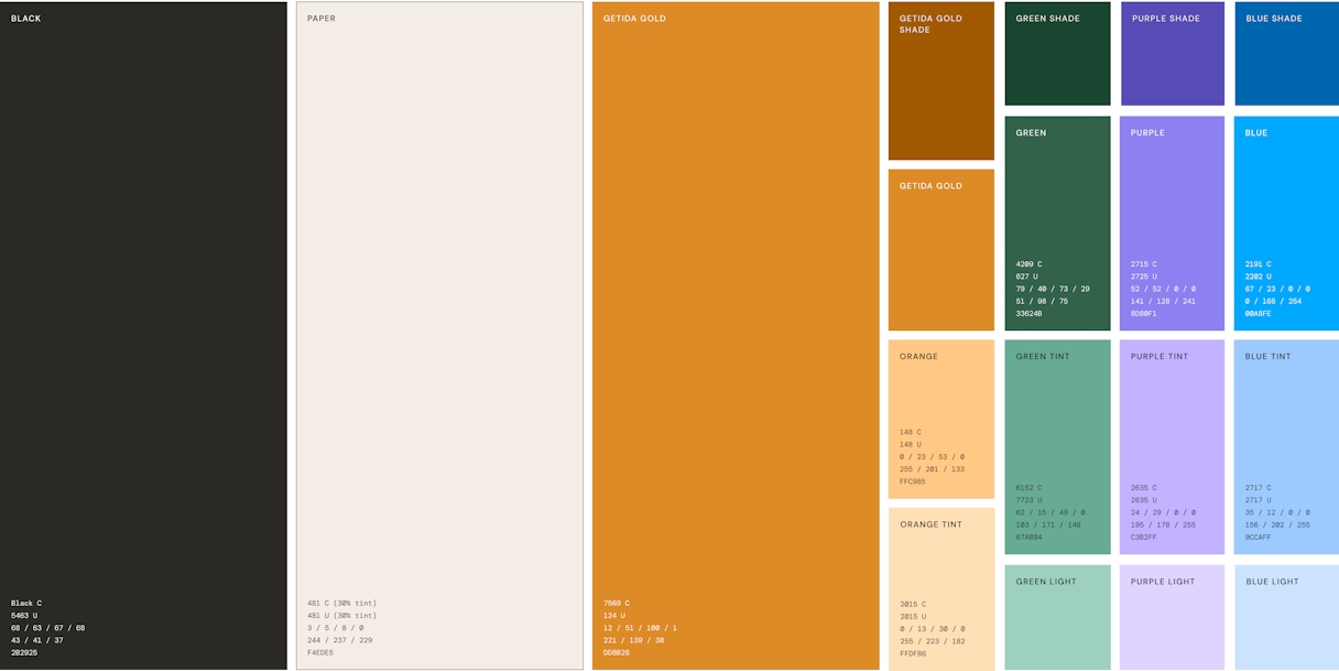
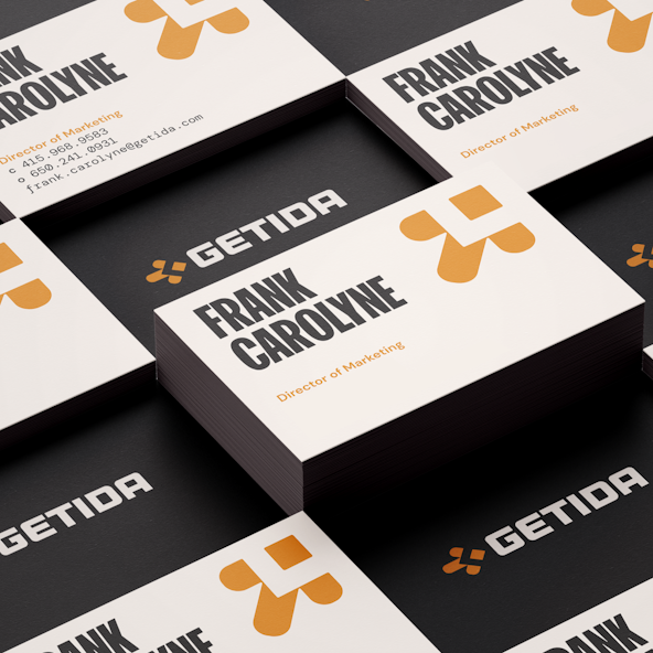
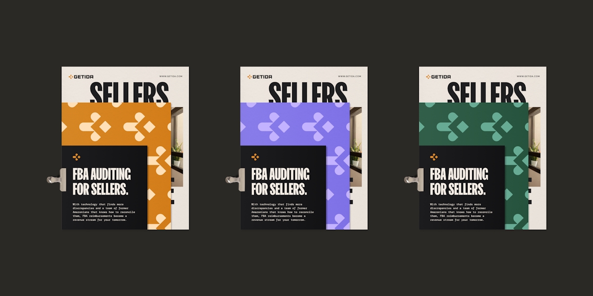
To guide our approach in how Getida presents itself, we drew inspiration from musical instruments. Specifically, we looked to vintage Fender Telecaster electric guitars for our color palette. These colors were carefully selected to evoke the ideas of amplification, dedication, and trust. We chose bronze as our lead tone to convey innovation and creativity, while black and white represent innovation and sophistication. Warm white adds a human touch and emphasizes our dedication to our customers. Overall, the palette exudes experience, maturity, growth, and strength — all qualities that come from a partnership with Getida.

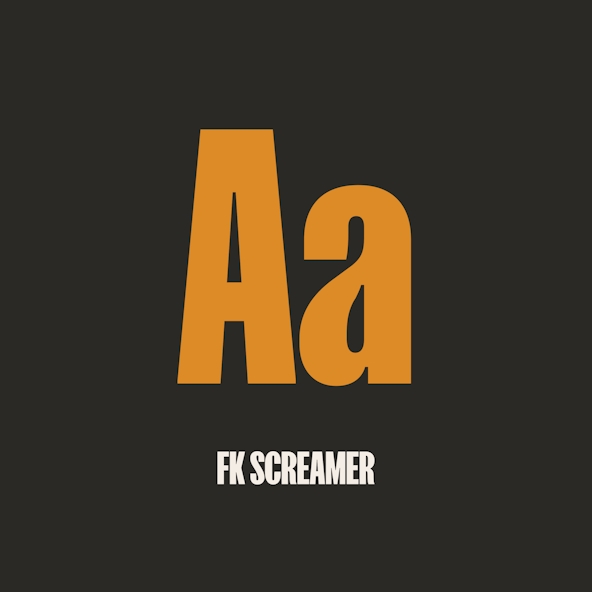
To give Getida messaging a bold and confident voice, we opted for FK Screamer, a condensed font family, for primary headlines. This decision to go all-uppercase was influenced by the previous Getida logo, which featured an all-uppercase lettering style. The new font choice builds on this legacy and reinforces the idea that Getida's messaging is more than just a name — it's what we say and how we say it.

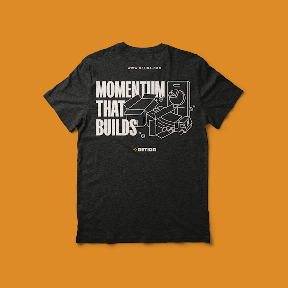
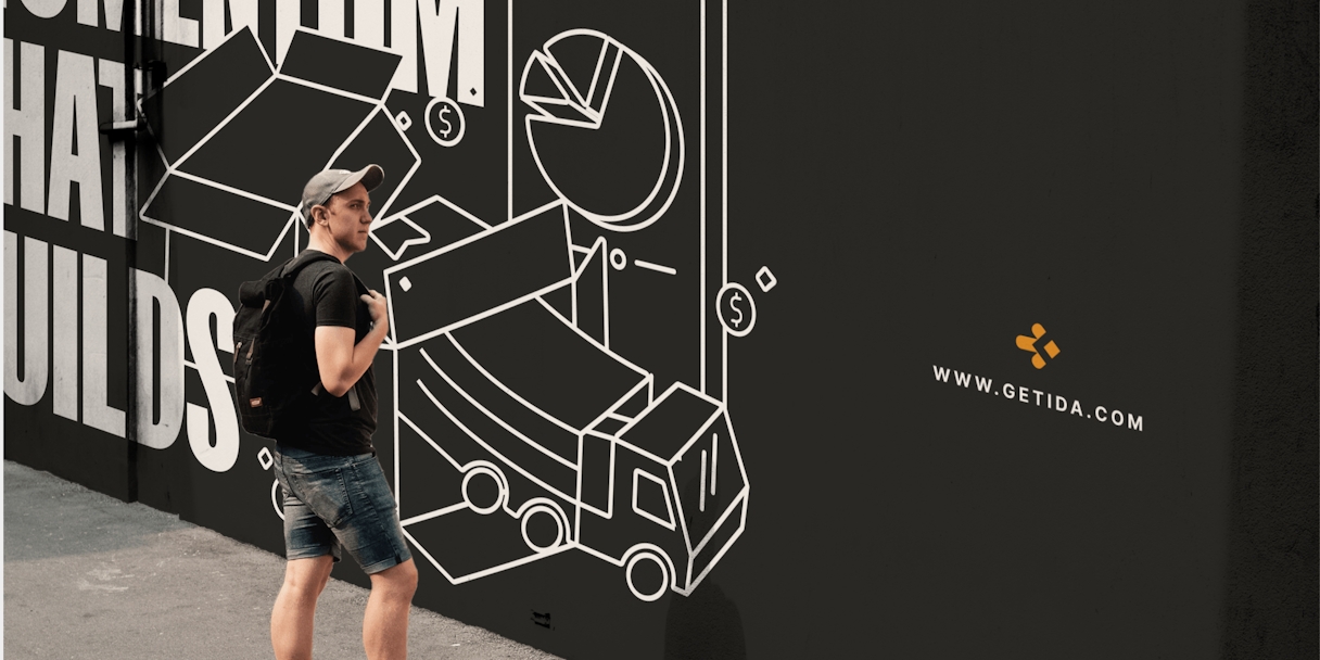
We can portray Getida's values and services through our dynamic marketing iconography. The marketing iconography evokes feelings of enthusiasm and dedication by employing light and expressive line work, which carries into the illustration style.

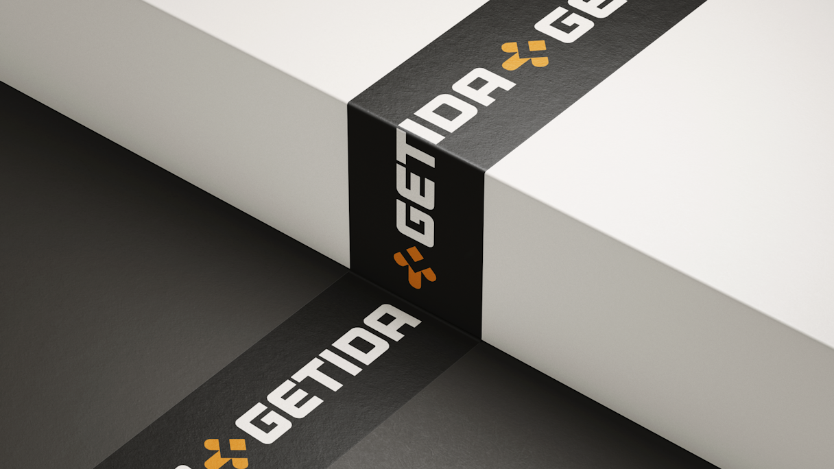
A graphic packing tape element adds dynamic energy to the brand and draws a connection to the importance of e-commerce. It’s an easy-to-use and complementary visual asset that balances the whole brand, highlighting key words.

Getida Big Brand Guidelines Grid
Getida Typography 1
Getida Telecaster
Getida Color Palette
Getida logomock shirt
Getida typestack2
Getida Type Stack
Getida Illustration
Getida Mockups
Getida Mockups
Getida Mockups 1
Getida Stickers
Getida more
Getida Booth
Getida signage
Getida Pattern2
Getida Elements
Getida desktop

Brand Support

As our branding project wrapped, Getida reached out for assistance as they assembled website messaging. Focus Lab's Brand Support team not only helped craft the right words, but also arrange messaging priorities and proof points to clearly convey value and impact. We also got Getida ready for conferences by designing various booth materials, in addition to letterheads and a few UI elements.

Getida bannerv2
Getida Booth Banner
Getida Brand Support

Your team was an absolute dream to work with, and the response from our customers showed that the work we did was incredibly impactful in reaching our goals. And I can't speak highly enough about all the support we got post-project completion to bring it to life!

Sandra Rand, former VP of Marketing, Getida

Read the next case study

Artifact