MessageGears

Founded in 2010, MessageGears enables enterprises to drive more revenue and customer loyalty by unifying data management, activation, and marketing channels, all in one place.

Alternatives built solely for the marketing use case ask enterprises to move, copy, and ship their customer data from the warehouse to another platform. The problem with this approach is ... everything. It’s slow, it’s risky, it’s limiting, it’s expensive, it’s inefficient, it’s annoying, and it perpetuates the silos between data and marketing teams. Enter MessageGears.

The MessageGears platform provides enterprise teams with a unified, powerful source of truth that connects to their existing data warehouse, activates billions of data points, and enables 1:1 marketing with each of their millions of customers.

With a rapidly shifting market, MessageGears needed a new brand identity to break through the noise and champion their differentiators.

Brand Strategy

We began our work with an onsite at MessageGears’ Atlanta headquarters. Through a few group exercises, we narrowed in on their brand attributes and their archetype: The Maverick.

Like famous mavericks, MessageGears prioritizes independence, nonconformity, and challenging the status quo. To inspire customers to think for themselves and resist the pressure of settling for less, the rebrand needed to emphasize a commitment to authenticity and individuality.

Part of the company’s mission of rebellion meant redefining its category. While competing against Customer Engagement Platforms (CEP) and Customer Data Platforms (CDP), MessageGears was constantly misunderstood because their solution goes beyond both of those limited definitions. MessageGears treats customers like individuals — not just data. During our customer interviews, people frequently brought up how accessible the MessageGears team is. These customers didn’t feel like a number in a spreadsheet or a ticket in a queue. The MessageGears platform also goes beyond the technical limitations of its competitors, by building a solution for more advanced marketing professionals eager for a centralized data cloud. Breaking out of the B2B acronyms, MessageGears redefined their platform as Data Activation and Engagement.

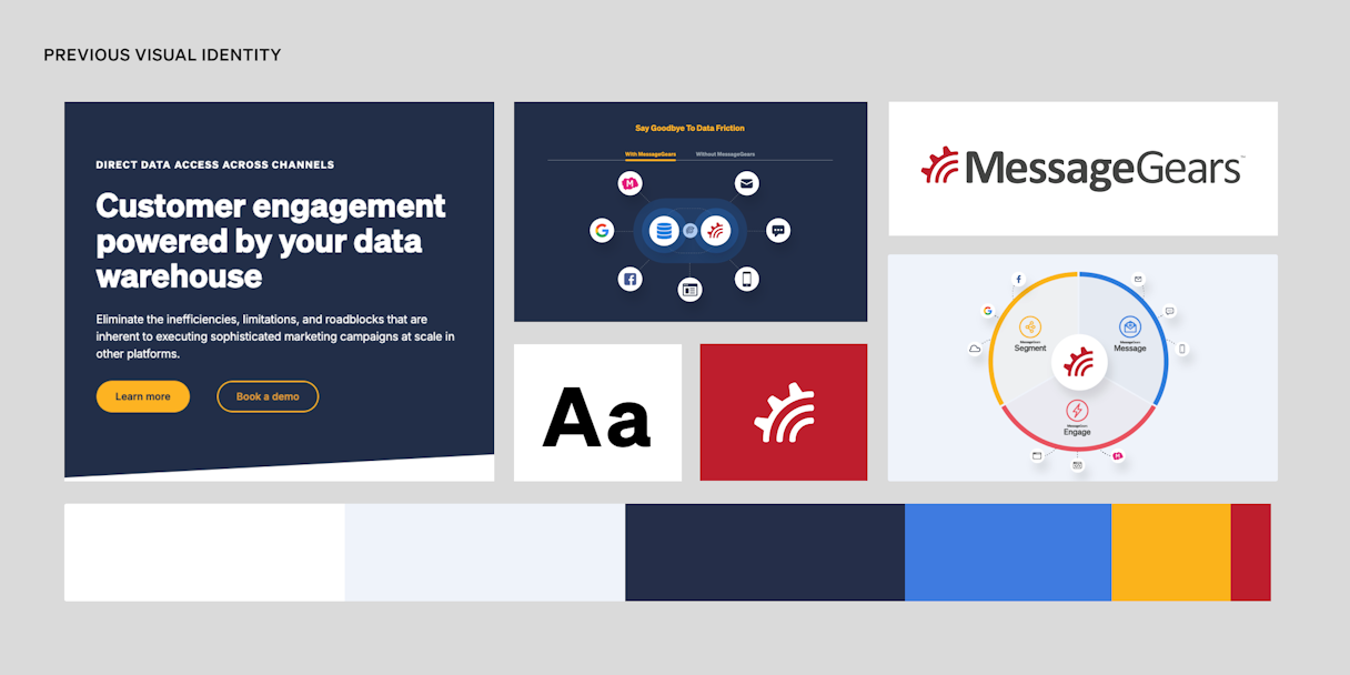
Their redefined platform and maverick spirit led us to create a brand concept called “Shift.” At first, the MessageGears team felt stuck with a gear for their logo, until we shifted gears (pun intended).

Messagegears Previous Identity
Messagegears Onsite

A photo from our onsite in Atlanta

Platform Positioning

After tackling brand positioning, we jumped into platform positioning. We often harp on the importance of keeping brand and product separate: brand is the emotional story that doesn’t change when new features come out – it’s more evergreen. However, product positioning serves an important purpose, particularly in the competitive analysis world of B2B, in product marketing and messaging.

We like to think of product positioning as, “We’re the _______ platform.” Concise and specific. With a more technical platform built for complexities, MessageGears is the advanced platform, and they can prove it. Alternatives built just for marketing teams make everyone’s job harder. Against this landscape, the MessageGears platform serves their specific technical audience better than anyone else.

Verbal Identity

The Maverick archetype continued to inspire our verbal identity work through an edgier voice: direct and provocative. The MessageGears brand story speaks to that directness, both literally and figuratively, that differentiates their platform.

MessageGears provides direct data access: no more migrating sensitive customer data to a disconnected marketing tool. That inefficiency had become such a standard in the CEP industry that pointing out, “Hey — there’s a better way to do that,” feels bold and rebellious. As mavericks, MessageGears is unafraid to call out competitors’ failings. Edgy felt right for MessageGears, but we recognized the importance of balancing that vibe with trustworthiness. Edge without trust can veer into juvenile, but luckily MessageGears has the technical chops to support their bold voice.

Messagegears Verbal billboard
Messagegears Verbal direct
Messagegears Purpose

Logo

The MessageGears mark is a monogram M that is constructed from six square shapes, each with the same width and height. The modularity of the logo is a direct connection to the flexibility, creativity, and composability they offer their clients through the MessageGears platform. With the exception of the bottom middle shape, each of the pieces can be swapped or rotated in 90-degree increments for subtle animation or specific use cases. Simple, structured, stunning.

The wordmark is Albert Sans, a modern geometric sans serif inspired by Scandinavian mavericks of the early 20th century. In all-uppercase with flat-top A’s, the logotype matches the grid of the mark.

Messagegears Composable
Messagegears Gearhead
Messagegears Final Logo

Visual Identity

The visual identity has a distinct light and dark mode, with a heavy emphasis on the dark mode: cool, edgy, and rebellious. Bold, but surprisingly sophisticated, a dark plum leads as the key color, providing a whole new spin on what dark mode typically looks like in tech. That spirit is carried over into the color names honoring favorite mavericks of the MessageGears team: Bowie Plum, Jobs White, Stark Red, Bueller Orange, Goodall Green, Ali Yellow.

Messagegears Color Palette
Messagegears Dark Mode
Messagegears Light Mode

The primary typeface, Cambon, is a wedge serif with some character, giving it a memorability factor and adding visual interest to the identity as a whole. A serif is also a good visual differentiator in the sans serif sea of tech brands.

The rest of the visual identity makes use of the logomark’s modularity. The shapes from the logo are used as photo containers and graphic elements.

Messagegears Cambon
Messagegears Cambon detail
Messagegears Photo
Messagegears Tote
Messagegears UI Color
Messagegears Mug
Messagegears Banner
Messagegears Ipad
Messagegears Mockup
Messagegears icons

After completing our branding work, we collaborated closely with our partners at Craft&Crew to bring it to life on their website, providing a seamless experience for the MessageGears team. Check out their case study for the next steps in MessageGears' rebrand.

Messagegears cc

By our friends at Craft&Crew

We’ve worked with a lot of agencies over the years for various things, and I think you’re the first agency we’ve not felt like we needed to manage. You do what you say. You have a very well defined timeline and process – very well communicated and structured. [...] It sets a high bar for every other agency we work with.

Will Devlin, VP of Marketing, MessageGears
Messagegears finale

Read the next case study

Irwin