TrustedSec

There’s security, there’s consulting, and then there’s TrustedSec.

From day one, the company has existed to do cybersecurity the right way, meaning it’s positive, pragmatic, and personal to each business engagement. In an ever evolving wheel of cyberthreats, TrustedSec believes that fear is not the pitch, out-of-the-box security solutions are not the answer, and playbooks are no longer possible.

Its independent and tech-agnostic approach means that customers get actionable answers that they can implement and feel confident about, and the results for TrustedSec are a thriving company culture, industry recognition, and a fanatical fan list that includes Fortune 100, globally recognized organizations.

So what’s the problem? Its brand was still the same as it was on day one, when TrustedSec was solely focused on offensive-testing and operated out of the founder’s basement. The brand identity was no longer an accurate representation of TrustedSec.

In order for TrustedSec to reach and help more best-fit customers, the brand needed to evolve in a way that retained the company’s culture but grew beyond the misperception that it’s still in its infancy.

TrustedSec rebrand case study by Focus Lab

Brand Strategy

Before working together, much of TrustedSec’s identity was a case of opposites…a smiley face logo against dry and corporate visual language, a culture and community of fans but a website that lacked personality, and a speciality in its offerings but a laundry list of features.

Our work began with collaborating with the TrustedSec team on identifying what aspects of their brand felt authentic and what felt like it was who they were “supposed to be” in the industry. From there, we uncovered a story that revolved around exceptional people invested in their craft and community who are committed to making the world a more secure place. This story led us to creating meaningful distinction for TrustedSec as a fundamentally different philosophy on cybersecurity.

Trustedsec Previous Identity
Trustedsec Attributes
Trustedsec brandidea

TrustedSec’s three attributes — Technical, Crafted, and Approachable — laid the foundation for the qualities we knew were most important for the brand’s target audiences. After evaluating the competitive landscape (covered in cyber-trends and scare tactics) where we setup opportunities for ownability, we identified TrustedSec's keenest opportunities to directly appeal to its best-fit customers.

We recommended that they highlight the internal culture they had developed and continue to invest in. TrustedSec’s team makeup directly elevates the client engagement and experience, taking a quality that before felt intangible and making it a tangible appeal and benefit for businesses.

We knew that from day one of the company, TrustedSec has represented the people who broke away from the fundamentals in order to build a business that approached cybersecurity differently so it could be better. Expressing this shared belief with its like-minded audiences was a clear opportunity for creating resonance.

In uncovering all of these unique opportunities within the first few weeks of the project, we were able to move into next steps with confidence and clarity. With it, TrustedSec had its north star. By illuminating the deeper value of TrustedSec’s breadth of service offerings, the brand would be positioned to take hold of earned authority among competitors and in the larger security landscape.

Trustedsec Inspiration

Verbal Identity

Capturing TrustedSec’s verbal identity was a balancing act. On the one hand, the brand’s long-established voice as a hacker’s advocate couldn’t be lost. On the other, the firm needed to expand credibility with larger enterprise prospects.

In brand messaging, we collaborated with the client team to wrap words around what we already knew to be true. TrustedSec’s purpose is to make the world a secure place, and all messaging emanated from this code of business enablement, empowerment, and positivity. From there, we workshopped audience-specific messaging guidelines.

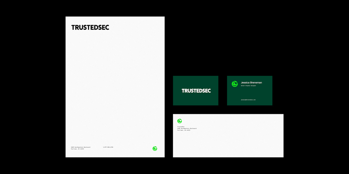
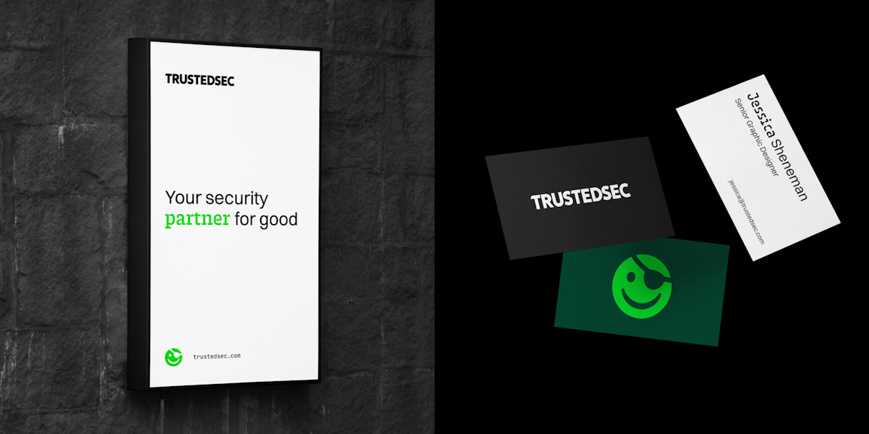
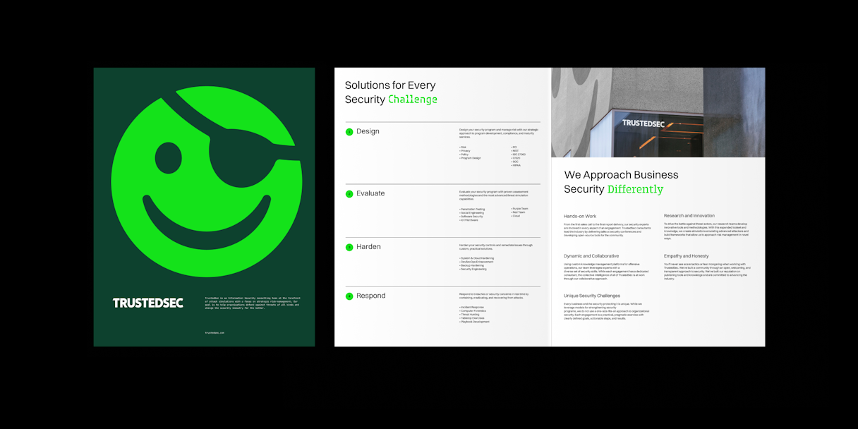
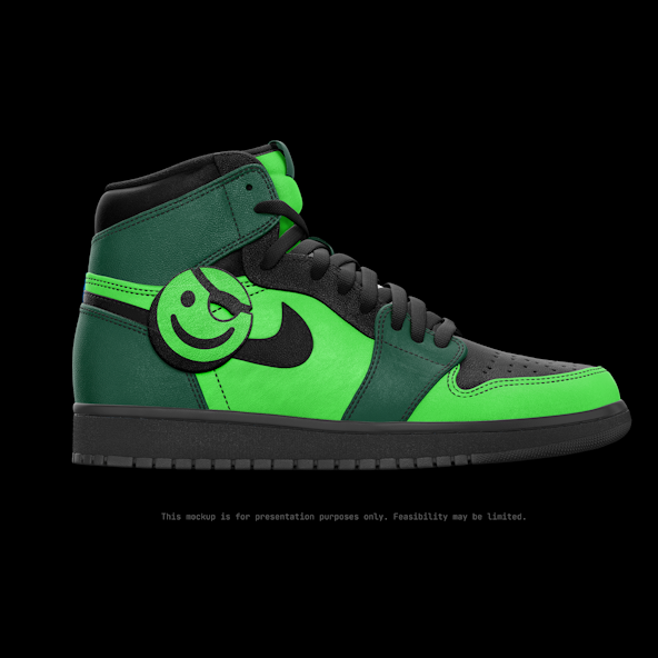
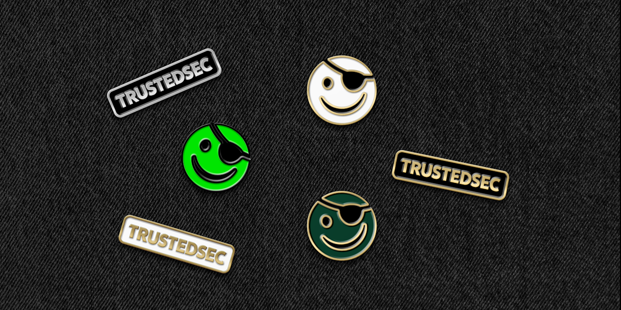
In support of messaging and visuals, we defined the brand’s voice attributes as Discerning, Approachable, and Irreverent. Through these descriptors, the TrustedSec team would have clear, strategic guidelines that allowed for business and play as needed.

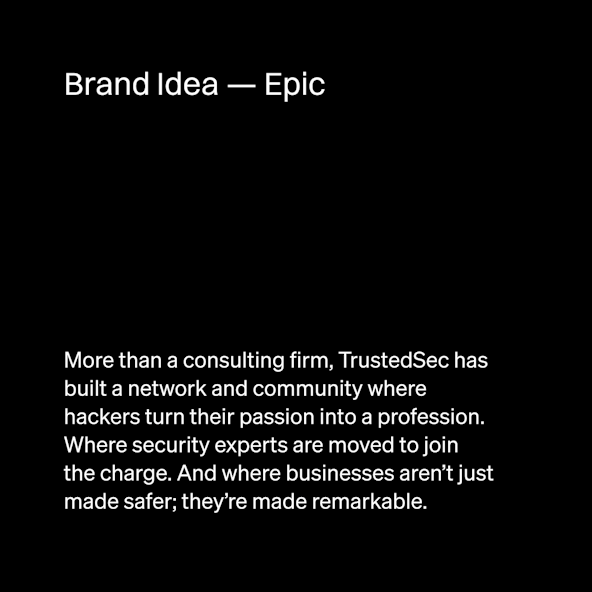
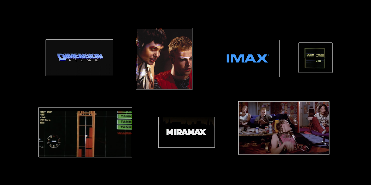
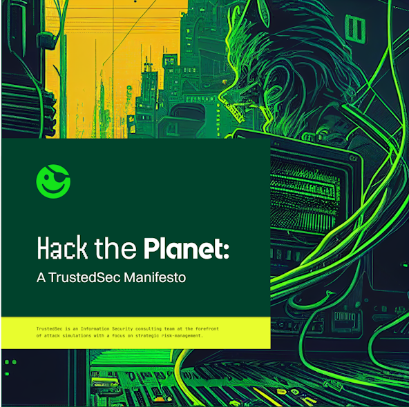
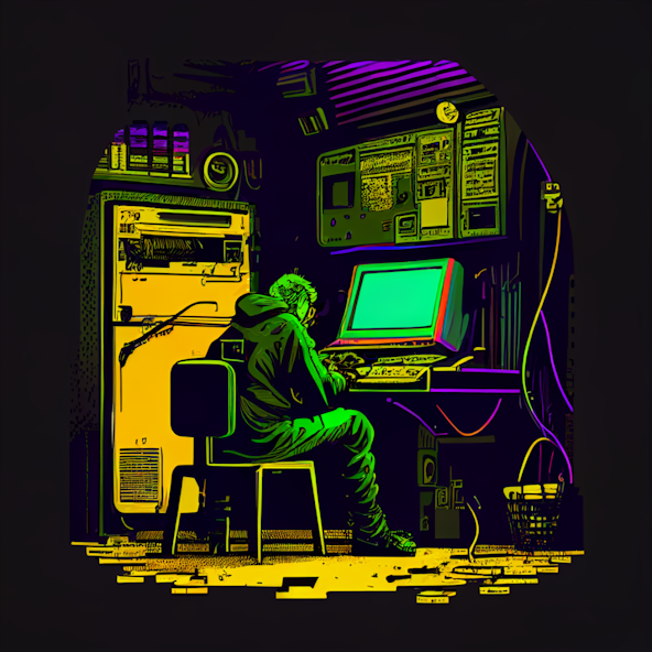
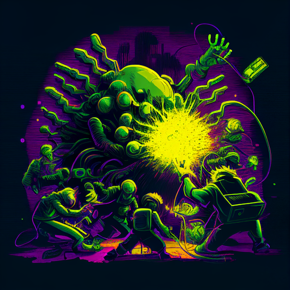
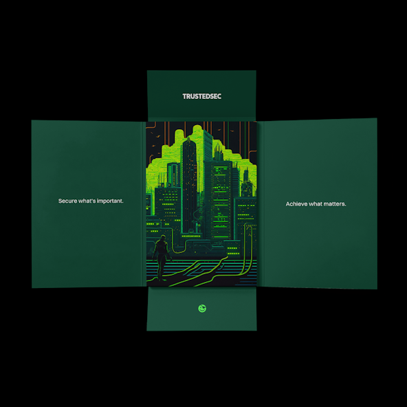
We wrapped our verbal identity work with a manifesto entitled “Hack the Planet,” inspired by the ‘90s cult film “Hackers.” The narrative declared the core tenets of the brand’s approach to cybersecurity. This largely revolved around the idea that doing the right things allows the company to do things right — that is, deliver a high-quality, low-ego service based in altruism, expertise, and creativity.

Trustedsec secure2
Trustedsec hacktheplanet

Logo

How do you make a smiley face ownable and cohesive within a larger brand system all about trust and security? That was both our challenge and our most exciting task when taking on the TrustedSec logo. An easter egg from “Hackers,” TrustedSec’s eyepatch-clad logo, nicknamed Smiley, was so anti-corporation and so beloved, it was part of our strategy to retain it and elevate its use in the brand identity. Our strategic direction was nicknamed “The Sequel.”

First, we freed Smiley from the original logo lockup. Free to roam, Smiley could be creatively “hacked” while remaining true to strategic brand guidelines. Second, we updated the TrustedSec logotype to stand apart and stand alone. The logotype is inspired by bold production house logos and by IMAX. There is something climactic and epic about experiencing these brands; they create anticipation and don’t shy away from having authority. After searching through dozens of typefaces, we loved how ICA Rubrik carried itself and presented such a timeless feel for the brand.

Trustedsec Refinement potential logo refinements 5
Trustedsec Refinement potential logo refinements 1
Trustedsec logotype detail
Trustedsec Mark

Visual Language

Green felt important to keep, as it represented so much of the growth and positivity of TrustedSec as a company and culture. So we refreshed the palette with two custom greens and complemented it with a hierarchy of neons and neutrals. Together, the new palette and color guidelines provide space and energy to the overall system, allowing the brand to ground or amplify in moments as desired.

Typography is arguably the true star of TrustedSec’s new visual language. The typographic visual language is a mix of old-school computer programming letterforms, a modern-futuristic style, a retro chunky option with fine details, and a digitized font for special callout areas. Across the system, there’s a balance of the past and present, nodding to technical elements that feel appropriate for TrustedSec’s industry and audiences. It celebrates TrustedSec’s open-source ethos and pays homage to their hacker roots, while still being unbelievably approachable and simple to use.

Trustedsec Typography
Trustedsec Color
Trustedsec Typographic Visual Language
Trustedsec Typographic Visual Language Anatomy
Trustedsec Iconography

Other visual language elements included a generative AI concept language, a library of images for branded content, photography styles, and various Smiley styles the TrustedSec team could use across the brand and continue adding to in the future. TrustedSec is a tight-knit team, so in everything we developed, we kept extendability, scale, and ease of execution as top priorities.

Illustration01
Illustration02
Illustration03
Illustration04

AI generative images

Trustedsec Showcase 03
Trustedsec Showcase 04
Trustedsec Showcase 05
Trustedsec Showcase 06
Trustedsec Showcase 07
Trustedsec print
Trustedsec shoe
Trustedsec Showcase 11
Trustedsec Showcase 15
Trustedsec building
Trustedsec pass
Trustedsec Showcase 01

Post-Project Success

Read the next case study

Braze