Totango

New customer acquisition is only part of the formula for growth. The other? Retaining existing customers by providing consistent value and support.

Totango is the customer growth platform helping businesses manage customer experience and prove that customer value galvanizes new and recurring revenue growth.

Founded in 2010, Totango was one of the first native customer success products — and helped create the CS category — before acquiring Catalyst in 2024. The merger of these two customer growth platforms — Totango, the trusted heritage solution for enterprise, and Catalyst, the agile innovator — formed a new Totango that capitalizes on both companies' strengths.

After a merger, Totango needed a fresh identity to signal a new era for the company and find a unified voice.

Totango Intro

Brand Strategy

During Research & Evaluation, we reviewed Totango, Catalyst, and their top competitors. A few key areas for differentiation stood out, particularly in value propositions. Totango’s competitors love to talk about being an “all-in-one” solution but fail to express why CS actually matters and should be invested in. Totango understands a customer’s success is cross-departmental and has real, tangible revenue results that speak to C-suites.

We identified The Athlete as Totango’s brand archetype. Athletes represent that determination to go after what they want, to strive, and to be better. They push the limits for the love of the game, relentless in their pursuit for a better outcome for their customers and the industry.

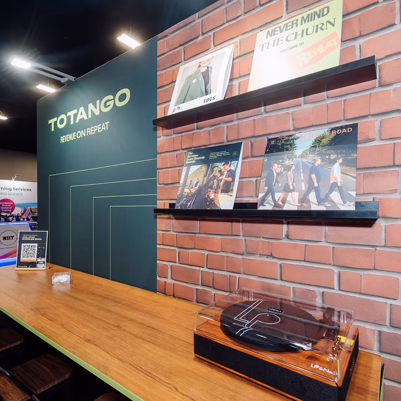
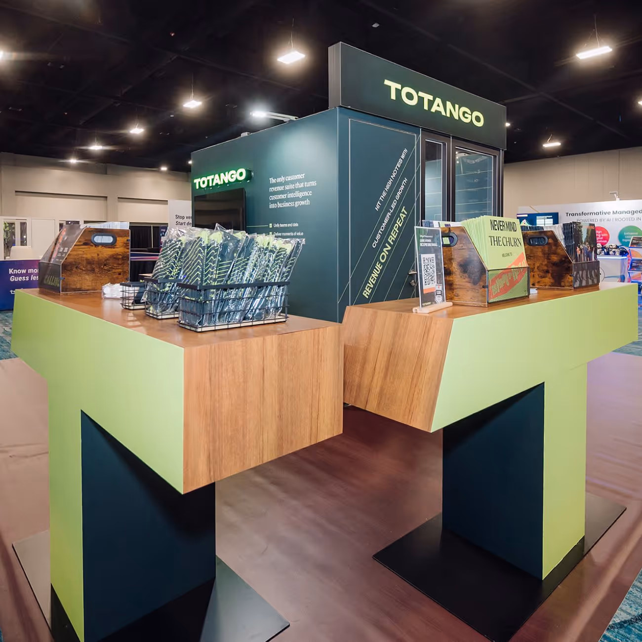
The concept for Totango’s rebrand was Rhythm. Totango works seamlessly across departments, smoothly and intelligently adapting to customer expectations. The merger of Totango and Catalyst evokes a new groove ready to take the industry by storm. As Elvis Presley said, “Rhythm is something you either have or don’t have, but when you have it, you have it all over.” And the new Totango has it.

Totango Previous Identity
Totango Archetype

Verbal Identity

In the merger, Catalyst’s existing voice offered more conviction and action when compared to Totango’s. The younger company had a bit more personality that all teams wanted to bring forward into the rebranded Totango, so we began our work by identifying the best pieces of Catalyst’s voice and how to balance that voice with Totango’s legacy.

The new Totango voice is direct, novel, and intuitive. It is forthright, original, and insightful. While every piece of copy won’t hit every note, a few rewrites demonstrate how this new voice could be implemented. The header “built to scale with you as your business grows” transforms into “tipping the scales” — concise and unexpected. New taglines like “grow ahead” and “revenue on repeat” have some pluck and do a lot to convey the new Totango voice.

The brand story distills the most important goals from strategy and captures the writing work. For Totango, that meant a rallying call to not only adapt to their industry’s evolution, but galvanize it. The brand story ends with a powerful sentiment: “Together, we can do more than follow where this era takes us. We can lead it.”

Totango Verbal VT
Totango Verbal Message
Totango Verbal

Logo

During our strategy work, we identified a strong logotype as an opportunity for distinction among competitors. While we explored some abstract marks, the Totango logotype won out for capturing the commanding presence Totango brings to their industry, post-merger.

Reserved for small use cases only, the two-letter monogram utilizes the rhythm of the two “T’s” to form a bold, athletic, and standalone symbol.

Totango Logo Detail
Totango Final Logo
Totango Hoodie
Totango Button
Totango San Fran
Totango Visual Language

Visual Identity

The primary color palette leans into blue-greens and a chartreuse that’s ownable in the space. Secondary colors of purple and orange are unexpected, but make for some delightfully surprising pairings.

Totango Color3

Typography is a powerful component of the visual language. Playing with different weights of the Staff typeface creates expressive tension, reflecting Totango’s adaptability and amplifying key messages with conviction and flexibility. Paired with the mature serif, Totango’s typography is vibrant and surprising. Even simple layouts can feel energetic and fearless.

Totango Cambon
Totango Staff
Totango Type Stack

Totango’s rebrand — from the Athlete archetype to the dynamic typography — is all about action and movement. We wanted to bring more of that feeling to Totoango’s photography. Motion blurs of dynamic workplaces buzz with life, and a subtle radial blur on portraits represents Totango’s focus on people. In the world of static, stale B2B stock images, Totango stands apart. Additionally, cinematic, wide-angle cityscapes evoke a sense of grand possibilities and big-picture visions.

Line patterns represent Totango’s forward momentum and strategic precision, guiding the way to growth. They add depth and contrast, enhancing visual interest.

Totango Pattern
Totango Icons
Totango Pin
Totango Badge
Totango Social2
Totango More Showcase

Interactive

The rebrand isn’t finished when brand guidelines ship — we had to translate the fresh, new brand to the web. We began with wireframes, interactive writing, and page-level storytelling for a few key pages.

By focusing on a few key pages, we were able to set up structures and interactions that carry throughout the rest of the site. Animated elements take the active motion from the visual identity work and weave it through the web experience.

Totango Lo Fi
Totango Product Illo
Totango Sitepage
Totango Elements
Totango Homepage

Brand Support

With a strong base established during our interactive work, our Brand Support team was able to tackle additional Totango pages, including the Totango blog. Our Brand Support designers work closely with the Brand/UI designers to make the transition from the brand project seamless.

Brand Support also worked with the Totango team to visualize their revenue-protection-and-growth methodology: Audit, Assess, Act, and Analyze. We also created launch graphics, social media assets, slide decks, and blog covers.

Totango Slide Deck2
Totango Category Page

I have led and been a part of A LOT of rebrands in my career, and I can honestly say without hesitation this one is THE BEST and the one I'm most proud of. Thanks for pushing us to choose something bold ... LOVE where we landed.

Karen Budell, Chief Marketing Officer
Totango Presentation

Read the next case study

NoCodeOps