Brands that lead and inspire their industries
Salesloft
Brand Strategy, Verbal Identity, Visual Identity, Web Design, Monthly Retainer
Fabricators & Manufacturers Association
Brand Strategy, Verbal Identity, Visual Identity
Zuora
Brand Strategy, Verbal Identity, Visual Identity, Monthly Retainer

Popl
Brand Strategy, Visual Identity, Web Design

LaunchDarkly
Brand Strategy, Verbal Identity, Visual Identity, Web Design

TrustedSec
Brand Strategy, Verbal Identity, Visual Identity
Cultivate loyalty, recognition, and growth through the power of brand.
Learn about our processMessageGears
Brand Strategy, Verbal Identity, Visual Identity

PolyAI
Brand Strategy, Visual Identity, Web Design
Marketo
Brand Strategy, Verbal Identity, Visual Identity
ClickFunnels
Brand Strategy, Verbal Identity, Visual Identity, Web Design

Totango
Brand Strategy, Verbal Identity, Visual Identity, Web Design, Monthly Retainer
Contentstack
Brand Strategy, Verbal Identity, Visual Identity, Web Design, Monthly Retainer
Luminate
Brand Strategy, Verbal Identity, Visual Identity, Monthly Retainer
Cadmium
Brand Strategy, Verbal Identity, Visual Identity, Web Design, Monthly Retainer

Bernard
Visual Identity, Monthly Retainer

Customer.io
Verbal Identity, Visual Identity

Formance
Visual Identity, Web Design
Speakeasy
Visual Identity

Comulate
Visual Identity, Monthly Retainer

Continu Retainer
Verbal Identity, Web Design, Monthly Retainer
Animoto
Visual Identity, Monthly Retainer

NoCodeOps
Brand Strategy, Verbal Identity, Visual Identity, Web Design, Monthly Retainer
Irwin
Brand Strategy, Verbal Identity, Visual Identity, Web Design, Monthly Retainer
Elastic Path
Brand Strategy, Verbal Identity, Visual Identity, Web Design, Monthly Retainer
Surfe
Brand Strategy, Visual Identity

Perion
Brand Strategy, Visual Identity, Web Design

Nitrogen
Brand Strategy, Visual Identity, Web Design
Getida
Brand Strategy, Verbal Identity, Visual Identity, Monthly Retainer

Voiceflow
Brand Strategy, Verbal Identity, Visual Identity, Monthly Retainer

Quantive
Brand Strategy, Verbal Identity, Visual Identity, Monthly Retainer

Tango
Brand Strategy, Verbal Identity, Visual Identity, Web Design, Monthly Retainer

Kasada
Brand Strategy, Verbal Identity, Visual Identity, Web Design, Monthly Retainer
Kion
Brand Strategy, Verbal Identity, Visual Identity, Web Design, Monthly Retainer
Locally
Brand Strategy, Verbal Identity, Visual Identity
Very
Brand Strategy, Verbal Identity, Visual Identity, Monthly Retainer
Real Thread
Brand Strategy, Verbal Identity, Visual Identity, Web Design, Monthly Retainer

Artifact
Brand Strategy, Verbal Identity, Visual Identity, Web Design, Monthly Retainer
Four Kitchens
Brand Strategy, Verbal Identity, Visual Identity, Web Design, Monthly Retainer

Rows
Brand Strategy, Verbal Identity, Visual Identity, Web Design
Broadlume
Brand Strategy, Verbal Identity, Visual Identity

Reify Health
Brand Strategy, Visual Identity, Web Design
Rebranding Focus Lab
Brand Strategy, Verbal Identity, Visual Identity, Web Design, Monthly Retainer
15Five
Brand Strategy, Verbal Identity, Visual Identity, Web Design, Monthly Retainer

Braze
Brand Strategy, Verbal Identity, Visual Identity, Web Design

ASAPP
Brand Strategy, Verbal Identity, Visual Identity, Web Design

Zello
Brand Strategy, Verbal Identity, Visual Identity
Vecteezy
Brand Strategy, Verbal Identity, Visual Identity

Frame.io
Brand Strategy, Visual Identity, Web Design

Patriot Software
Brand Strategy, Verbal Identity, Visual Identity, Web Design
Keymaster Games
Brand Strategy, Verbal Identity, Visual Identity
Aptible
Brand Strategy, Verbal Identity, Visual Identity, Web Design
Deputy
Brand Strategy, Verbal Identity, Visual Identity
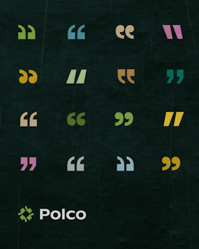
Polco & NRC
Brand Strategy, Verbal Identity, Visual Identity, Web Design

Galvanize
Brand Strategy, Verbal Identity, Visual Identity
Laravel
Brand Strategy, Visual Identity, Web Design

Pinpoint
Brand Strategy, Visual Identity

BlueWave Solar
Brand Strategy, Visual Identity, Web Design
Cahoots
Brand Strategy, Visual Identity, Web Design
StoryBots
Brand Strategy, Visual Identity, Monthly Retainer
SpotHero
Brand Strategy, Visual Identity

Serverless
Brand Strategy, Visual Identity, Web Design